Birthing classes landing page critiques/feedback

  • 17 September 2020
  • 14 replies
  • 15 views

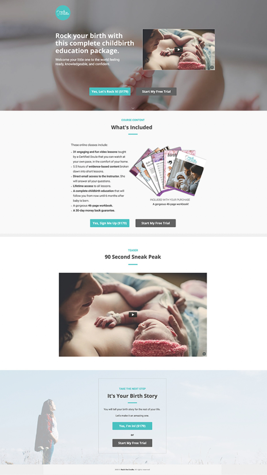
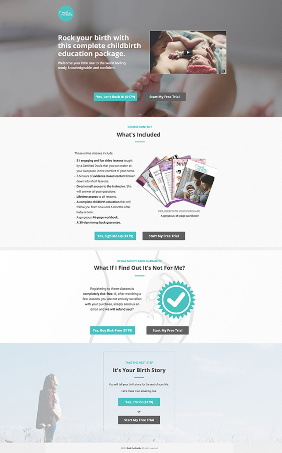
So apparently, we can post our landing page here and get tomatoes thrown at us 😉 No but seriously, I’m looking for honest feedback. Let yourself loose. This is my first landing page ever!

My landing page: https://birthingclasses.rockthecradle.ca/rockstaredition/

We sell online birthing classes. Our target market is pregnant women between 24 and 35 years old who feel overwhelmed by the amount of information out there and who want all the essentials in one neatly packaged birthing class.

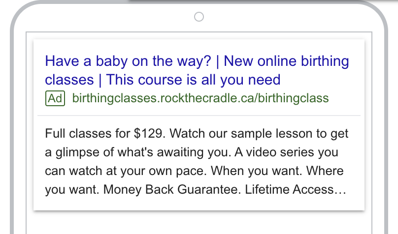
Our first campaign will be a Google Ads campaign targeting New York, Boston, Austin and San Francisco. We chose those cities because they have a positive birth culture (less medical interventions, more doulas, less planned c-sections, etc). If you know other cities where our birthing classes would sell, let me know.

My conversion goal is simple: get expecting moms to buy the class!

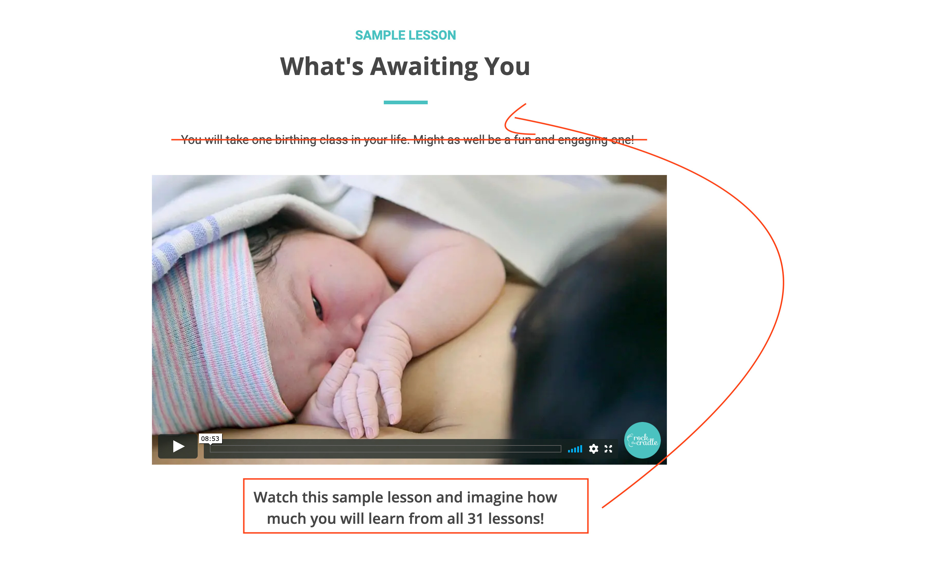
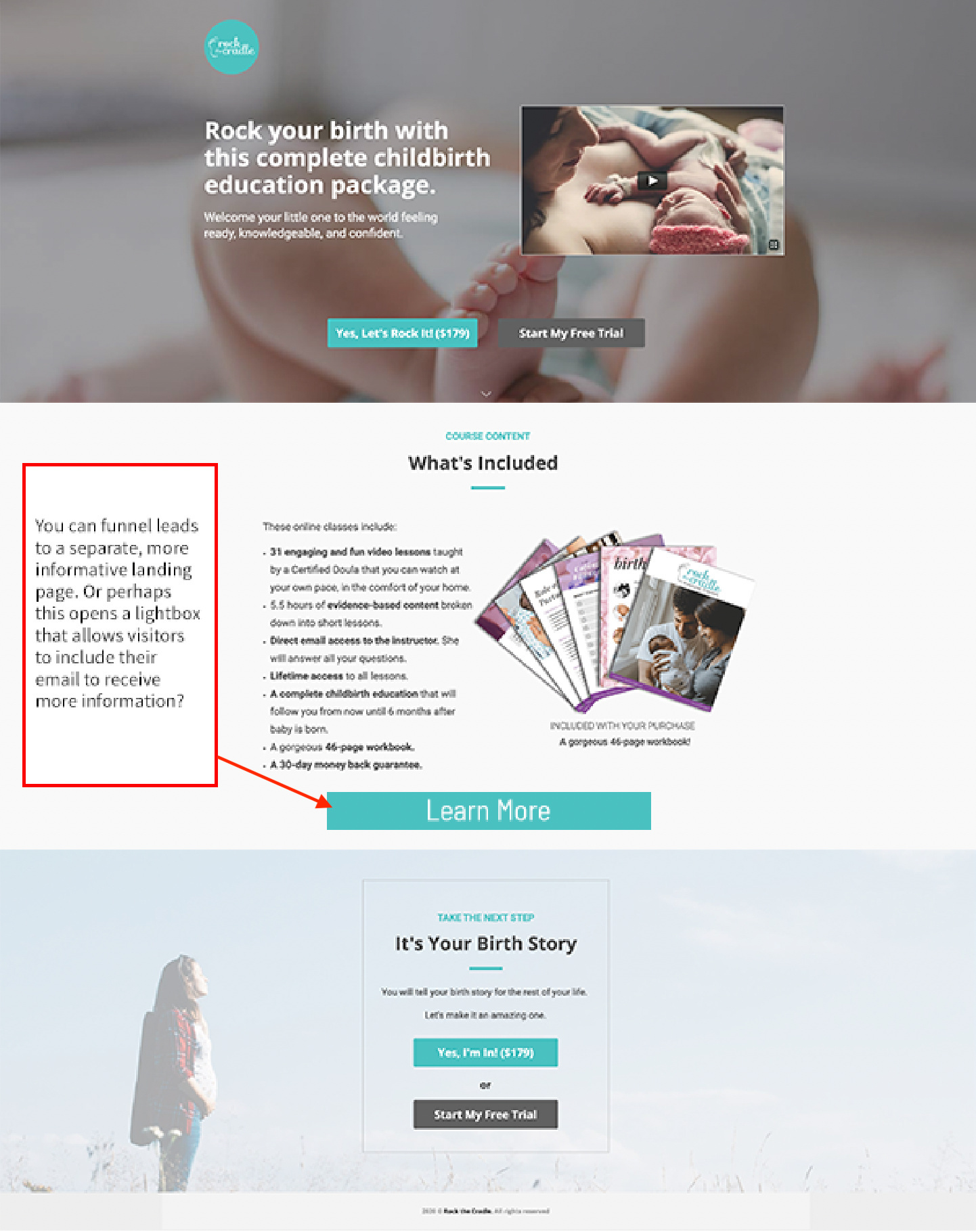
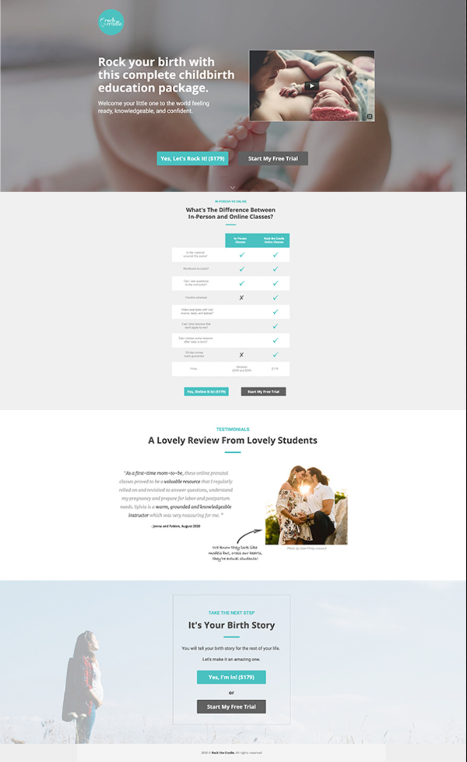
So please let me know what you think about the look and feel, the design, the text, the pictures, the video, the length, etc.

I’m way too close to the tree so thanks for helping me see the forest!


14 replies

Userlevel 7
Badge +1

Hey @jpserra! I’ve put together a quick recording of my review for this page.

First of all…

Congrats on your first landing page ever! 🎉

I’ll summarize some of the points I made:

  • I’d love to see the backgrounds stretched to the full width of the page to let your content breathe a bit.
  • I think there’s so much great content here that you can use a lot of it in multiple variants! If you’re not already using Smart Traffic, I highly recommend creating multiple variants and turning that on for optimal conversion lift.
  • I would play around with the headline, it’s a bit long so maybe something like “A Complete Childbirth Education Package For $129” and then the CTA can just be “buy now” (I’m not a copywriter, I leave that to @SeanKirby)
  • If you have access to more customer reviews, it would be nice to see them in a carousel animating throughout the page, that would look pretty slick. Let me know if you’d like me to link you to some instructions for that.

That’s all I’ve got for now, but I’m happy to chat more if you have questions. Great work!

-Jess

Wow! This was such a generous review. Thanks so much.

Good point about the background stretch. Since I’m working on a laptop, the landing page goes right to the edges of my screen so I didn’t even see beyond . It will be an easy fix and look so much nicer for people with bigger screens.

For smart traffic and a/b testing, it doesn’t come with my basic package. I’ll definitely check it out when I’ll upgrade. I also want to try DTR (which I don’t have access at the moment). I’ve noticed that some people look for “prenatal classes”, “birthing classes”, “childbirth education”, “pregnancy classes”. So it would be nice to adapt my page’s vocabulary. I wonder what’s the most popular term in the States. I’m from Canada and I put “birthing classes” as default but maybe I’m wrong.

Good point for the length of the headline. I’ll wait for Sean’s suggestion. Since a lot of birthing classes are given “live” and require to be there at a specific time, often for 3 to 6 hours at a time, I wanted to differentiate our services by saying it was at their own pace, where they want , when they want.

I say YES for more info on the animated carousel for the testimonials. I’d love to try this.

For the copy, you’re right. Some of it is too long. I’ll cut it down a bit. But for the list of lessons, I think it’s necessary. This is what people are buying. I don’t expect a visitor to read them all. It’s only there to show how rich in content the class is.

As for section order, those are great suggestions. I’ll play around with them.

Thanks again! I’ll make the fixes and repost.

I’m done making the changes.

I took about 90% of your advice. Lol!

For now, I’ll leave my little sentence under the teaser (No words can explain it better than this 90 second teaser.). I will remove it eventually to compare if people click on the video no matter what. I really want people to watch the teaser because it’s my best conversion tool.

I also decided to keep the sign up form at the end. If I don’t have anybody signing ups, I’ll remove it.

Userlevel 7
Badge +1

Yes!!! :clap: Already a massive improvement!!

I love the lesson plan button, it makes the page a lot easier to scroll through.

I’m getting nit-picky at this point, but since you’re giving away FREE content here, I think it could be highlighted a little bit more.

I’ll leave it to the real marketers in here to provide additional feedback, but is already looking really great! Well done!

-Jess

Userlevel 5
Badge

Is that the ad that leads to the landing page? If so, I think you have a bit of a mismatch. When I read “Try for free” I expect some sort of free trial, but the page asks people to purchase.

Free is a compelling offer, though. I would test making that the offer on the page. Have the prospect give their contact info to access the free lesson, and then follow up with promotions to try and sell the full program.

As for the page itself, the layout and images look nice. I do think that the copy could use some refinement, though.

Are the points in your headline the pain points for your target audience? You know the space better than me, but since having a child, especially for the first time, is such a monumental event, I would think the time and effort of a traditional birthing class wouldn’t be too much of a barrier or frustration for most people.

While I like the sentiment of the subhead, I think it’s too generic. Try to put it in more specific, concrete terms that can stir up an emotional response.

In looking at what’s in the teaser, perhaps you could use the fear not knowing what to expect or where to turn for trustworthy information as a hook to draw people in.

I like that you show what’s included, but I think you need to do more to establish the value it provides. Why is all this worth the price you’re charging? Perhaps you could quantify the price of each component on its own and then show how the bundle is a savings. Or you could focus on the value of the benefits the offer brings.

Since you’re calling out features that are unique to the virtual format instead of in-person, why not go a step further and make it a direct comparison. Maybe you could even have a chart or something visual like that.

If you are going to try to close sales right from the page, then I would call more attention to the guarantee to reduce friction. Really spell it out and help people feel like there is no risk in moving forward.

Finally, I would cut the secondary offer at the bottom. I’ve found that more often stops people from choosing the main offer more than in adding additional leads.

Best of luck.

Hi Sean,
Thanks for the feedback.

No it’s not the ad that goes with the landing page. It’s an old copy that is still there when we were using another strategy (a free trial of the first 4 lessons). This is the new ad:

The reason why we changed our strategy is that we found out that the free trial made the sale more complicated. In order to buy the class, the student had to:

  • Sign up to our mailing list.
  • Receive an e-mail with a link to the 4 first lessons and a 25$ off coupon.
  • Click the link and watch the 4 lessons (which took 20 minutes of their time).
  • Decide if they wanted to buy our class or not.

So the whole process was long for a $129 class. Lol!

In the meantime, we had many people landing directly on a website (without going through the landing page), watching the teaser, and buying the class full price. All this within 5 minutes.

We’ve been told that getting people in an e-mail sales funnel was good for:

  • Expensive courses (because potential buyers need to be nurtured and convinced)
  • Selling more than one course (growing an e-mail list to keep students aware of new classes)

Since we only have one product which is very affordable (“live” birthing classes are $200+), we’re trying direct sales.

You ask “Are the points in your headline the pain points for your target audience?” That’s a good question. The answer is definitely no. It’s more of our main differentiator (compared to a live class with a fixed schedule).

The pain points are addressed in our subhead. The two major pain points of a first-time mom-to-be are:

  • Feeling anxious about how their birth will go. Most of what they see on tv and read in the media is that birth can be a traumatic experience (hence “Set yourself up for the most positive birth possible”)
  • Feeling insecure about their own capacity to birth their baby. They feel clueless and don’t know where to start because the amount of information out there is overwhelming (hence “feel confident when bringing baby home”)

I’ll try to find a way to make it less generic.

About the direct comparison of “live class” vs “video series”, it’s a great idea. We didn’t want to do it on our website because we are still selling the “live class” and don’t want to cannibalize our sales by making the “video series” look more appealing. But since the landing page will only be seen by the people we target, we could definitely make that comparison.

As for calling more attention to the guarantee to reduce friction, I already mention it 4 times on the landing page. 3 of those times are right below the big Buy Now button. Not sure how I can draw more attention to it. Following your suggestion, to really spell it out, I added “Risk-free” next to each mention of the guarantee. If someone doesn’t see that we have a 30 day guarantee, they’re blind. Lol!

Finally, for removing the last section, Jess mentioned the same thing. I cut it. So now, there’s only one CTA on the page.

Thanks again!

Just letting everyone know that since we just switched our marketing campaign to Canada, we adjusted the price in Canadian dollars. That’s why it’s $179 instead of $129.

Userlevel 5
Badge

Ah, OK. I have a bit more feedback based on that.

While the guarantee is on there multiple times, it’s low in the visual hierarchy. It looks more like a disclaimer than a selling point. But it’s an important piece to help reduce the biggest friction point.

I would make it larger and bolder, so that it stands out. I would also give it its own section and really spell out more details, emphasizing how there is no risk.

In fact, anytime you’re asking for a sale, you really need work hard to reduce that friction. Even with a money-back guarantee, there’s still plenty of obstacles to completing the sale.

Think about the reasons someone could say no and try to counter that. For instance, why is this worth the price you’re asking? I know you mentioned in one of your comments that it less than the price of most in-person classes, but will readers make that connection? They could just as easily compare it to free videos on YouTube. Or they could think that money is better spent on something else. There’s plenty of expenses when expecting a child.

You’ll probably need to go beyond just the features for that. It’s not really a class that people want. It’s what that class is going to do for them. Help people see how what they learn is going to benefit them. Speak to the end result, not just the product you’re selling.

If you’re going to offer a discount, I’d draw a bit more attention to that as well. Maybe come up with a reason that you’re offering the discount to add a bit of credibility to the offer and the deadline so that people don’t think it’s just a bogus sales tactic.

And if the goal of the offer is to add urgency, then I think you should play up the limited-time aspect more. A countdown timer could be a good option.

One last thought. I understand your rationale behind your change in offers. But I do think that with the proper execution, starting with a lower commitment entry point could be worth exploring more. Here’s why:

• Lower commitment = less friction, which increases conversion rates.
• Once you get people to respond to an offer, they have made an investment, even if it’s just in time and emotion.
• Getting people’s contact info allows you to follow up with them. This allows you to send more targeted offers and messages and gives you more opportunities to close them.

You could even make the lesson itself a bit of a sales tool by including pre- and post-roll marketing for the full class and teasing the next lesson (available after they purchase).

Have you tried A/B testing a free lesson vs. purchasing the course to see if your assumptions are true?

Hi Sean,

Thank you for the detailed feedback.

I’ve changed the headline and the subhead. I think it’s much less generic now and it gives it a nice personality right from the start.

I have added a new section that compares the in-person class to the online class. It clearly shows that a student gets more benefits for a lower price if they go for the online class.

I am working on a section that will focus more on the benefits to the customer than the feature of the product.

I will also find a way to make the guarantee larger and bolder.

Finally, I’ll put the discount sale in its own section. This way, I’ll be able to draw more attention to it and I’ll be able to toggle the visibility off when there’s no sale.

I’ll let you know when this is done.

As for testing the sign up for a free trial, it’s actually what we’ve been doing from May to September. We were inviting people to sign up and in exchange for sending them the first module for free and a $25 coupon. So we have a lot of data to compare with. In a few weeks only, we will be able to figure out which method will be more profitable for us.

Hi Jess and Sean,

So I have done some major changes to the page:

  • I start with a section “Are these classes for you?” to get an immediate connection with the visitor and speak about them instead of the product
  • I added a section where I compare in-person classes to online classes
  • I added a section announcing our sales (when we have one)
  • I added a section about our 30-day money back guarantee
  • I added a picture of the couple who wrote the review (to make it look more authentic)
  • I changed the copy of the first section to give it more personality
  • I changed all the calls to action on the buttons. “Buy Now” was boring. I linked the CTA to the section.

Phew! How does it look now?

Userlevel 7
Badge +1

Hi JP!

Sorry this fell off my radar, I love what you’ve done with this!

In terms of design you’ve nailed it, the brand is solid throughout the page, and I really like the two CTAs of fully committing to $179 and starting a free trial. I also think it’s a good use of content near the top with your objection handling section of “you are in the right place if”.

That said! I do still think that for a landing page this is a tad long, HOWEVER, I know that this is your first page (that still blows my mind) so I’ll let it slide.

Down the road, this is still a PERFECT fit for creating multiple variants that include different content.

I’m so committed to this concept that I’m going to photoshop some options:


Looking at all these pages in this perspective, you can also see that the CTAs start to look a little repetitive. I’m not sure they need to be used as many times as they are. If it’s at the top, somewhere in the middle, and at the bottom, that’s probably all you need.

If you split up the variants in this many ways, you can target specific audiences a lot more effectively rather than hammering a ton of content at everyone and hoping they all convert.

I’m really excited to see how this page evolves, and to see how running tests and multiple variants improves your CR%. I hate to be a broken record, but ya gotta turn smart traffic on! It was made for this!

Let me know if you’d like to book a call one day if you have any questions, I’d love to highlight this story here in the community.

All the best,

-Jess

Thanks for your very pertinent comments. I’ll check out the multiple variants and get back to you. Have a good weekend.

Userlevel 5
Badge

Sorry for the late feedback on the latest round.

Overall, I think it’s much better than where you started.

I would still play around with the wording in the hero area a bit. It’s not bad, but it would be even stronger if you can make the potential customer feel the emotions you mention rather than just telling them how they’ll feel.

I do think having an offer with less commitment is appealing, but I don’t think having two offers on the same landing page works. It just confuses things. Why not have two different versions.

I would also test putting some versions with the content reordered a bit. One of the first things most users want to know is, “What is it you’re trying to sell me?” So I would probably put the What you’ll learn and What’s included sections right after the hero.

I like the Are these classes right for you content, but that’s likely a question people would ask after they know what’s included. In fact, that probably comes after they are interested and are either looking for reasons to not move forward or for reasons to justify taking the next step. I would have that pretty low on the page.

I like the new guarantee section, and I would put it at the end for a strong closing right before the final call-to-action.

Perhaps test a few different variations to see what works best.

Reply