Hi Michael, welcome to the community 🎉
In my experience, if you’re getting visitors to your page and they’re not taking the next step it’s either:
- They don’t understand the offer or
- The offer isn’t compelling
My 5-second test review on this page is that it’s a lot of text, which means it requires more work for me to convert. A good landing page will take all of the guesswork out of what the offer is and what’s expected of them. That means within 5 seconds they should be able to know what they’re getting, and how to get to the next step (get your free training guide, schedule a call, register now, etc.).
After spending some time on the page it looks like if I submit my email I’ll receive free training – that’s a good offer! I think you could benefit from updating your CTA (button) to something like “Get Your Free Training Guide”. The word “free” is very powerful.
I’ll also add that it may help to be more explicit about what kind of training you’re offering. You’d mentioned a video on the next stage of the funnel so it’s a good idea to include that.
I also like to promote the use of a favicon on all landing pages, it’s a small improvement but it adds legitimacy to your offer.
As for the design layout. I’d spread the copy out on the page. This article does a really great job at explaining how to structure the content on your landing page.
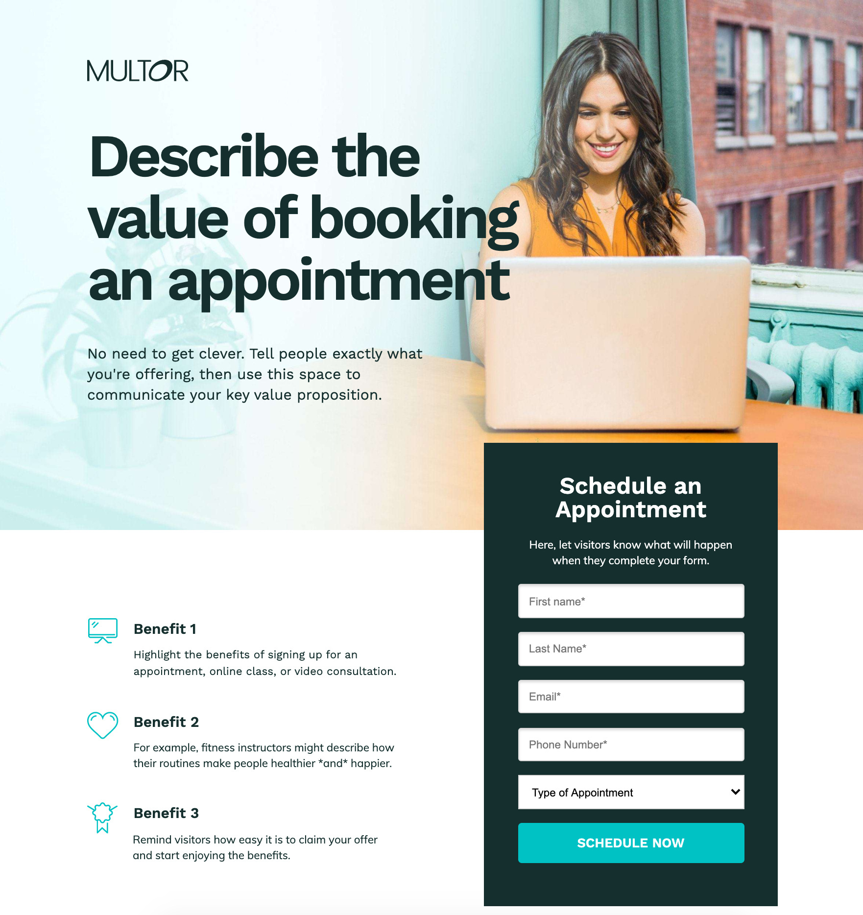
Here’s a layout that could work well for your content, you can click this image and it’ll take you to the full view. It’s an Unbounce template so you can jump right in and add your own content.

To summarize:
- Space out the copy so that your message and benefits are clear. Don’t be afraid to use the full width of the page.
- Update your CTA button so that it’s clear what your visitors are getting next.
- Add a favicon
- Follow the guide (linked above) on customizing your landing page
Hope this helps. Let us know what kind of results you see!
-Jess
Thank you for your fast response!
I did go in and clean it up and shorten the text so they can see immediately that the offer is a Free Training video.
There is one sentence that I left in but I could remove if your think it would be better to do so. The text: “Avoid the biggest problems in retirement planning today using Financial Planning 2.0!”
I left it there because “Financial Planning 2.0” is my proprietary product/service that I offer that nobody else has and I’m an using it as an enticement. But again if you think it would look better, I can remove it.
All the disclosure stuff below that is required to be there per my compliance department and cannot be removed. However, my Google Analytics shows me that 95% of all my traffic to my website is on smart phones and when you arrive on this landing page, you see all the important stuff that I shortened up and you have to scroll down to see the disclosures so it looks very clean upon arriving at the landing page.
Also, I originally had my company name/logo on the very top of the page, I moved it down to the bottom as you can see (Stellar Financial Services) but the article you gave me said that the company name was pretty important. Keep in mind the traffic to this website is coming from Facebook advertising that I am running which has my company logo on the top of that add…
So, should I remove: “Avoid the biggest problems in retirement planning today using Financial Planning 2.0!”
And should I move my company name/logo back to the top of the page?
Sincerely,
Michael Hass
P.S. Your awesome!
Glad to hear you’re already putting some of this into action!
This is a great point – it’s important that your visitors have a seamless experience from the ad to your page, so if your logo is prominent in the ad and prominent in the landing page they’ll know they’re in the right place.
I think it’s also important to leave that in there because it addresses their pain point that you’re trying to solve. That said, TEST TEST TEST! If you make another variant where this line isn’t included you can see how effective it is. I also strongly urge you to turn on Smart Traffic, especially if your traffic is split between desktop/mobile then Smart Traffic will learn from that and send your visitors to the right variant based on their device type, rather than standard A/B testing which will send traffic to your variants at random.
That’s good to know! It definitely felt like I was looking at a mobile landing page on a desktop.
In terms of conversion-centred copywriting, my go-to guy is @SeanKirby, he is a goldmine for how to determine what/what not to include. Hopefully he has a moment to give this a look.
Keep it up, I look forward to hear how this evolves.
-Jess
Thanks for the shout out @Jess.
Welcome to the community Michael.
Jess is right about needing to make the offer easy to understand and compelling. I think you have more room to improve on both.
The wording of the headline is a bit awkward and confusing. I think because of the double-negative with “avoid” and “reduce” and the passiveness of “having to.” And, while I don’t know your audience as well as you, I suspect they don’t think in terms of “reducing their lifestyle.”
Try to use wording they would use and paint a picture in their minds. The better you do that, the stronger the emotional appeal will be.
I think you also need to introduce what it is your offering sooner. You don’t know until you get to the CTA button. So in essence you’re asking for people to enter their email before they know what they’ll get in return.
Speaking of the button, the text reads more like directional copy that would go above the form than what would be on a button. I would make it something that sounds more immediate and exciting such as “start my free training,” “Send my video” or something along those lines.
As for the second point, you probably need to provide a bit more information to entice people. Perhaps give them an idea of the types of things covered in the video. If you can tease the benefits you can build curiosity. For instance you could have something like “This free video training will show you:” and then follow up with a few bullet points that offer benefits without giving away the full story such as “The #1 mistake people make in retirement planning and how to avoid it” or whatever you can come up with based on what’s in the training.
If you have any sort of social proof, I would put that in there, too. Testimonials or success stories are great for building trust.
I hope that helps. Best of luck.

