Hey Bruce!
Thanks for reaching out here 🙂
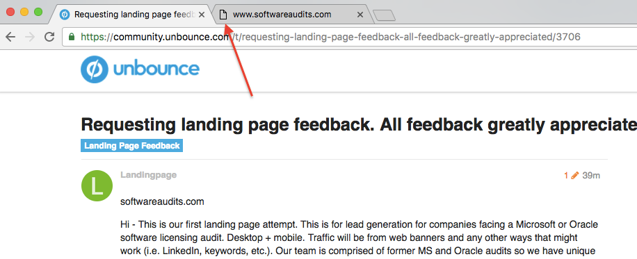
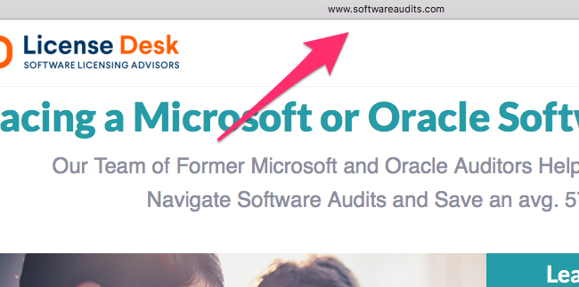
First off, I had to re-type the URL (www.softwareaudits.com) because without the “www.” it didn’t go straight to the page, that’s not really feedback but any time a user has to take an extra step to get to a destination it might decrease the odds of them getting to your page. I’d even make it clickable for the super lazy folks. 😊
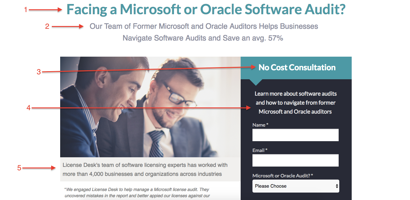
This landing page has a lot of really great information in it, it’s not too text-heavy and it’s very clear who the message is directed to (individuals who are facing a Microsoft or Oracle software audit).
I think this line “License Desk’s team of software licensing experts has worked with more than 4,000 businesses and organizations across industries” could be a bit more prominent, as it gives a lot of credibility to this cause.
Also, I’ve given the same little tidbit of feedback to some folks before, because I’m a stickler about it. I love it when landing pages have favicons.
In my opinion, favicons provide a sense of legitimacy to a landing page. In this case, you could use a the logo for License Desk as a favicon to show that they are affiliated. Personally, I’m more likely to navigate away from a site that may have skipped that step (like I said, I’m a stickler).
We’ve got some handy documentation here that can take you through the steps of implementing a favicon on your landing page.
Hope that gives you a starting point. We’ve got a group of @Unbounce-Experts who can give some feedback as well, I’m curious as to what their thoughts are.
I’ll keep an eye on this as this thread grows 🙂
Cheers,
-Jess
Thanks Jess. You are awesome. we really value your feedback.
I will add the favicon. I will also try and workout with GoDaddy how to make softwareaudits.com work. Any suggestions on how to make, “icense Desk’s team of software licensing experts has worked with more than 4,000 businesses and organizations across industries” more prominent? (should i put in color back of sorts?)
Thanks.
Bruce
No, YOU’RE awesome!
A common trend that I’ve seen on really effective (and beautiful) landing pages is a large banner image at the top (you could potentially use the same image that you have on your landing page if the image quality is high enough.
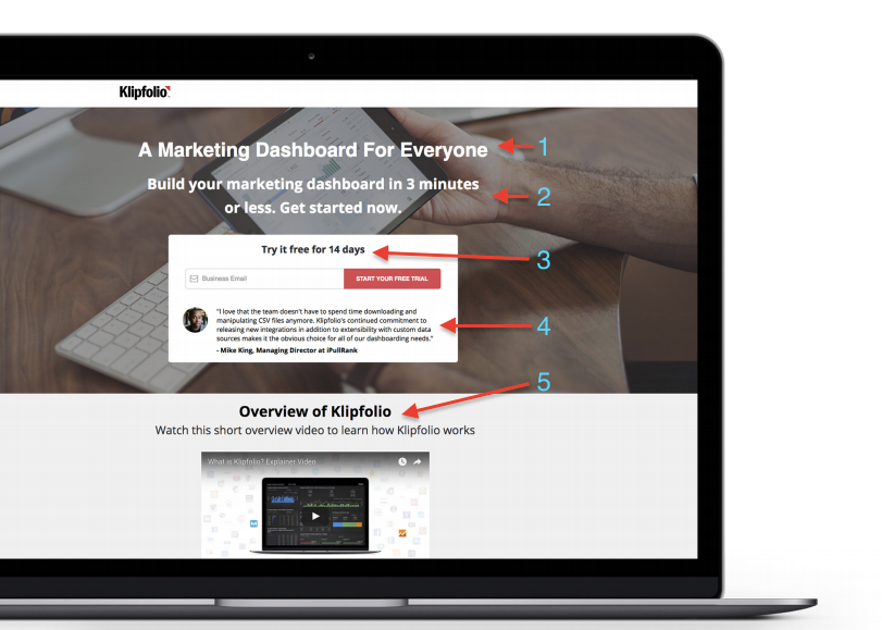
I think there should be a bit of a “hierarchy” for text, and you’ve already got it laid out. Here’s an example of a landing page built in Unbounce by Klipfolio. I’ve annotated the hierarchy of messages that I’m talking about:
They’ve given each chunk of text a ton of breathing room on their page, and it allows the user to take in each bit of information as they scroll through it, rather than have it bunched together competing with each other.
We’ve got a lot more examples that you can browse through of landing pages that we love in our Fall Lookbook. Have a look through that and see if you can gather some inspiration.
Hope that helps!
Hey there @Landingpage! Welcome to the Unbounce Community. 😀
Here’s a couple of quick tips for you. To make your landing page work without the www, just follow these steps (who would’ve thought this was called a naked domain?).
Also, I completely agree with @Jess here about the favicon. It’s actually one of the first things I do when building a landing page. Here’s a quick how-to to get this up and running in minutes:
https://community.unbounce.com/t/tips-scripts-how-to-add-a-favicon-to-your-landing-page/3708
P.S. Awesome start so far! 👊
Hi Bruce. Just 2 super quick feedback points from me:
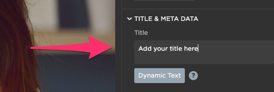
Add a page title to your page, e.g. “Learn more about software audits - License Desk”.
Change the call to action button on the form from “Submit” to say something more meaningful, and also explain what happens when you submit the form. Perhaps “Get a free consult”. Read more about this here from the master @oligardner himself.
Hi Jess, Thanks for the feedback, I’ll follow. The image came with the unbounce landing page template. I tried to make if bigger but it wouldn’t allow. Does unbounce have the same picture but large size? Thanks again. Bruce
Thanks Finge,
Do you suggest adding the page title (i.e. “Learn more about software audits - License Desk” above the “Facing a Microsoft or Oracle software audit” or just replace it? Thanks.Bruce
Thanks for the feedback Jess, Are you suggesting re-formating the landing page to the example page layout? (taking out the two customer references and the 3 bullet points (bottom left)? Thanks. Bruce
When referring to the title I mean “Title” field in the editor.

This specifies what the visitor will see as the page name in the browser window and/or tab, where it on your page says “www.softwareaudits.com”

I think your headline is a bit unclear. On first glance I would like to understand what you are offering and what you want me to do. “What am I getting out of this”. You need to offer something unique and compelling.
Here are some quick examples:
Heading: “Get help to succeed your software audits”
Subhead: “Our experts will help you save time and audit impact”
Heading: “Facing a Microsoft or Oracle Sofware Audit?”
Subhead: “Get help from our experts to succesfully navigate your audits”
Heading: “Save time on your software audits”
Subhead: “Get in touch to see how our experts can help”
As always you should A/B test your different unique selling propositions.
Thanks Finge, Very helpful. Do you know of a service or person that could better setup up page? Our team is not great at copy and good marketing words, etc. Thanks. Bruce
Hi Jess, Do you know of a service or person that could better setup up page? Our team is not great at copy and good marketing words, etc. Thanks. Bruce
Hey @Landingpage would love to help you. I’m always upf or a call to see where we can.
🙂
Hey Bruce! There are lots of folks in here who I think are up for the challenge. Feel free to reach out to @digibomb, @Finge and @Joe_Savitch, they’re pros. ☺

