Hey, everyone!
Need some advice on this LP: http://sales.sitesforsellers.com/test/ This is a service for amazon sellers. The mobile version isn’t ready yet. I’ve decided to hear your ideas and recommendations before editing the mobile version.
Thanks a lot!
Hi Vlada,
Very nice design, and awesome use of the element animations. I like that you lead with an explainer video at the top too.
Here’s some feedback on some of the things you might want to test:
The headline doesn’t really tell me what you’re offering. I’m not a fan of headlines that are positioned as questions. “Where to find inventory to sell on Amazon or eBay?” sounds like you’re asking me for advice, rather than providing me with a solution to that problem. I would try something more focused on how you help your customer. Maybe something like “Get Everything You Need to Succeed as an eBay or Amazon Seller!” You can probably come up with something better. That’s just an off the cuff idea.
I would add a logo to the upper left section of your header to add some credibility to the page.
Also, see if you can add a call-to-action button somewhere above the fold. Maybe on the right side of the header, on the same line as where the logo would go. Right now, I don’t see any call-to-action above the fold, which could hurt conversions.
I would emphasize more about the advertising component of your service. It seems like a very valuable part, and it answers one of the first questions I had which was “where does my site traffic come from?” If you’re providing expert advertising services, it would be great to learn more about that in detail, which can really add value to the offer (and the page).
In the “site examples” section, I think most people are going to want to see a live demo site. Maybe have a demo link which opens in a new window, so they can see the site. I personally wouldn’t buy anything related to a website template without seeing a live demo.
Maybe add some trust logos if possible. Maybe you’re affiliated with some notable organizations, or places such as the BBB or Chamber of Commerce. It would add to the credibility of the page.
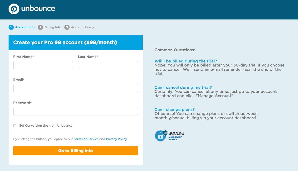
MOST IMPORTANT: I saved the best for last. 🙂 Oftentimes, we spend a lot of time optimizing our landing page, but neglect our actual checkout/cart page. In your case, I’m not sure if you’re going to be keeping the PayPal checkout page you have now or if that’s just temporary, but I think it would certainly be better if you had a standard checkout cart page instead. Right now, your checkout page is pretty bare bones, and I’m not sure I’d hand over $497/month without seeing more about what exactly I’m getting on the checkout page. As an example, I really like the checkout page layout that Unbounce uses. You can see it below:
Well, overall, you have a very visually-appealing page. Hopefully these tips above help with your conversion goals. Let us know if you have any questions and best of luck! 🙂
Solid points @Nicholas - and I couldn’t agree more with the last point. $497/month is a big ask to push through PayPal. Great eye! Most critiques would have ended at the landing page itself. 😉
Thank you very much, @Nicholas.
Great points, super useful 🙂 We’ll take into account all of them!
If you get a chance, please have a look at our other LPs:
http://ub.booksalesfound.com/book-sales-found/
http://ub.scoutbotpro.com/scout-bot-pro/
Your recommendation would help us a lot 😉!
Hey Vlada,
No problem. Let us know how the page comes along.
As for the new pages you linked to, at first glance, I think a lot of the advice I posted above would come in handy for these as well.
Most notably, having a logo somewhere at the top for brand credibility, and also doing something with the checkout pages to make them more robust.
Hi Vlada,
I have to agree with @Nicholas 's simple replacement for the headline.
Other headlines you can try (and you did use them somewhere on the page)
Automate Your Inventory Sourcing
Get an Easier Way to Source and Manage Inventory
Questions just lead to answers, and not necessarily clicks, signups, and registrations, which you need.
I checked the site on a Macbook pro 13 Inch and the button is nowhere to be found on the top of the fold. It makes a lot of difference if the CTA shows up, above the fold. You can reduce the size of the video and bring the CTA along side? Or maybe just push all those elements up to have that button show up.
Logo should go on the upper left as @Nicholas suggested, or at least right in the middle, at the top.
Ash
Just going to add something: That page has no favicon. You might want to add that…
Reply
Log in to the Unbounce Community
No account yet? Create an account
Enter your E-mail address. We'll send you an e-mail with instructions to reset your password.

