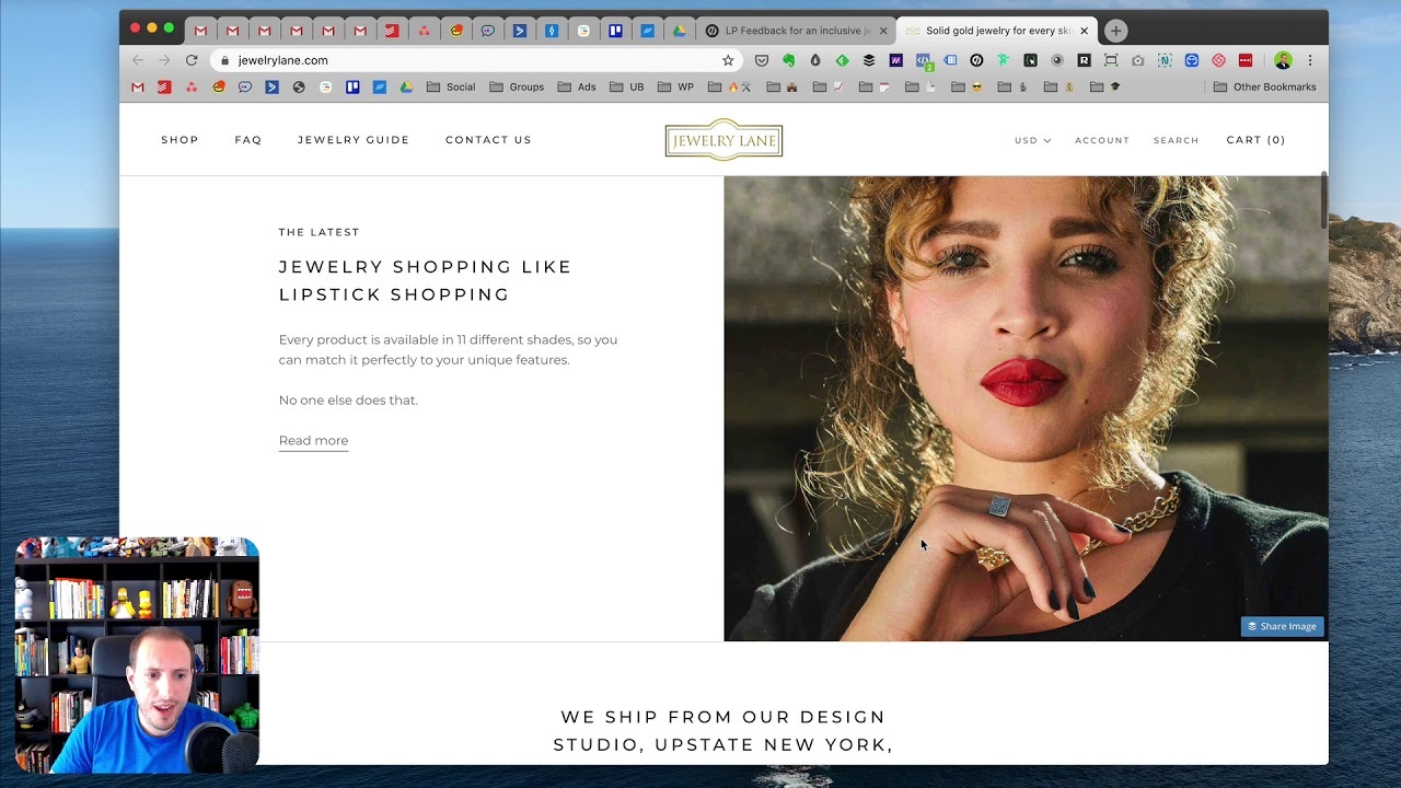
Hey @JewelryLane!
First and foremost - great concept!
So to me, this page looks more like a homepage that it does a landing page. Generally your landing pages have a very specific Call to Action or objective that you want the page visitor to achieve. That could be something like completing a sale, signing up for a newsletter, completing a form, etc.
When I land on this page, I don’t necessarily know what that objective is, but I’ve probably discovered this page whilst on the hunt for some new jewelry! It may just be harder to bring up that conversion rate if the goal isn’t super clear/obvious when they land on the page.
I would maybe try to blowup how your brand stands out from other brands with the inclusive approach you’re taking. Have you thought of adjusting the order of the image slider at the top of the page? Maybe you can make the text that says “For every skin tone” a bit more prominent? I had to scroll down a bit to the image of the other ladies before the lightbulb went off.
I would maybe consider doing some A/B testing (if you’re not using Unbounce to build your pages, Visual Website Optimizer and Optimizely at strong picks) with some different layouts/copy/images. But altogether I appreciate how everything on the page looks very clean and professional.
Hi Melissa, here’s a short video with some feedback for you:
Regards,
You’ve gotten some good feedback already. And I agree that a dedicated landing page would be a good idea. In fact, I think you could do multiple dedicated landing pages around different promotions or audiences. For instance, you could create specific pages for gift giving occasions like anniversaries, holidays, etc. or around a specific product line.
For the page itself, I think you should hit your unique value proposition a bit harder. If the matching to skin tone concept is really what sets you apart and is important to your shoppers, then put it upfront more. And don’t make people click to a different page to get the details.
You could also work the concept into more places on the site. For instance, you could have a way to sort by skin tone.
I would rewrite the copy to be consumer-focused. Right now there is a lot of “we” and not much “you.” People care about themselves. Let them know what’s in it for them.
Best of luck.

