Hey Louisa! Thanks for chiming in here, and welcome! 😊
So far, you’re doing all right things (running Google Adwords etc.) which is awesome, and I love the colours and overall design you’ve chosen - it’s very welcoming.
Often, when people aren’t “biting” on what you’re selling, it’s not about changing how you promote the offer, but moreso about changing the offer itself.
I think there might still be more ways to translate what it is you’re offering. It took me a bit of time to really understand what it is this page is telling me to do.
The CTA at the top of the page says “Get Started”, but it takes you to a form at the bottom that tells you to “Get A Quote”, I think getting a quote is a solid way to entice your viewers. You need to guide your visitors toward a single call to action with a combination of persuasive design and psychological triggers. So far, I think the design is already there, but your viewers might still be a little confused around what Travel Time Platform is.
Additionally, I think if the name Travel Time Platform is great! It helps to explain what the product is, so I’d suggest using that in the copy a bit more.
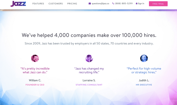
I’d also try giving a bit more personal touches to the Testimonials section. Try turning those boxes of text into quotes with images. I found this sample on Google, which I think is pretty effective:

Lastly, I’d like to see how it looks to use some iconography in your What You’ll Get section. Those are great features to point out, and some icons would draw a bit more focus towards them. Here’s a good resource for some free vector icons to have a look at: http://www.flaticon.com/
I hope this gives you something to work with. I’d love to see what our @Unbounce-Experts have to say about it. I’m sure they’ll chime in soon. ☺
Hey Louisa - awesome looking page!
I’d love to know more about the architecture of your AdWords search & display campaigns. The type of traffic is also a culprit of low conversions.
To start, what kind of keywords are you using?
Feel free to DM me if you’d like to chat in private 🙂
Hey @Louisa_Bainbridge
Welcome! I’ll try not to repeat anything @Jess has already mentioned.
For me I found it a bit difficult at first to understand exactly what “story” was being told here, it was a bit unclear. The more I read through your page the more I began to understand. I would’ve liked to see more visual cues. Any kind of image or drawing that illustrates the product or how the product or where the product is being used.
I clicked over on to your main site and couldn’t help but notice a very different brand style than the landing page. I would love to see the same colours, icons and imagery used on the LP. There was also some really great copy too.
Most importantly I think your LP needs some form of trust building. Testimonials, company logos of current customers, etc.
Then we have the PPC side. It’s all about the numbers. @Stefano is definitely the guys for that to help you decipher how traffic could be more qualified which in turn will increase version along with some design optimization.
Hope that helps. Let me know if you wanna chat some more. 🙂
Thank you all for your help - I’m going to add these to my site and check it out. Excited to see the differences and really appreciate the feedback. It’s not the simplest of offers so I really think the addition of more visuals is a great tip.
Thanks again!
🙂
My pleasure, Louisa! Can’t wait to see how this turns out, let us know if you see some success! Chime in any time if you have questions 😊

