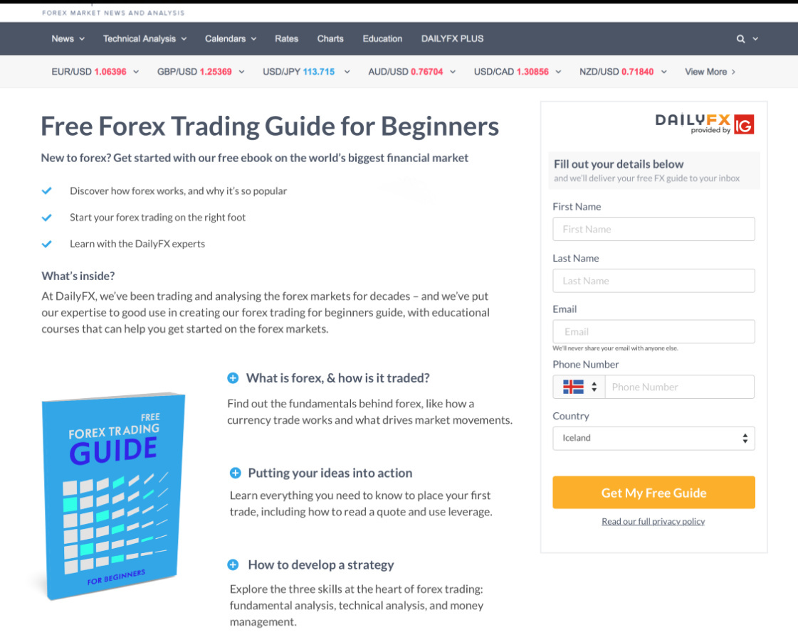
Hi all! I have an extremely visually boring landing page that definitely needs improvements. It’s a lead-gen form for an e-book that desperately needs help. Any feedback/suggestions for improvement would be greatly appreciated. Thx!
Hi Nancy,
I think you have a nice start here, and with a few modifications, you’ll have a great page in no time. Here are a few suggestions:
Put a logo at the top left. This will help build trust and credibility with your brand. Right now, when I look at the page, I don’t immediately know what brand or company is associated with it.
I’d remove all of the links and ticker info in the header. If it’s not leading people to download the guide, then it’s just a distraction. The above-the-fold section especially should be very clean and focused.
Try encapsulating the form to make it stand out from the rest of the page. You can simply give the form box a color background and make it pop out. This will help people focus on the offer. Also, change the header of the form to something more value-based. Right now, “fill out your details below” doesn’t tell me what I’m getting or why should I fill it out. You want to restate your main value proposition in the form header.
This is a tough one, but I’d cut the amount of text above the fold in half. There’s a lot going on right now, so if you cut it down, people can focus on the headline and the main offer. If you need to include the text, maybe just add it lower on the page.
Add some trust logos for credibility. This is very important in the finance space for sure.
Add a few testimonials if you can. I know there are restrictions with this in the financial industry, so maybe you cannot add any though.
Add a few photos to spruce up the page. Maybe images of people who fit the target demo. Something to add a little personality to the page.
Well, that’s all for now. Best of luck with your page and thank you for sharing it with us!
Awesome suggestions!
Would you mind sharing some data you have right now @nancy.robles?
Consider adding a lovely convertable to capture any missed opportunities 😉
Hey @nancy.robles,
Adding to some of those awesome suggestions from @Nicholas,
- Move the image up, well into the hero section. Keep the headline above all, and corresponding copy below it, maybe next to the image.
- Consider reducing the number of form fields after you encapsulate the form. Don’t ask for any data you don’t need. For people to download the free guide, you might not have to ask for the last name, phone number(unless you plan to call them) and the country?
- The currency ticker on the top is a distraction. If all I wanted was to keep tab on currency rates, I’d have other sources for my use. Use this page to just one thing: get sign ups for your free guide.
- As @Nicholas suggested, there shouldn’t be a navigation on top at all. No more links for me to click except signup on the form (or not).
Hope that helps.
Ash
Appreciate all the suggestions/feedback guys! Yes, will definitely try a convertible for exiting traffic. Stay tuned for revised version!
Reply
Log in to the Unbounce Community
No account yet? Create an account
Enter your E-mail address. We'll send you an e-mail with instructions to reset your password.

