Hey! Welcome to the Community, and congrats on your first landing page! There’s some really great content in here.
My first thought on feedback would be that your background image could expand across the entire background (if the image resolution is high enough). All of your content can still align all in the middle if you’d like, but it all feels a bit squished to me right now.
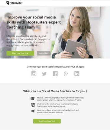
Also, since the image you’re using has a blur on one side, you could apply an overlay and move your headline on top of it. Here’s an example of this design tactic being used very well:

We’ve also got a Lookbook that has a writeup on that Hootsuite campaign above ☝️ . Feel free to browse through for some inspiration in the meantime: https://unbounce.com/photos/2016_Spring_Lookbook.pdf
I think your language and presentation in this page is really great, it’s convincing without being pushy. I’d love to hear what some of our @Unbounce-Experts have to say about this on the marketing side.
Cheers 🍻
Thank you for the tips, Jess! I’ll certainly take a look at the link you provided too. 🙂
Hey there,
Welcome to the community and congrats on your first page! Not bad at all. 🙂 My first landing page was a mess. lol
Anyway, here’s some constructive feedback for you:
I agree with @jess that the overall hero image could be better positioned if it spanned the full width of the page and had the text on top. Also, you might want to try to find an image where the person isn’t looking directly at the camera. People are naturally drawn to faces, especially when they’re staring right at them, so this might be distracting visitors from actually reading the text. If you can find an image of a person looking in the direction of your form or your headline, that would be good to test.
I would move your logo to the left side of the header, and then utilize the upper right corner for another call-to-action button (that simply jumps them down to the form section) or your phone number if you want to attract phone leads.
Maybe bump up your sub-headline text. I really like the headline you have, and it works well with the sub-headline, but I almost didn’t see the sub-headline because of the small text). You really want them to see the headline and sub-headline and read it as a one-two punch.
There’s a lot of text on the left side of your page. The stuff that is highlighted in yellow is all I read at first glance. That’s probably what most people are going to do, since it really stands out. So you might want to cut down the non-highlighted text, and just emphasize the main points that are highlighted. Usually, less is more.
I like that you have encapsulated your form in a box. This is a good technique. However, your form should be able to give a visitor the gist of the page on it’s own. In other words, if all I see is the form, I should know exactly what I’m getting. In this case, it’s a little vague. Maybe revise the form sub-headline to show that this is about getting a powerful resume built.
The “Your Message” field could probably be more descriptive. I honestly don’t know what I’d put there if I was actually filling out this form. That could be creating some friction. Maybe revise it to say “Tell us about your job search (optional)” or take the question out completely. I’m not sure, but I would give a little more direction for this field if you do decide to keep it in.
I like how you’ve used orange for your main call-to-action button. Great use of contrast! But maybe reword the button text so that it’s more descriptive (again, going back to the idea of making your form stand on it’s own). I often try to make my buttons complete the phrase “I want to…” So in this case, I’d use something like “Schedule a Free Consultation” for the button text. You can probably come up with something better than that though. 🙂
Nice use of a testimonial. It would be great to see more than 1 testimonial. Maybe add 1 or 2 more that showcase people in different career stages. If you have more than 1 customer avatar, then it’s usually a good idea to showcase 1 testimonial from each of them. The goal is to make sure that every visitor can relate to at least one of the stories in at least one of the testimonials.
Lastly, I’d include some trust logos/badges on the page. If you’ve worked with clients who have landed jobs at well-known companies, and you have permission, it would look great to see those company logos on the page. Or if you’re affiliated with certain organizations, you can include those logos. Trust logos really add to the credibility of a page.
Well, I’ve written a novel. Sorry about that! Overall, I think you’re off to a great start, and if you have any questions at all, don’t hesitate to ask.
Happy Unbouncing! 😀
Hello Nicholas,
Thank you so very much for the detailed feedback, it is greatly appreciated! I have quite a bit to go on now and I’ll start making the adjustments that you suggested. Enjoy the rest of your week!
Joel
@Nicholas You just blew my mind. So many good points! I was going to chime in as well, but you took the cake. I didn’t even catch points 6 and 7 myself. Seriously solid stuff. 👌

