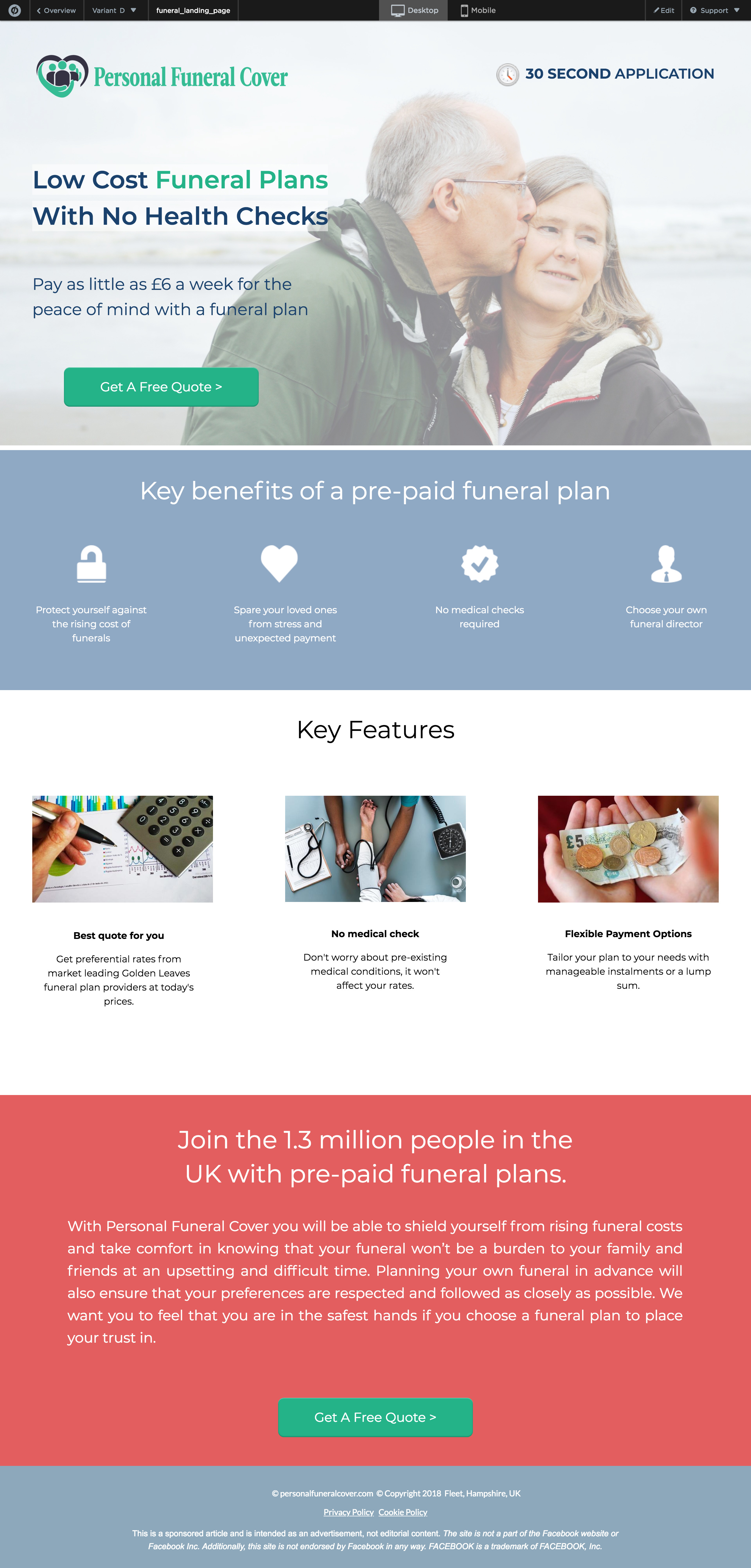
I would start by stretching the sections to be the width of the page. Right now, it has a bit of an awkward size where everything is centred and both sides of are white. It just looks like an old website that isn’t responsive.
I don’t feel like the hero image best represents what you offer. I just don’t understand what the image is supposed to portray.
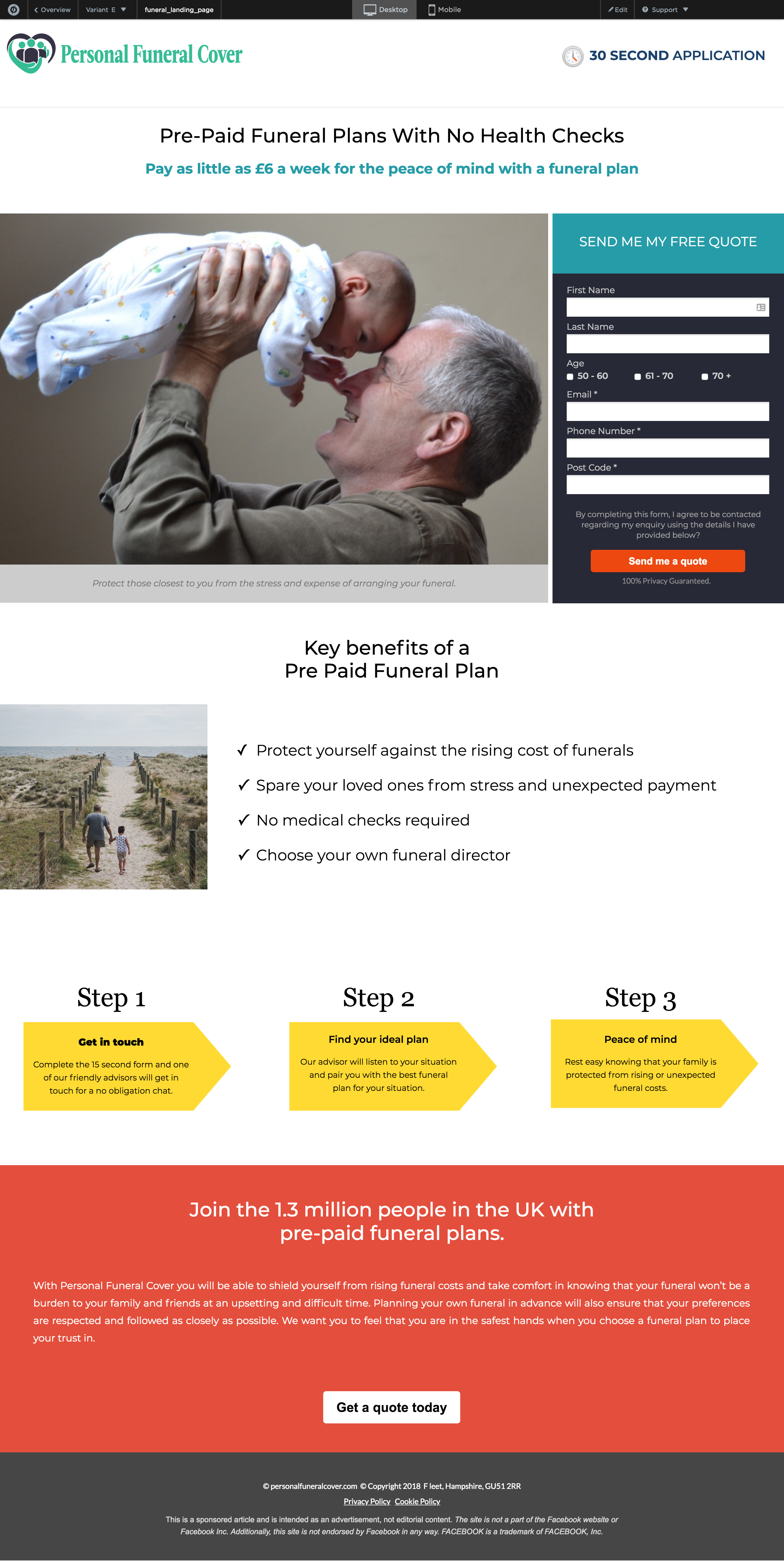
The form is fine, I do fine the age range a little awkward. 0-44? are parents doing this for their children? If you are 16 can you do this for yourself? If you are underage do you need a parents consent?
The “get a quote” button at the bottom of the page doesn’t have any script or anything on it - when you click it, it doesn’t scroll you up to the form or open a lightbox. It just appears to be a button that doesn’t do anything.
I would space out the sections just a little bit more. Maybe even try some false bottom/angled section. Right now, I just feel like there is a lot of information very closely stacked together.
Favicon, to build trust before your page even loads.
You’re on the right track!!
I would recommend that you become familiar with similar conversion rates within your industry, if possible. A 100% conversion rate seems high. 😀 You might look at the Unbounce conversion benchmark report from last year to see if there is a similar industry listed. https://www.conversionbenchmarkreport.com/
For the landing page itself - I really like the design that you chose, but I did notice that the “Get a quote today” button at the bottom of the page did not respond to my click. I wonder if this was added by mistake. I also wonder if it distracts from your ultimate goal of collecting name/e-mail/phone etc. but you definitely have a lot of useful information on the page.
One concern might be how much information you’re asking for up front - maybe ask yourself and your team if less than that is acceptable and perhaps create an alternative variant. You may find that people are more likely to fill out your form if less PII is required.
If you wanted to clean up your LP you could also ask for some of this information in a lightbox.
And with anything, don’t forget to log your button clicks in google analytics! You can create labels for your pom-button clicks which makes it easy to see where you might have dropoffs.
Quick summary
- Know your industry benchmarks
- Log everything and analyze dropoffs
Looks good! Keep up the good work
Hi.
We’ve been working on our pages. We’ve tried a variety of layouts and images, we’ve used the same branding on both pages vs different branding, changed the images to be consistent with the FB ads we are running, … but just aren’t getting the conversions or leads. We are well and truly stumped.
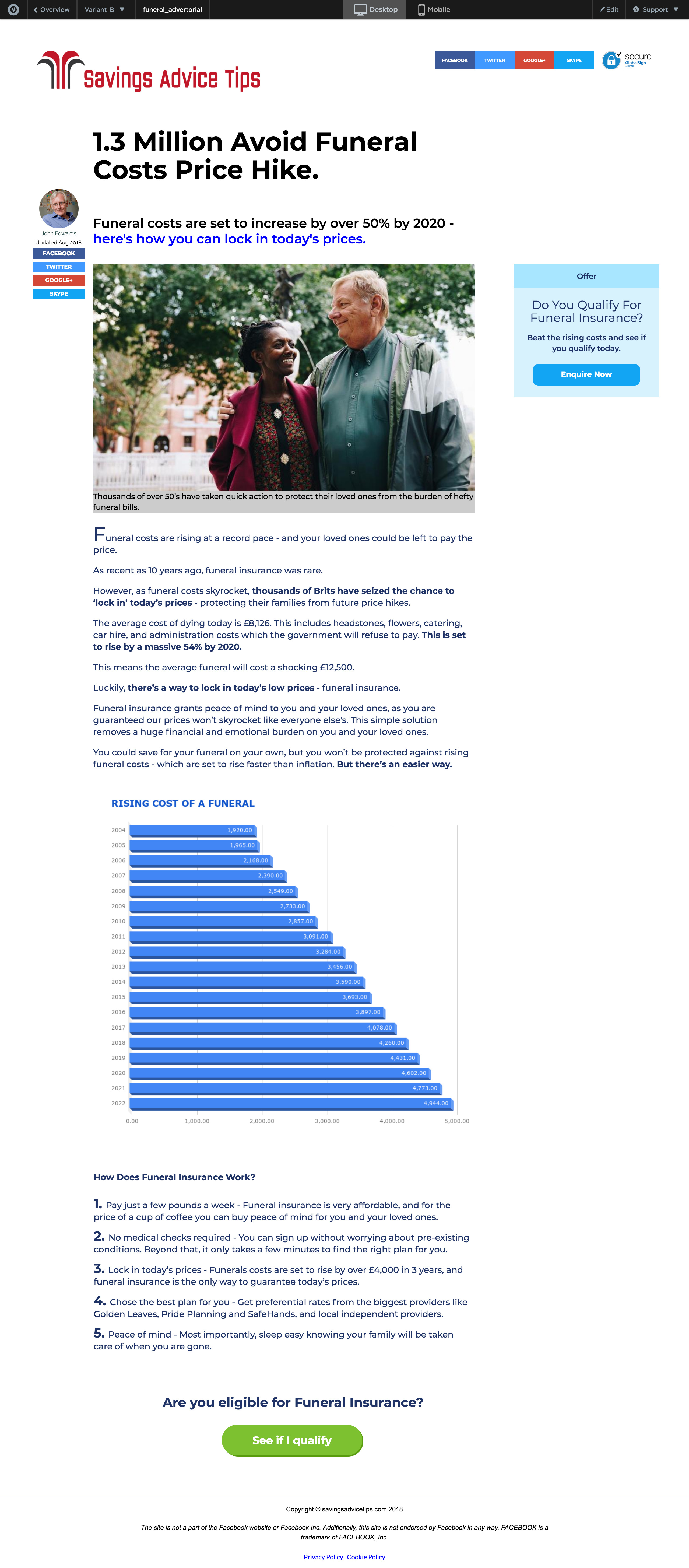
At the moment we’ve gone back to the original layouts. Would you mind taking a look? I’ve attached screen shots of the advertorial pages and the form pages (the form page with no form is because it in a pop up window).
Feel free to follow the journey/ pages and fill out the form to see it all in action. We aren’t getting any leads so it won’t screw up our stats 😦
http://personalfuneralcover.com/pfp-lp/
Thanks in advance.
Tanya
screencapture-app-unbounce-2747721-pages-0edf09bd-805e-4c0d-b424-07afabfacb07-preview-2018-10-05-18_30_46.pdf (6.9 MB)
,


