Your hierarchy is broken, dont start with “Risk free 30 days trial”. I want to know what your UPS is first, what is the number 1 feature with your product?
If you want them to fill out a questionare, why dont create the questionare online, and then leave their info instead?
Then let them leave their phone number, and a dropdown for when you can call them.
Dont get me wrong, but maybe phone calls are difficult for the hard-of-hearing?
I feel like your colour palette could be a bit braver and I completely agree with @Daniel_Sandvik … I think lead with your value proposition and USP, trust signals need to be closer to the call out.
There is a lot going on with this page.
I’d suggest sitting down and figuring out what the number one aspect of your offer is and what exactly it is you want a visitor to your landing page to do.
On first opening the page as a prospective customer, above the fold, I see;
Call Now! (and a telephone number)
Risk free 30 day trial (What I would class as a secondary selling point)
Save Over $2000! (What I would class as your primary selling point)
Call for an evaluation
Telephone number again…
Title for the simple process I need to follow…
the simple process begins ‘fill out a simple questionnaire’
chat box pops up
As you can see, this is pretty intense and confusing for somebody wanting quick info and a good deal (most landing page visitors).
My suggestion would be to try and eliminate at least half of this stuff. As I said at the start, think about what your primary offer is and what you want the visitor to do, and then only have elements on the page that move towards those goals.
I began writing a lot of the same advice @Ma77ward gave above. There is a lot, and nothing in particular stands out. Like, @Daniel_Sandvik said, the hierarchy is broken. This should be the main focus area to improve conversions. Try something like “Save $2000 on Your Hearing Aid Package” - I’m not too familiar with this industry so forgive me if “package” isn’t the right word!
There are a few other items I noticed that could help improve the page:
Color scheme - the white on the light blue is difficult to read.
Font - This font, when the light weight version is used, can be difficult for people to use, especially in a paragraph. I also noticed that there are parts that use a different font (“Our Clinic” pricing section")
Pricing section - I would test this section and remove it on one variant. Pricing can intimidate the customers before they even make the first point of contact. Perhaps make this a benefits section.
Add a little space between the brands’ logos and make them a bit smaller - they appear jumbled together.
Move those awesome testimonials closer to the top! Also make those names just a bit smaller so they are not the same size as the quote (visual improvement).
I like again adding the logo to the footer of the page, the the left corner.
On mobile, the first paragraph under the doctor’s image, is not fitted correctly to the page.
On mobile, instead of writing out a phone number, place a “Call Now” button with a link to the number.
Add in a favicon!
Another idea to try would be a hearing quiz form that might get some more engagement.
Ii’d be happy to assist you further. Feel free to reach out if you have any questions!
Thanks, colors are not my wheelhouse and any suggestions would be appreciated.
Thanks again for your time!
Gary
Thanks, I have the questionnaire coded in WP, I am trying to figure out how to bring it into unbounce.
Gary
Your desktop page is a little too busy and come across a little overwhelming ,too wordy and to many icons/logos. Some of your text is also off center. You can accomplish more above the fold with a good slider with some good graphics and a few different calls to action. Your process icons are too large and a little blurry, also they could be numbered. Your footer could be cleaned up and made smaller with smaller logos. Also you don’t need another logo for your company on the bottom left. I do like your mobile page better than your desktop. If your clients are older you may want to use some higher contrast colors. Your risk free 30 day trial is also a good call to action. Your testimonials need to be cleaned up a little better on the mobile version. If you are pushing local traffic you might want to include a Google Maps embed code.
Also we are a local South Florida Certified Google Partner if you ever need another set of eyeballs to look at your Google Ads setup. Good luck!
I’m also in the hearing aid business. I’m in the UK which is a country where my potential customers can skip the private sector entirely and get them for free! This means you have to work very, very hard to get people interested in you.
I won’t go into fonts & colours & stuff. I’ll offer more (my personal) general advice which I hope can get you the leads you require:
Learn about dynamic text replacement. there’s lots of documentation on it on this site. This is the key to getting 10/10 quality scores across the board.
Structure your adwords account very, very carefully so it doesn’t go wrong!
Personally, I have 6 ad groups, 5 of which have dynamic text replacement.
The ad groups are based on different types of hearing aid searches (e.g. invisible hearing aids, hearing aid prices, hearing aid brands etc).
The keywords you use have to be exact match if your using dynamic text.
The last one I’ve called general which hoovers up all the other keywords and has no dynamic text replacement on it. You can still have 10/10 scores on KW’s in this ad group if you match the ads, keywords & landing page right.
In fact, this is where you will get most of your leads but the others are so targeted you know what they will be interested in.
Don’t forget to use the dynamic text replacement on the meta page title as well as on the page. That’s important for the 10/10 quality scores which you will have oodles of after you do this properly. Your CPC will also go through the floor.
Less is more: Honestly. The more text I put on a page the less leads I get. Yours is loaded with text.
On my adword landing pages I pretty much have two things - my 10 word headline & my 10 field form. I know this sounds crazy but it’s not.
Believe it or not I have a 10-13% conversion rate on almost all of my pages. How?
Using this:
This.script.is.incredible.
I’ve basically set up the first few question to get people clicking (have you had a hearing check before? do you currently own hearing aids? checkboxes for the features they are looking for in hearing aids etc) and then ask for their personal details afterwards.
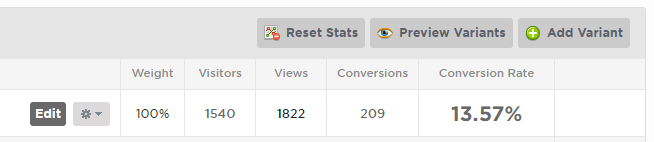
For example, I’ve been running this variant for a while:
That’s a 13.5% conversion rate on a 10 step form that includes asking for their phone number!
You won’t have to muck about with creating questionaires and embedding it either…this is all native to Unbounce & is quite easy to create.
OK…this post is now very long! Sorry about that.
A couple of other tips:
Your absolute best USP is your 30 day free trial. Make your page only about this (or at least everything above the fold about this). The information about the Dr. can just go to the footer.
Without delay get rid of the $2000 dollars off headline. Replace it with the 30 day free trial. Think about this - people have absolutely no idea about hearing aids, they have no idea how they work and more importantly will be floored when they find out how expensive they are. If I was looking for something and the offer was $2000 OFF whatever the total price is I am bouncing. See ya later. I’ll stick with mishearing things for a while longer thanks!
Make the focus more on hearing aids. You have no images of hearing aids on the page. If you want to sell hearing aids, make the page about hearing aids.
I’ve tried paying for ads & making landing pages about booking in hearing tests/consultations and it’s just never worked.
Make the page all about finding the latest hearing aids at the lowest costs & I think you will have a much better success rate both in terms of generating leads and revenue which is what it’s all about.
I hope that helps! Maybe this applies more to the UK market because I don’t quite know how the US industry operates but I really do think the multi-step form will start working for you.
Feel free to message me & I’ll send you a link to some example landing pages if you like!
Wow thanks, I have 22 adgroups with very focused terms. I have not used dynamic text yet.