Hello,


I would love to get some feedback on our first landing page, really appreciate any thoughts.


1: What challenge are you currently trying to solve?

Validating if providing a landing page from a social media ad leads to better conversion. The social media ad is a video, and we have used the same/copy as our landing page image


2: How are you driving traffic to your page?


Social media ads


3: What is your conversion goal?


Clicks to purchase a sample


4: Provide a link to your published landing page / convertable:

https://snackbomb.snackconscious.com/samplebox_a/

Hi @faraz! The page doesn’t seem to be working for me.


Hey @Jonathan


Oops just updated it https://snackbomb.snackconscious.com/samplebox_a/
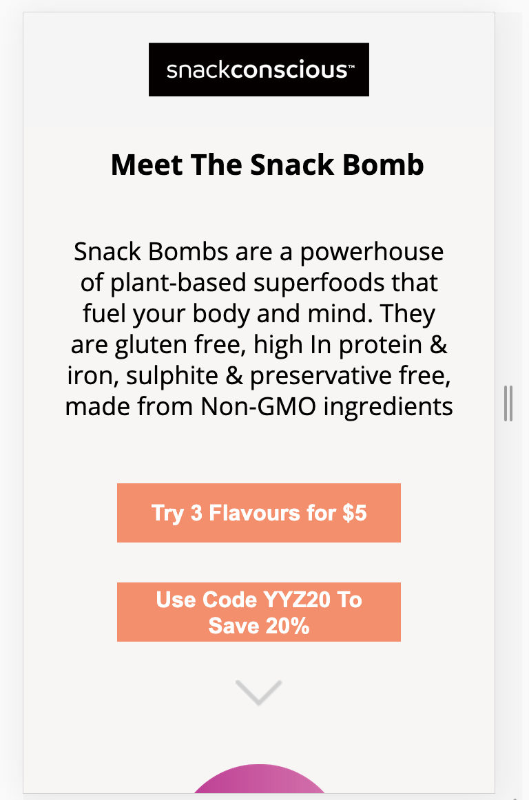

Thanks! I’m happy to see an ecomm Unbounce page! You’re definitely on the right track. Here are a few things I would recommend.


  • Try to avoid redirecting visitors to your store too early on (i.e. in the hero). Give yourself a chance to “sell” them a little more on the product first. After all, this is what the landing page is there for;


  • I’m seeing lots of convincing info in your store’s product pages, but I don’t see that info in your landing page (i.e. omega rich, gluten free, 5 grams of protein). Ingredients would also be a great piece of content to add. Your landing page is where the sales pitch takes place. Take advantage of that opportunity;


  • You have some beautiful photography in your main store. Try to utilize some of this in your landing page;


  • When directing traffic to a product page, try to direct the traffic to the checkout page of that specific product. There’s a catch though, the landing page needs to have enough convincing info about the product first. I see your store was built using Craft Commerce. If they allow for an embeddable shop button, that’s even better;


  • This next comment depends on where the traffic is coming from and what your ads look like. If applicable, try to push 1 offer, such as the 3 flavours for $5, instead of giving the user too many options;


  • Here’s an example of a relatable landing page. This page was built 100% in Unbounce: https://get.perfectketo.com/perfectketobars/


Hope this helps!

Jon


Wow Thank you so much @Jonathan this was very invaluable. Our team would like to keep the buy button up front since they are coming from the ad that also has copy.


That is correct, we are using Craft Commerce; it would totally be ideal if they can simply buy directly from the page. Will have to speak to the dev team. Is there any documentation on how to integrate ecommerce on the landing page or if anyone else has done this before


Any thoughts on the new page? 🙂 https://snackbomb.snackconscious.com/samplebox_a/


Much better! I would consider AB testing having a product image in the hero, depending on how much traffic you are driving to that page. I can definitely give you some pointers on integrating ecomm on an Unbounce page. I haven’t done it for Craft Commerce in particular, but we’ve done it for Woocommerce and Shopify.


Hey @Jonathan,


Thanks for the suggestion on the A/B testing, will create that.


Are there any guild available on ecomm. integration that I follow? What does the integration for Shopify and Woo look like?


Absolutely. Check out this guide for Shopify. It might be a tiny bit out dated so I’m glad to answer your questions. "How To] Add A Shopify Checkout to Your Unbounce Landing Page


For Woocommerce, you would simply create a unique checkout link for the product in Woocommerce, and link to it from your Unbounce page.


I could use a snack bomb right about now 😉


Page looks great and the design fits perfect with the checkout page. But the hero image doesn’t display on mobile! Is that on purpose?


I feel like there is a missed opportunity that is certainly affecting conversions. I suggest making a mobile version of the hero/header image to capture attention.


Reply