Hi @Jim_Hill,
- The headline can be removed from the banner on top. It’s taking up space while not communicating any of value to your end user. I am guessing that your visitors already clicked through from somewhere (links on blogs, ads, etc) and they came looking for OCR software. So, why mention it again like "ABBYY Optical Character Recognition Software" on such valuable space? – you’d be better off not saying anything at all.
Following Dan Kennedy’s copywriting trick called PAS:
Problem – Present the problem your prospect feels
Agitation – Poke at that problem until it’s visceral
Solution – Present your solution to the agitated problem
Would you be better off if you tested two sets of headlines and sub-headings as follows iForgive me if I misrepresent your products 🙂 ]
Struggling With Documents You Can’t Find Storage For?
You know office space is expensive so extra storage cabinets and rooms are ruled out. Having more documents just for the sake of having them around makes you & your team unproductive. You’ll lose time, waste money, and let’s not even get anywhere near the loss of productivity. You’d need a better way to manage your documents. Even better, how about turning it all into digital images & text?
Convert documents to editable text. Automatically index them based upon values in them. Process invoices with 2-way match.
CTA copy: SHOW ME HOW IT WORKS
or
CTA Copy: DEMO IT TO ME
If you did remove the redundant headline on top, it’d make space for the phone number and the other information on the top right corner. Gives you an opportunity to place that info in line with your logo.
I’d suggest you keep the CTA and let go of everything else on the page (Just kidding). But the page does look busy. Maybe you don’t need all that information on a landing page? If the product is such that customers do require information, you can use it to your benefit by having them sign up to get it by email.
The testimonial like blurb that sits on the image could find another place on the page. You might leave the image alone or maybe have that image as a background – and this will change the way your hero section looks.
You have an extra link for “bulk orders”. I suggest you use another landing page for it and not put the link here. The more links you have, the more chances of people clicking away from your page.
The form that pops up after clicking on the CTA: Do you really need all those form fields just for arranging a demo or sending some information about your products out? You could just do with Name, email, and phone? You decide. The point is that more form fields you have, the lesser conversions you get (You need to test this though because if I was hungry and Dominos asked for 15 form fields, I’d still fill it up 🙂 )
Green background color on the last section looks jarring (but I am no one to talk on anything “jarring” since my websites and landing pages give “shocking and jarring” an inferiority complex). It’s your call. But I was thinking maybe you’d continue with your color theme and just use white as a background (which also allows for that little logo to blend in nicely).
Otherwise, awesome page. Happy conversions 🙂
Ash
Fantastic, we are working on these things. Thanks so much. Jim
Awesome, @Jim_Hill. Let me know how it comes out.
Ash
I agree with all of the points from Ashwin. Great job!
Jim, the only other point I would add is to maybe test some video content on the page, either a product overview, brief product demo, or a customer testimonial (or a mix). Just from personal experience, I’ve seen videos help tremendously any time you’re dealing with a highly-technical product such as this one. Just keep it short, so ideally under 3 minutes.
And it looks like you’re making some changes to the page right away, or at least running some tests, because it looks better already!
Let us know how it goes. Good luck.
Thanks so much, we are working on this. Sure appreciate the feedback. All of our pages need lots of work!
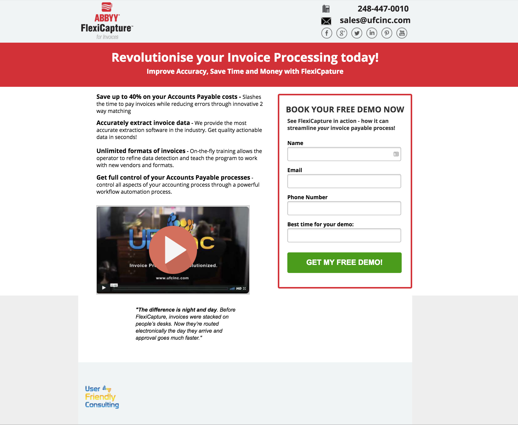
Nicholas, what do you think about this layout? We have the scheduling widget in place but left the old CTA for those who don’t want to schedule an immediate demo (or just want pricing info). We have not yet determined an easy way to add the Google Adwords conversion when they book a meeting with us. Calendly has not yet published a method yet from what I found on their web page. If you have ideas that would be helpful.
http://www.abbyy-flexicapture.com/for-invoices/
Hey Jim,
Yeah, I’m not aware of an easy way to track conversions on Calendly. I have also heard this is something they are working on.
As for that page, I see you have a “watch video” button. The video is great by the way. I’d try highlighting it at the top of the page, and not hiding it behind a button. It is exactly what I was hoping you’d have, because it does a good job of explaining the product.
I would then move the CTAs below the video. The CTAs are not going to make sense to someone landing on the page for the first time, if that’s the first thing they see. It would just confuse them I think.
Also, you might be losing conversions by having 2 different CTAs side-by-side. You could try embedding or linking to a logic-based survey built with something like Typeform (which works nicely with Unbounce). That way you can personalize the form fields based on their responses.
Thanks for your feedback Nicholas!
Hey Jim,
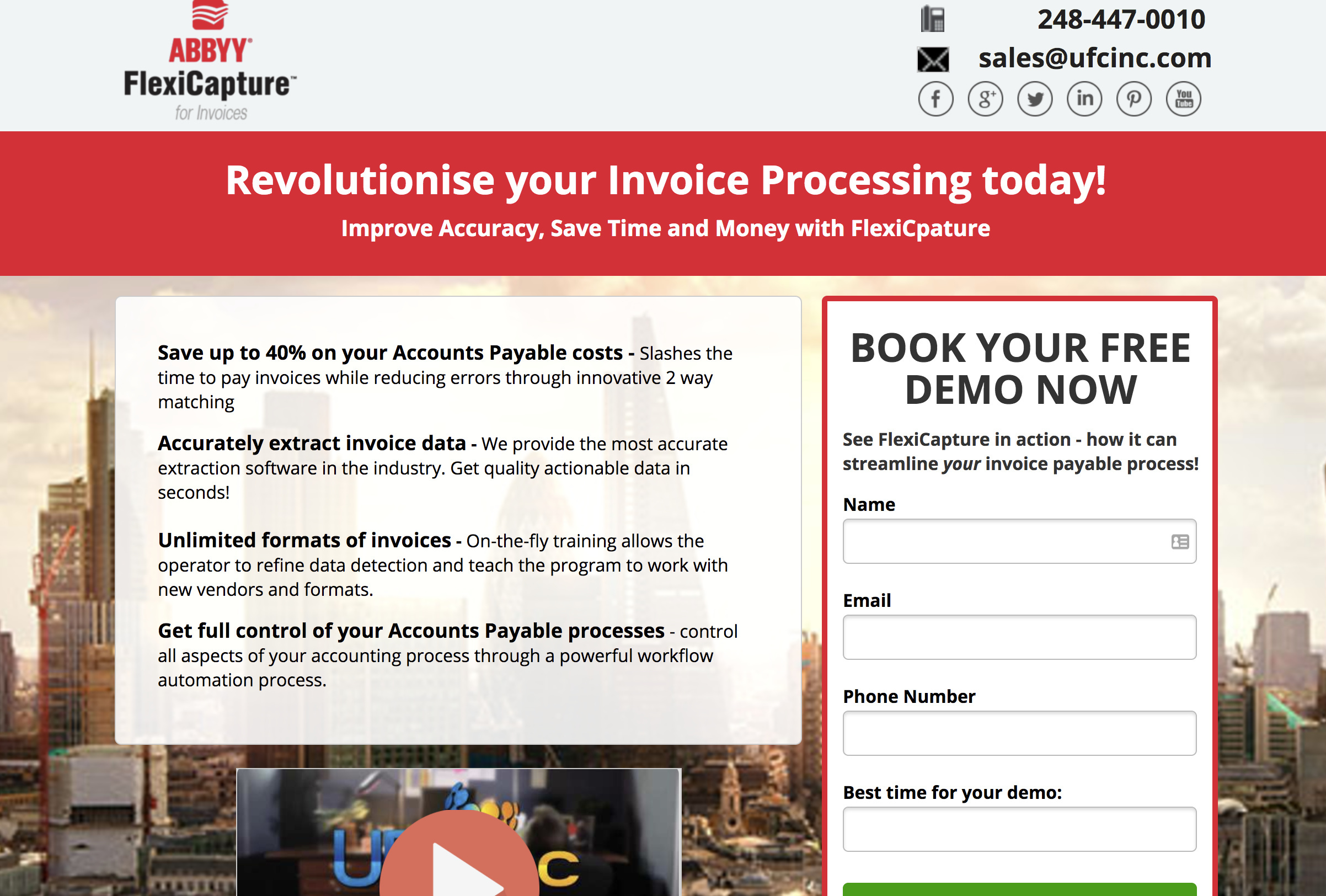
Nice! The video looks great at the top. I’d maybe test a CTA button in close proximity to it though. Usually, you’ll want to have a CTA above the fold.
The “see it in action” section is interesting. It really helps you showcase how the product works. But maybe move it higher up?
I’d also add some trust logos to the page. I think you had them on one of the other variants.
Thought I would chime in with a few thoughts… hope you don’t mind!
In fact i started to make a page, but it’s starting to take a bit long (need to crack on with other work):
(zoomed out to fit on one page)
Comments on yours:
i found the two logos a bit confusing - i don’t know how well known the company logo is (user frienly consulting) - on mine, i dropped this to bottom, however if well known we need to keep prominant.
on the whole, i think your sentences should be more concise across the board. For example on your CTA button replace “VIEW OUR SCHEDULE TO REQUEST YOUR OWN NO-OBLIGATION DEMO” with “SCHEDULE YOUR FREE DEMO” or “BOOK YOUR FREE DEMO” - shorter sentences can be ‘digested on sight’ whereas longer needs active reading.
make headline much more prominent and more concise - current: "See for yourself how we can help you reduce your invoice processing labor and errors. " how about: _“See how you can reduce invoice processing labor and increase accuracy” - still not hitting the mark i think - we want to concisely convey what it does and key benefit/s…
It’s a little busy right now - get rid of “see in action” button, shorten sentences across the board (you can say the same in much less words).
Play button on video could be good to make it more obviously a video - or autoplay? (not sure how easily done this is in unbounce)
I like the testimonials - more “trust” icons might be good - even social media icon links can help - it shows it’s more than one page… I saw on your main site you won an award in 2014, you are approved partners of HP or something (from memory) - things like this really lift the reputability (although careful not to make too busy)
I’ll pipe down…
One more slightly more strategic level thought - I have found going straight to demo on this kind of product can be tough.
Free trial does well if you can do it - it’s less of a jump for people who naturally tend to be scared of actually speaking to someone. With Free Trial, you get telephone number and then push for demo by telephone.
Or perhaps a whitepaper download or similar campaign could do well - offering a hook for a lower commitment level and then sell over time.
Fantastic Alex, this is very helpful. Working on it now.
Alex, what do you think about this? I will work on improving the play button for the video. We are using Vimeo.
https://www.abbyy-flexicapture.com/for-invoices/l.html
I wrote this earlier but never posted: (looking at your page now and writing comments, however may aswell post this in the meantime since it’s here)
bit more - closing browser pane now before i start working on it again!
Looks `
Alex, what do you think about this? I will work on improving the play button for the video. We are using Vimeo.
https://www.abbyy-flexicapture.com/for-invoices/l.html
Looks really good - a much clearer message and flowing page now in my opinion.
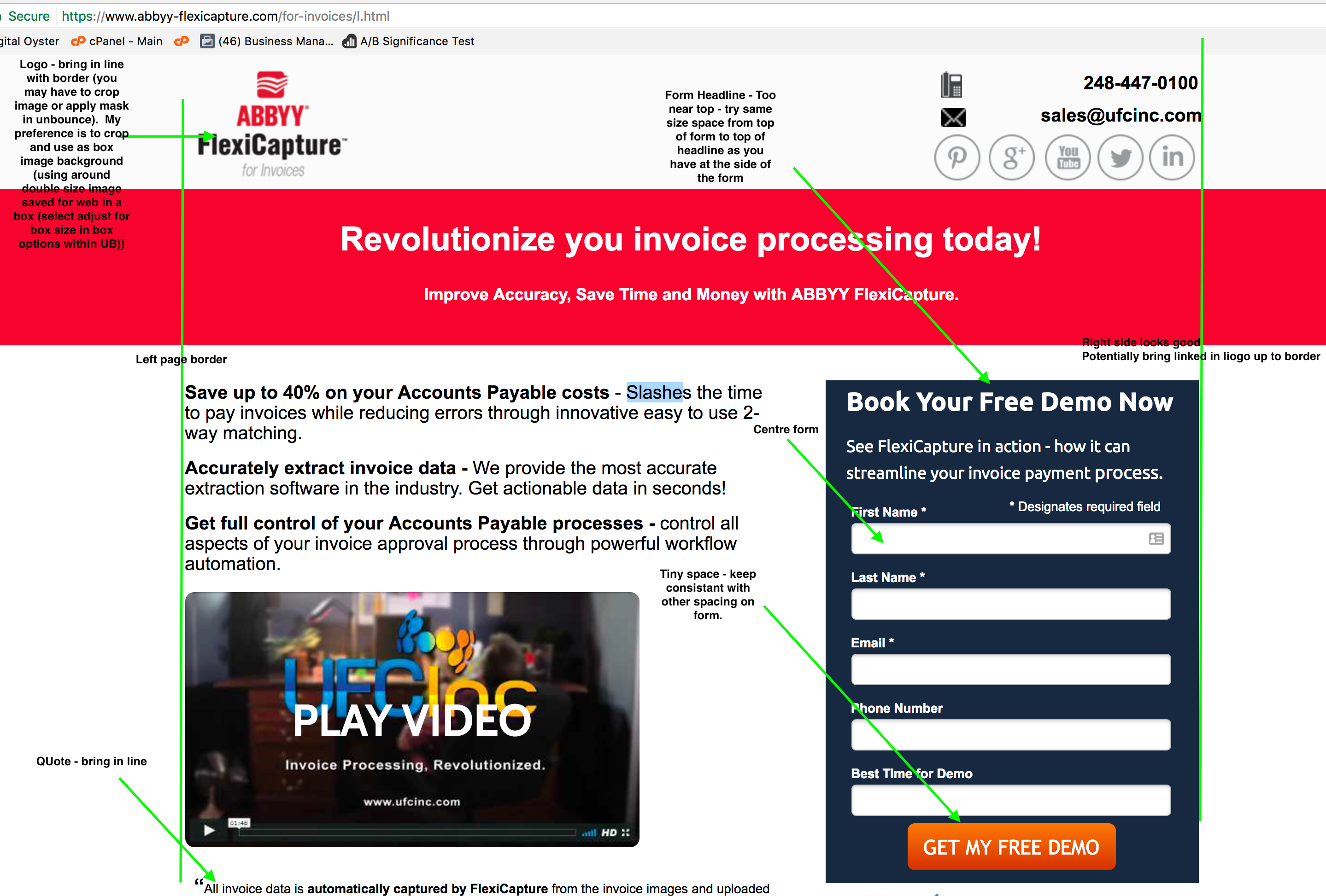
Whilst I am no means a designer (definitely not) there are a few tips i have picked up along the way. In my view its these consistencies applied rigidly throughout a page which take a page from amateur looking to professional (fortunately they are really easy):
- following guides throughout the page - stuff should line up and wherever possible work with maths (have stuff the same size or even fractions - double, *1.5, *.75 half etc etc).
more coming…
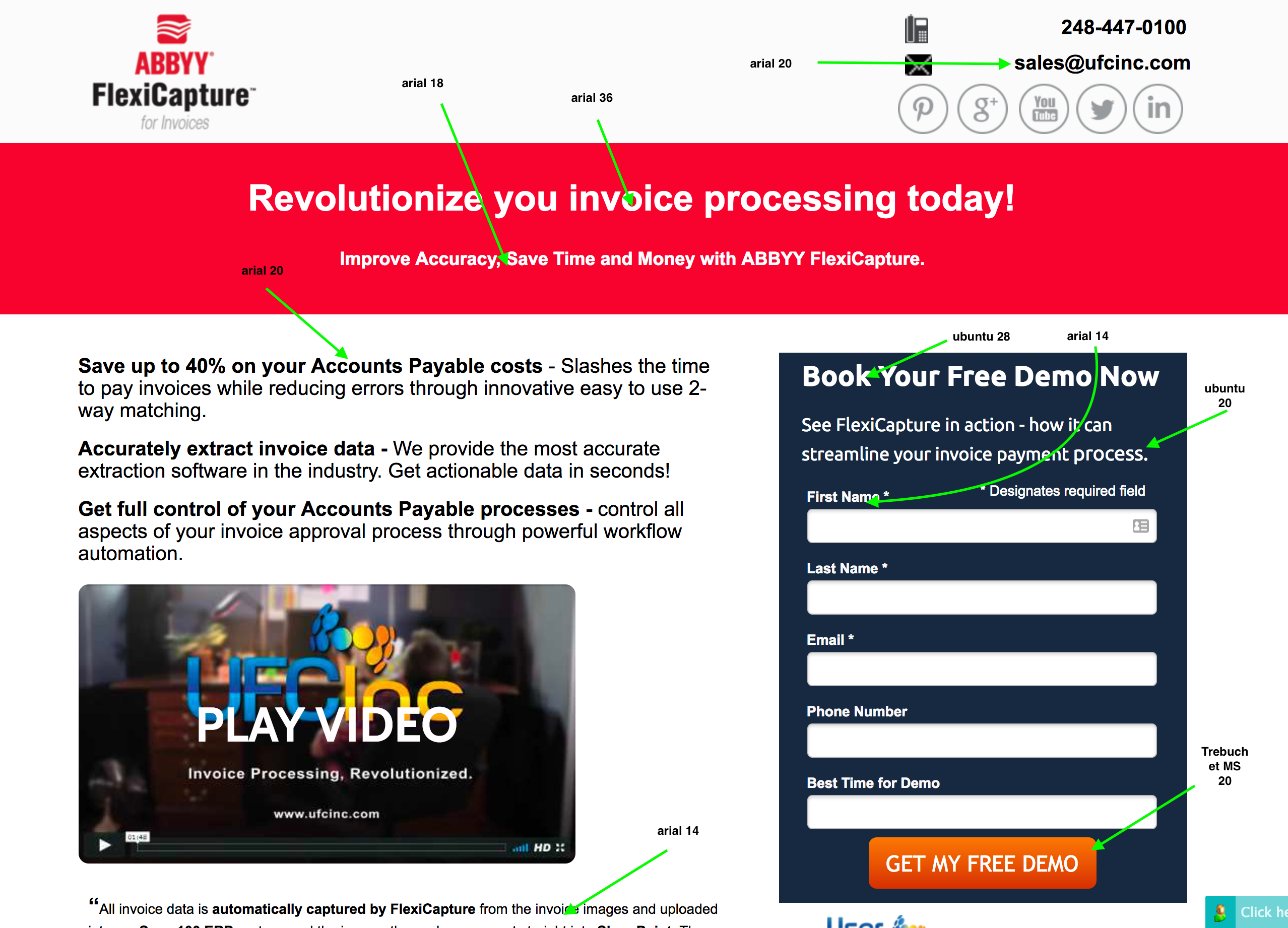
- Similar with Fonts - keep same fonts and a selection of font sizes throughout page:
So now we have:
Arial, 36, 20, 18, 14
Ubuntu 28, 20
Trebuchet MS
which is quite a mix… I would go arial across the lot (opensans is the one i use most, -but it doesn’t matter hugely as long as consistant throughout page)
personally i dont like to go smaller than 16 (smaller can start to be an effort to read).
i would try: (only listing changes to what you have):
subheadline - 20
main text - 18
testimonial - 16
form labels - 16
form headline arial bold 26 perhaps (see how it looks)
form subheadline - arial 18
form button arial bold captalized 26
with all of this - try it and see how it looks
more coming…
Fantastic, going back to work on this soon and will use to improve my other pages too. I really appreciate your input!
3- colours - again consistancy is key.
Use complementary colours and generally no more than two main colours + not many shades of same two colours + a dark grey / black
I must re-iterate, i am no designer, these are rules i follow to save creating disasters and keep a professional look. (mine are definitely more on the ‘passable’ end of the scale).
So start with logo colours (you can change these really, so these are you start point).
Your logo according to my photoshop is (the red) colour hex #e21932
Change this bit to that colour:
From there we want a nice contrasting colour for the form button and scatter lightly elsewhere. See http://paletton.com/ (others exist i’m sure - i use this one).
Enter #e21932 as base RGB and select triad or tetrad for complementary contrasting colours (or you might have brand colours to follow).
here is a tetrad from that colour http://paletton.com/palette.php?uid=75z0u0kstt-hBBdmAv0usnxzQiy
This one could be good:

(EC6F1A)
(we want bright for button stand out and fairlly dark as button text will be white (#ffffff). As above use sparingly in a couple of other places (ticks can work) and it will look good - don’t overdo.
For the black we want to match the logo black which according to my photoshop is #231f20.
Use these throughout the page. right now below the fold, you have all kind of things going on - stick to same font, same font sizes, spacing and alignment + same design colours through whole page - and will look good 🙂
there is more and i think we can improve messaging still. But let’s get a good professional look throughout the page and then take from there.
Thanks Alex, I am working on these things. I too am not a designer, instead an engineer / IT guy / marketer. Sure appreciate all this and I am adding the hints to my style guide so all my pages are uniform.
Jim
Just wanted to chime in and say all of these points are fantastic. Incredible feedback from @Alex_Scovell, @Nicholas and @Ashwin_Satyanarayana!
Hey @Justin – thank you so much for the shoutout. Lifetime fans of Unbounce, you see? 🙂

