Hi Nicolas,
Have you check http://www.blurb.com/ ? I believe its similar to your product.
Hi,
Yes I Know blurb, we are not doing exactly the same thing, but yes it’s similar
Great, then I would recommend to mention why your product is different (your unique value proposition) I bet there are many people looking or comparing Blurb alternatives that you can convince.
If price is your main attractive then I would recommend you to state a number such as “Publish a book from $xx” and make a pricing comparison table to your competitors.
Here you can check, similar sites , check ads and what keywords your competitors are buying:
http://www.spyfu.com/overview/domain?query=blurb.com
“Wedding books” seem like a hot topic to have a dedicated landing page. (Usually when you target really specific topics you will get high conversion rates at a low cost) http://www.spyfu.com/keyword/ad-history?query=wedding%20books
Review all the sites, ads, keyword history, organic performance and check what key elements your page/ads are missing.
Hope this works!
Thanks for you comment.
We already create page for precise niches.
Even if our price are lower than blurb most of the time, we prefer talk about personalized support than prices.
About Weeding books, we are not targeting these kind of books, we are searching for people who want to publish a book and not people who just want to print one.
I didn’t know spyfu, I think it is really helpfull!
Nicholas,
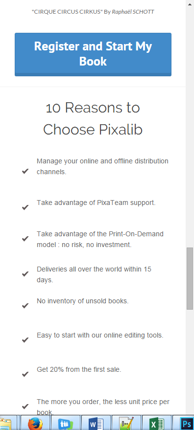
Couple of little tweaks on your mobile version. First the spacing is way off at the top
You can mimize the scroll by just tightening that up.
Also in the bullet section the checks are slightly off line on the mobile version.
Lastly, as this is a click through page the page you land on from mobile isn’t mobile friendly. That could kill conversion rates.
Your headline has punctuation in it, I might consider adding a period as it is a full sentence.
I love the double CTA at the top and bottom. That is great for mobile and desktop visitors.
It is a solid page, a few tweaks (especially at mobile) and you could have a real winner here.
Hey Nicolas,
I’m a little picky when it comes to CTA copy. I would suggest simply going with “Start My Book” rather than Register and Start my Book. It could seem long and I think registering is usually implied anyway 🙂
Cheers!
Stefano Apostolakos
https://ca.linkedin.com/in/sapostolakos
Thanks for your remarks !
I updated the registration form with a new MobileFriendly version. I also add some elements to the registration page to improve the bounce rate.
I also make a A/B test with the two version of the CTA “Register and start my book” and “Start my book”. The results are the same, then, I will follow your advice and keep the “Start my book” CTA.
Thanks again!!
Awesome. Keep us posted with the progress!
Nicholas,
Love the little tweaks. Especially the registration landing page on mobile. Let us know what happens!
Hi Nicholas,
I think your landing page is quite on point. So congratulations!
I can see that you placed your “call to action” button very cleverly which prompts a visitor to click on.
You also wrote the main massage of this page at the top so that the related person would read it at a glance and stay in the page if they are interested.
However, I think you should keep the page a bit shorter and use the other content in other related pages where you will lead the visitor if they are interested in that specific topic. So what I mean is the basic idea and CTA button should be put on the landing page but the remaining text towards the bottom of the page is, I would say, distracting. I can also suggest you a short yet beneficial read.
Regards,
Omer


