I’m going to loop in @Nicholas as his feedback is always 🔥
In the meantime I can provide a little bit of feedback to get the ball rolling.
The interactive designer in me has a few tips for the look of the page (nothing major). A clean page design gives much more legitimacy to a page, and promotes more trust to individuals who may potentially be booking demos. So I’d suggest making these tweaks to the design:
- The content of the page is slightly off-centre. If you shift the company logo and the sub header into the middle of the page that would help a lot.
- I’d add a footer to your page with a company logo. It doesn’t need to have any links that take you away from the page necessarily, but it works as a good constraint for the content of the page, and again adds a bit of legitimacy. It feels slightly incomplete without that banner at the bottom book-ending the page contents.
As for other feedback. Have you considered a multi-step form? As shown in this landing page here that my colleague Noah made: http://landingpage.noahmatsell.ca/multistep-form/
There’s some super handy instructions on how to implement this here, and we’re here to help if you hit any snags.
Multi-step forms make form completion that much easier for the user. Even though there’s only 3 fields in your form, that can sometimes act as a bit of a barrier for users. It might be worth A/B testing as well, to see how effective it is. 🙂
Additionally, I’m often on people’s case about adding a favicon to all your landing pages 😂, we’ve got a post in the community on how this can be done in Unbounce here:
Without a favicon it’s easy for the page to feel less official, and incomplete.
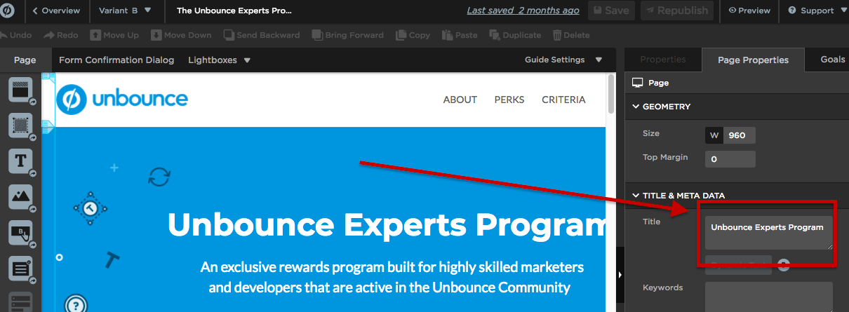
Lastly, be sure to always include a Title for your page shown here 👇
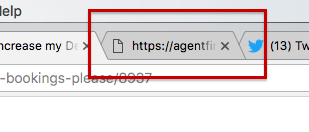
Otherwise it’ll show up like this in the tab:

Again, looking a little incomplete.
Hopefully this feedback gives you a good jumping off point until some of the other @Unbounce-Experts have a moment to provide any further feedback.
Keep me posted on any updates, let’s get you some demos!! 💪
Hey Mack,
Ah, AgentFire! I’ve heard of you guys. One of my old realtor clients is a client of yours. Small world!
Anyway, here’s some feedback on the page, in addition to the awesome points shared by @Jess:
I think the main issue here isn’t the page, but the content and offer. The video is highly technical for the average realtor. It might make sense for an existing AgentFire customer, but for someone who just browsed the site and bounced, I think that video is going to be way over their heads. I’d recommend testing a much shorter, high-level video. Something that explains the benefits, rather than talks about upcoming features. Also, any time you can talk about things that are available now, vs. “coming soon,” you’ll have an advantage. People want things now. 🙂
Along with realigning the video content to make it more high-level, I’d rework the headline and subheadline too. Something that speaks to the fact that they visited and didn’t commit. Or something that drives the benefits of AgentFire home. “New Year, New Leads!” is catchy, but too vague. It doesn’t tell me what I’m missing out on by not being an AgentFire customer. The key here is FOMO (Fear of missing out).
I’d add some more supporting info below the fold too. Some of the key benefits of AgentFire’s tools. Bascially, this is for people who don’t watch the video, since not everything watches video content. You don’t want to lose people just because they don’t watch the video.
I’d also include a case study that the average realtor can relate to. Something that maybe shows a before and after image of their site, and talks about how they went from 0 leads to hundreds of leads once they jumped to AgentFire.
Add some trust logos too. If you have clients from some of the major real estate agencies, the logos would probably be nice to have on the page.
Lastly, I’d add a call to action at the bottom of the page, that jumps back up to the form at the top.
Hope all this helps!
Hi @Jess thank you for the great feedback! Implementing this right now. Question: is there an easy way to horizontally center elements on the page? Right now I’m just dragging and eyeballing the element alignment (I know it snaps to some locations, but still kind of eyeballing).
@Nicholas thanks a lot for the feedback. Can you give an example of a good headline in this case? Would love to hear your opinion there.
Lots of stuff here for me to dig into. Thank you.
Hey Mack!
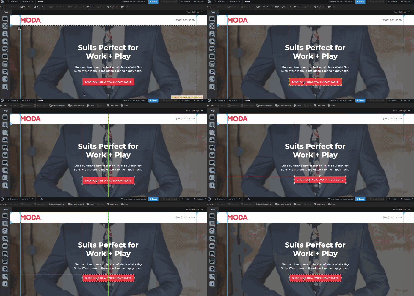
So when you’re dragging content around on your page, you’ll see a couple of rulers pop up, they’re intended to help you find the centre of the page, as shown in the gif below, the green vertical line indicates the centre of the page:
Hopefully that helps!
Hey @mack, I’m a little late to the party, but I had some thoughts on your landing page.
As @Nicholas mentioned, this page would benefit from a stronger, more benefit-driven headline and value proposition. As it is now, the headline is vague, and offers no value to the visitor. And saying “We wanted to share” makes it about YOU, when it should be about the prospect and what they want.
So, what do they want? As always, benefits they can sink their teeth into – one or two specific ways that AgentFire can make their life better. Some broad examples: More leads, obtained easier, for less money, that convert better than other services.
As for the video – it’s too feature heavy. The viewers are people who for the most part are wondering if they even trust you guys yet… so reciting a list of features is way too early in the conversation. Give them the big-picture overview of how you can help them, why they should believe you, and why they should take action today.
Also, the testimonials are good, but I would add a paragraph about who AgentFire is, and how many people you’ve helped, how much money you’ve helped clients make, etc. That kind of social proof helps people understand who you are and makes them more comfortable moving forward in the funnel.
Thanks @Jess, @BradW. Working on a new landing page now and taking your advice into consideration. I’ll post updated one shortly and would love some more critiquing.
Cheers,
Mack
Sure thing, let me know when the new version is live, and I’ll take another look.
Well, not much to add here. You got some great advice. I pretty much agree with everything @Nicholas has said 🙂


