Your landing page looks good. And what an important topic!!!
I love your first picture. It looks very professional.
Here are my feedback (and I’m far from being a professional, so you got to take some and leave some).
- I found it a little bit confusing that your landing page is both for individuals and organizations. And both of them have different calls to action. Individuals can purchase now but organizations need to enquire. And in your text on the left, you mention a free demo (that you should put much more emphasis on) which doesn’t seem to be available to individuals. The beauty of a dedicated landing page is that you can target a very specific audience. I would suggest you make one landing page for individuals and one for organizations. Or, if you want to have one landing page for both audiences, you give them the same call to action.
- Often, when we see a variety of logos on a landing page, they are all in gray. This way, it looks more uniform.
- Not sure about the picture you chose for “The gender pay gap”. Pennies make it look like the pay gap is not that significant.
- Under the picture, there’s a big block of text. You should try to play with formatting (disposition, font size, bold, italic, underline, colors) to make the text look less plain. People don’t read on the internet. They scan. You need to make some of your keywords stand out to catch their attention.
- At the end, you mention “Join over 400 companies” but you put only 5 logos. I would put at least 10 to give the impression of abundance. Also, use the whole width of the page. Now, you have the logos bunched up on the left and a big empty space on the right.
That’s it! Keep up the good work!
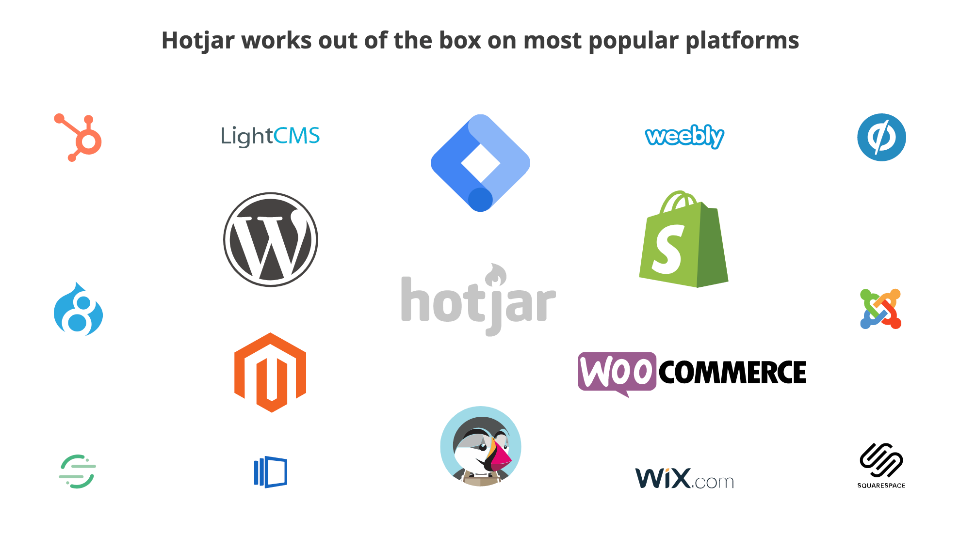
I stumbled on this page and thought it was a nice way to present your customer logos. They have left the colours on the logos and managed to make it look visually pleasing.
This is really great feedback, much appreciated!
Going to get to work on the logos and imagery - the good news is we got our first conversion last night so it’s only upwards from here 🙂

