Hey @Lauren_Greg_Fine,
Well you’re in luck! We happen to be giving away free review right now for Valentines Day http://daychamp.cc/lp-love 🙂
Here’s a few to get you started.
It is difficult to say for certain why you’re not getting any conversions. I would need to see some analytics on the 192 visits, I’d like to see the FB ads as well. Perhaps there is no congruency between ad and LP, meaning the message is mis-matched. that can lead to drop-off.
In terms of design - it is difficult to read a lot of the copy. I would recommend not highlighting text and having a busy background behind it. It pushes people away from reading and if they do they do not internalize it. The same with the hero.
Message me if you want to chat more and submit your link above.
Thanks for the insight. How do I message you and whats a “hero”? I’m brand new top this and any jargon associated with it.
No problem, start by filling this form out http://daychamp.cc/lp-love
A HERO is the first panel you see, it usually contains your Value proposition and CTA.
Hi @Lauren_Greg_Fine
The good thing is that you did take the first step to create landing pages and started a campaign. As Brendan (@digibomb) puts it, there are just too many variables as to why the conversions aren’t happening.
Given that it’s Yoga training, FB is indeed a good place to do advertising. There’s nothing stopping you from doing Google Adwords (it’s intent-based, so it’s even more powerful).
Now, for the landing page. I just one version and I have this for you:
Use a separate section on top of the hero section (hero section is the part that shows up before we have to scroll – this is prime real estate) to put the logo there maybe? Your logo is getting washed out with the background video.
Let’s start with your main headline.
200 -HR Yoga Teacher Training
That’s not telling your visitors anything, except that there are 200 hours somewhere and that there is some training available for Yoga teachers (so that that can learn and teach Yoga to others?).
Instead, you could use alternatives with built-in offers like ( Stats are from http://www.statisticbrain.com/yoga-statistics/)
OVER 15,875,000 AMERICANS PRACTICE YOGA. THEY NEED YOU TO TEACH THEM
BE THE GURU NOW
WOULD YOU LIKE TO LEARN AND TEACH YOGA & MAKE AT LEAST $75,000 ANNUALLY?
GET A FREE SAMPLE OF THE TRAINING NOW
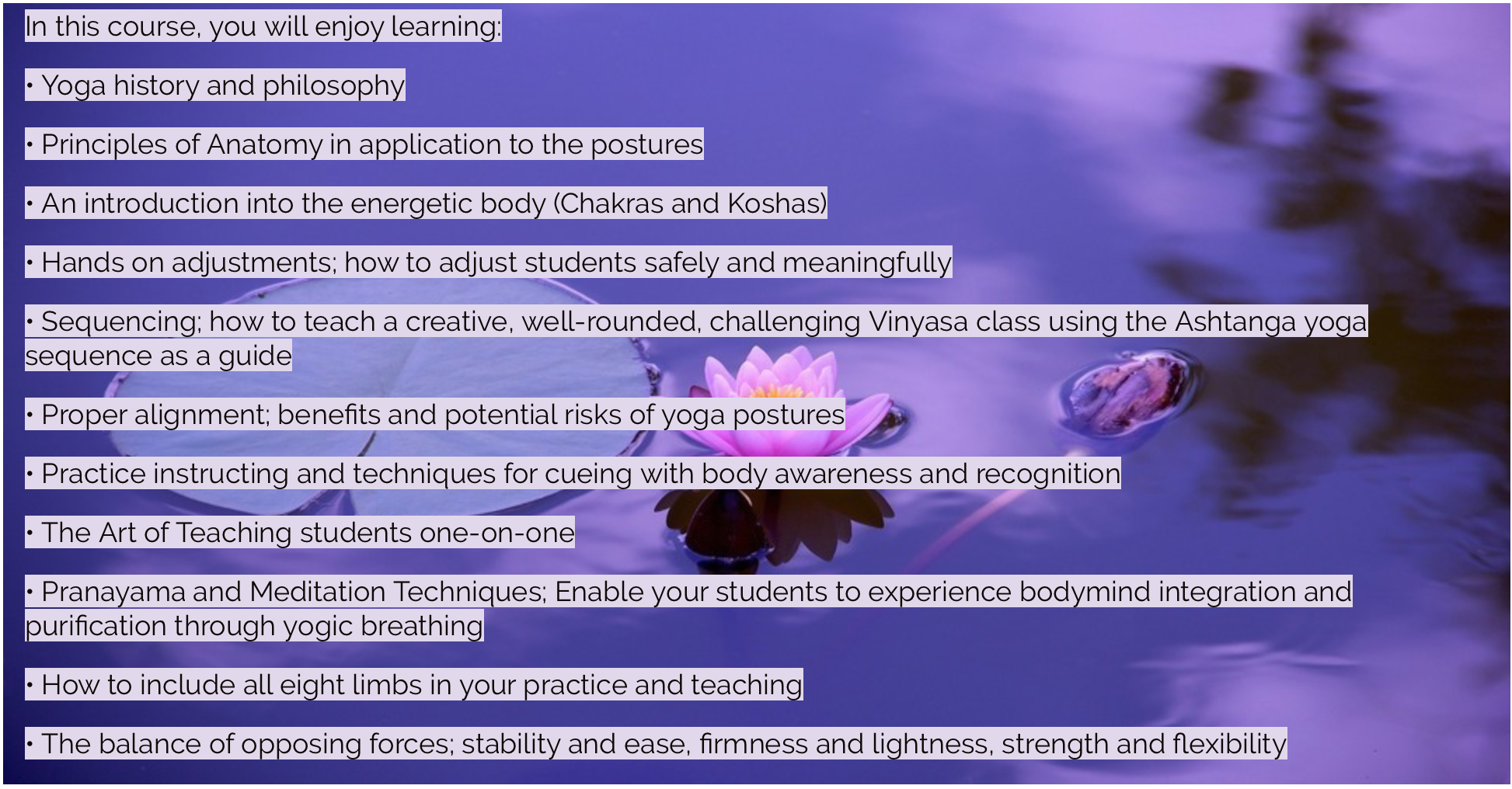
It is indeed hard to read your copy. The text is all over the place and doesn’t seem to have any pattern to it.
This part, right here is too jarring.
It’s better not to use any images at all than use stock photos. Don’t get me wrong, you can indeed get away with stock photos but the images seem to take too much attention here and that’s not the purpose of your landing page.
- Timings, Dates, Maps, etc
You could create a separate section and place those elements right?
You could test two versions (one with the video and one without). If you are using video, place it at the very top (and not the bottom).
Hope this helps.
Ash
Ashwin, Thank you very much for giving me these pointers. I did cut out the fat of the variant b I created alongside the one you saw. Not sure if you saw that version. training.fuelthesoul.com/yogatraining/b.html http://training.fuelthesoul.com/yogatraining/b.html. As far as the headline of making 75,000. I usually avoid that end of the training and get more into the spiritual side of the practice. I will try and redesign with some of these ideas in mind and make yet another variant. Really appreciate the insight. Thank you.
You are welcome, @Lauren_Greg_Fine. Wish the very best for your campaigns. Please don’t forget two test two versions always. Maybe these landing page tips can help.
Not sure if you’re still wanting some help but:
Try adding different background-colours to sections of your page. This will really help make it more structured and therefore easier to read (for your eye)
I would also look at your imagery… too many images can confuse the eye, we don’t know what to look at,
the purple image should just be a list of things in 2 rows… with a title. And make sure all your font on the page is the same font-family! (ie all georgia or all sans-serif etc)
I actually did a quick redesign.