Hey there,
It’s not too bad, there are a few design & copy things to pay attention to.
❗ When asking for phone-calls, mobile is of utmost importance. It looks like the phone number in the header is causing a page-width issue on mobile.
“Free… is a click away” You have already lied to the user. According to your form, it’s 3 clicks away. I suggest changing that title. It’s better to be honest. Try, “Get a Free Consultation by Filling out the Form Below.”
Or, eliminate the form in the header (move it to a lower section on the page) and just use a button to “call now for a free consultation.”
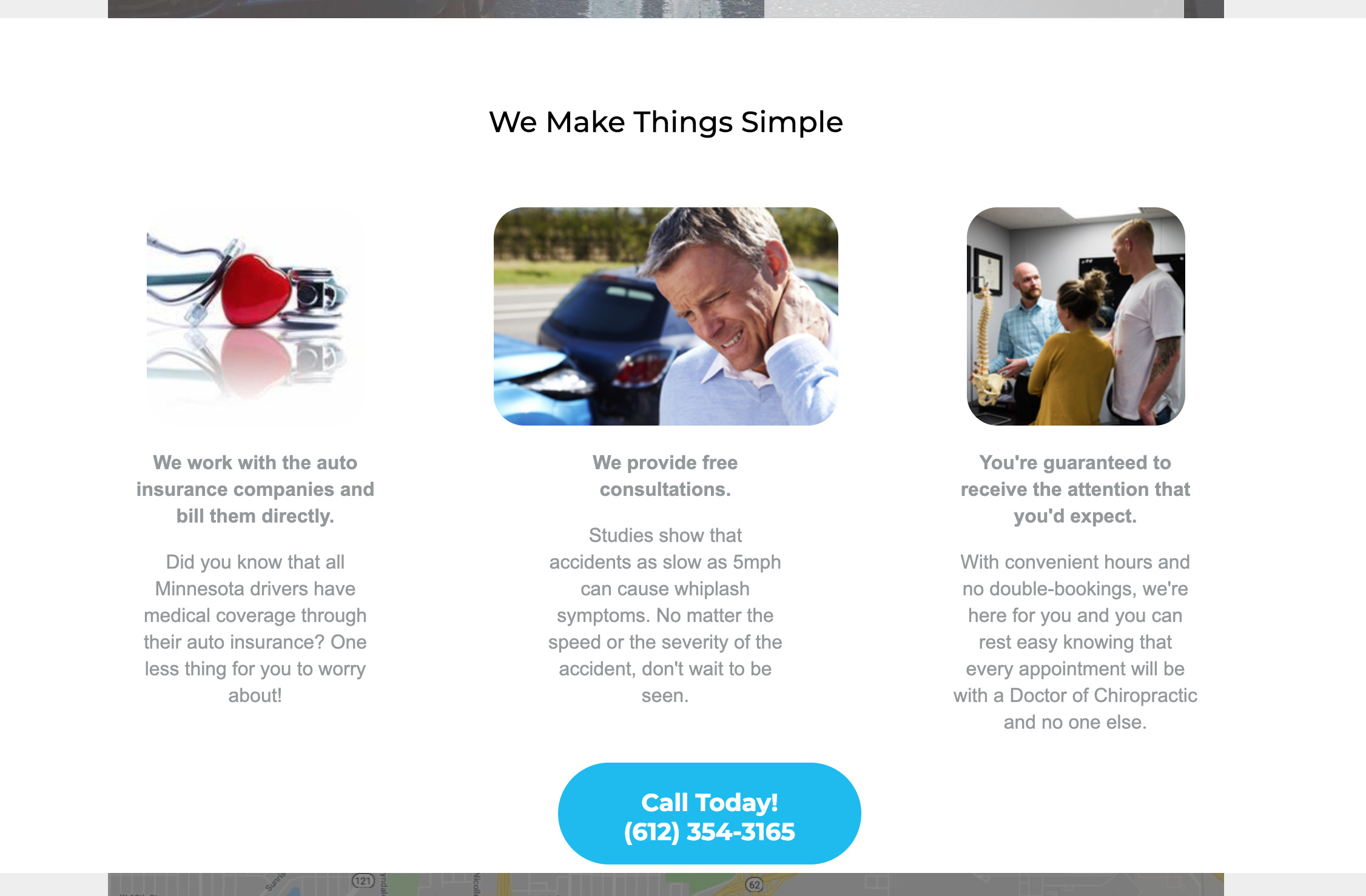
“We Make Things Simple” … This could be more obvious with those three topics. First, put that section title in the same colored-container as the three topics. Having it within its own grey bar is awkward design. Secondly the copy is great, but to make your point more clear I have swapped some sentences. Check out the screenshot where I have edited several changes.
You could even remove the sentences, and leave the ones I put in bold 🤷
The rest of the page does it’s job 🙂 Hopefully those tips help. Let me know if you have any questions!
Hey there,
Here’s some feedback in a short video: https://www.useloom.com/share/d87479a391f24a59bbf84a8f4f16d585
Hope it helps!

