Hi @sandyh 👋
Honestly, the page doesn’t seem that bad. It looks great on mobile and I think the headline is strong.
Here are some thoughts on things above the fold…
1️⃣ Could you delay the pop-up a bit longer? I think a few more seconds will allow time to finish reading the headline. But that shouldn’t be too much time that we would lose a possible bounce. Or even removing that pop-up altogether.
2️⃣ Have you tried less form fields? You only require three but more could be intimidating. I’d attempt just using the required.
3️⃣ The CTA could be better, because you already have the “Request a Demo” at the beginning of the form, they already know what they are going to submit. So you have the opportunity to reinforce your headline. I would try a CTA button as “Try Interactive Video” or “Try Vudoo Videos.” Or even something casual like “Get Started”
All-in-all, great landing page!
Headline needs to be stronger. “Videos that convert views into leads”. That sounds like a bullet point. Think about what will grab the reader/prospect. What is their pain point and how do you solve it?
Ask your customers what they like/love most about your product and turn that into your headlines. Develop 3-5 and then test them.
Hierarchy of messaging at the top could be better. When I hit the homepage my eyes really don’t know where to go. I would increase your headline and copy size and reduce the form box.
Love your CTA color, works really well. Think about using that color for your primary headline at the top to really make an impression and let the reader know exactly what they are getting.
Page flow is good.
“Turn your videos into engaging experiences.” This headline should be bigger. It is the last impression you are making. Think about a better option also. This is generic sounding and something many companies say. Be different.
The page looks really good. Everything’s got room to breath, the text has good contrast for readability and the images are nice. I also like how you encapsulate the form.
That said, there is always room for improvement.
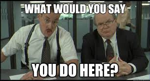
One of the biggest issues I see is with clarity. It seems like a pretty cool product, and I can see the value after doing a bit of digging. Unfortunately, that isn’t immediately clear. As the Bobs would put it:

If someone doesn’t get any further than the hero section, they could assume you are an agency that shoots video, a stock video footage provider, or any number of other things related to marketing videos. Nothing really speaks to the unique value the product provides.
Try to be as specific and concrete as possible as well. Phrases like “unleash the full potential…” are too vague to have any real meaning without more context. And while converting views into leads is a good benefit, it’s something just about every marketing solution claims. What makes this better? Can it be quantified?
I’d also try to stay away from trying to be too clever with lines like “It’s not sorcery, it’s Vudoo.” What does that even mean to the visitor? Clarity trumps cleverness.
Explainer videos are great, and since you’re selling a video solution, it makes complete sense to include one. I would just add a bit more context to draw viewers in. Right now there’s no introduction to it. There’s just a play button and text to Watch Now. But why? What’s in it for the viewer? Tease them a bit to entice them to watch.
If this is specific to a PPC campaign, then I would make this a dedicated landing page by removing the navigation. Why give people more opportunities to leave the page before converting?
Finally, if your offer is for a demo, then sell that. Right now the offer is just sort of tacked on, rather than the focus of the page. Make it all about that offer. What is the benefit of the demo? What are they going to see in that demo? If possible, tie that to the benefits or use cases of the product.
Hope that helps. Best of luck.
Hey!
Here’s some comments to your landing page:
thanks for the awesome information.

