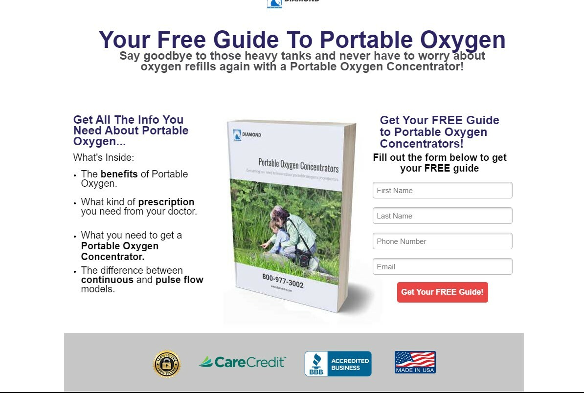
The biggest issue is that it seems to go back and forth between offering a guide and selling the product. Frankly, it’s confusing for the user. High converting landing pages focus on one specific thing only.
If the offer, and the ads that lead to the page, focus on the guide, make you page all about that. Sell the offer to generate the lead and worry about selling the product after.
To do that, I would move the image of the guide from the form, so itt’s actually part of the page, and make it much bigger. Show people what they are going to get.
Then, on the copy, give people a reason to complete the form. What are the benefits of the guide? Maybe tease some of the content that’s included with copy like, “You’ll learn the three biggest mistakes…” or something along those lines.
Mentioning anything about purchasing the product, especially financing options, will likely kill conversions. There’s much more commitment and risk in that than simply sending for a free guide.
Best of luck. Let us know how it works out for you.
Thanks for the feedback.
I have an A/B test going with this campaign.
Would you say something like this would be better?

Yes, I think that is a much more focused page.
I would just work on making it more benefit-oriented, Why should people get the guide? How will the content in the book improve their life? A good way to pull out the benefits is to keep asking, “so what?”
Thanks for the feedback! I’m already noticing some improved results.
That’s awesome! So happy to hear it.

