Just set up my first convertable and it was super easy. It works well on Desktop. The only problem I have is that on mobile (Iphone 6s) I see also the Desktop version with some extra white space on the sides.


Here’s the website http://fungiacademy.com/ the trigger is 6 seconds.


How can I fix this so it is showing the proper mobile version of my convertable?


Thank you

Hmm, I see what you mean.


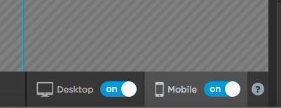
Do you have both the Desktop and Mobile versions “on” in the convertables builder, like this:


21 PM


And if so, did you make sure to optimize the size and layout of the mobile version?


And do you have any custom code added anywhere, maybe in the Javascripts or Stylesheets sections?


Thanks for your suggestions Nic. Yes I had both versions on and designs optimized.


I finally found a workaround by creating two different convertables. With one having only the mobile version on and other only the desktop. It takes up 2 convertables of my 10 limit, instead of 1. But It works fine now.


Reply