Hi
Good start there and congratulations on getting the page up. Please ignore anything here that you want to ignore. Just my 2 cents.
- The maroon background (was it maroon?) is Jarring. You might want to just stick to white.
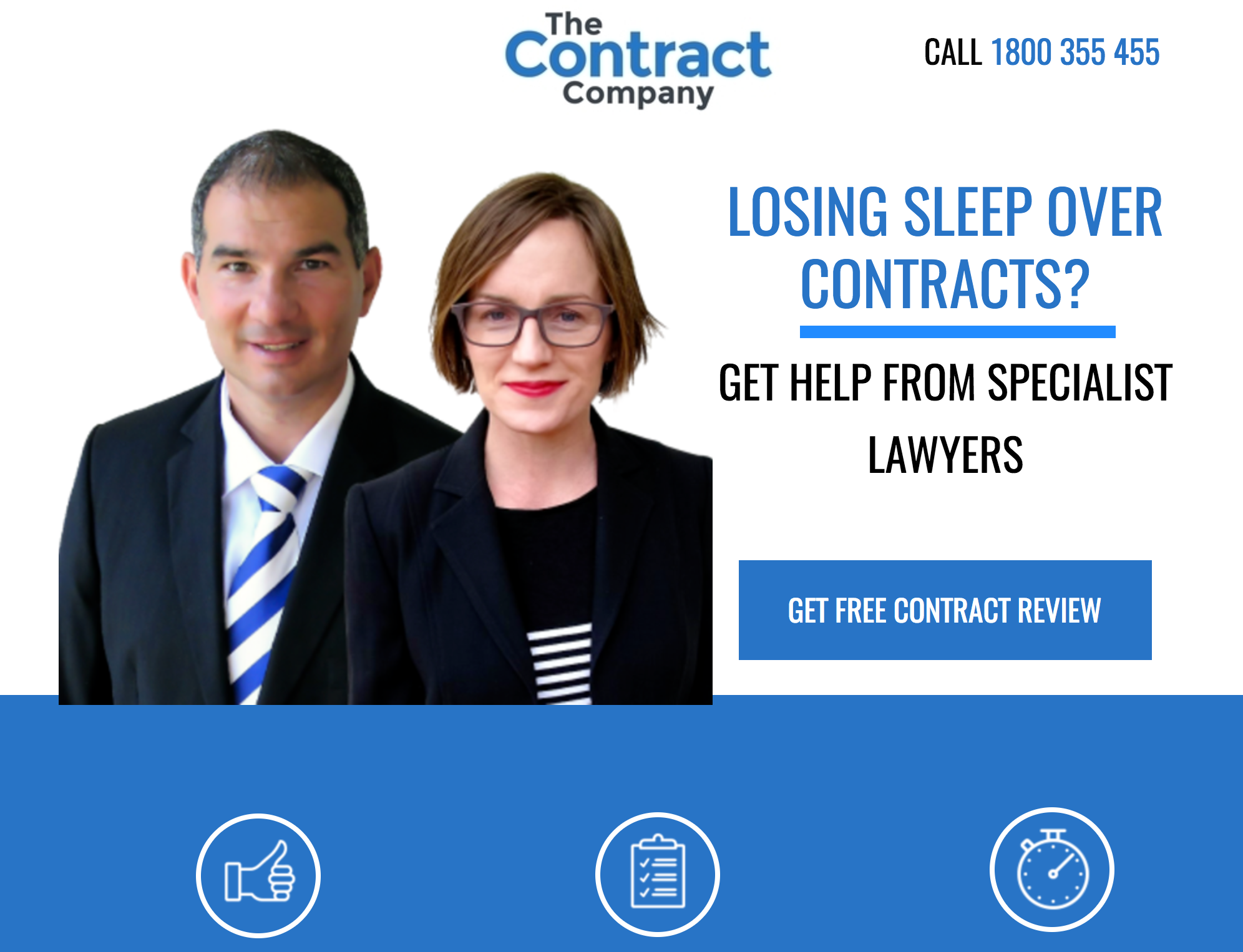
I am not saying white is the de facto, but landing pages really look nice that way. Here’s an example:
Put the subtitle “Staying ahead of the trends…” below the main headline, and align them together, in a cluster. Also, please do experiment with fonts and choose
Try to push the video further up, within the hero section (so users don’t have to scroll). Bring the form (which is somewhere way below on the page) right up to the hero section (maybe just beside the video). As usual, please do A/B testing with and without the video.
Remove social buttons off your page (they should go on the thank you dialog box that subscribers will see).
The big section in the middle where this guy holds up something (Image) is unnecessary. If a section has no purpose, it shouldn’t be on the page at all.
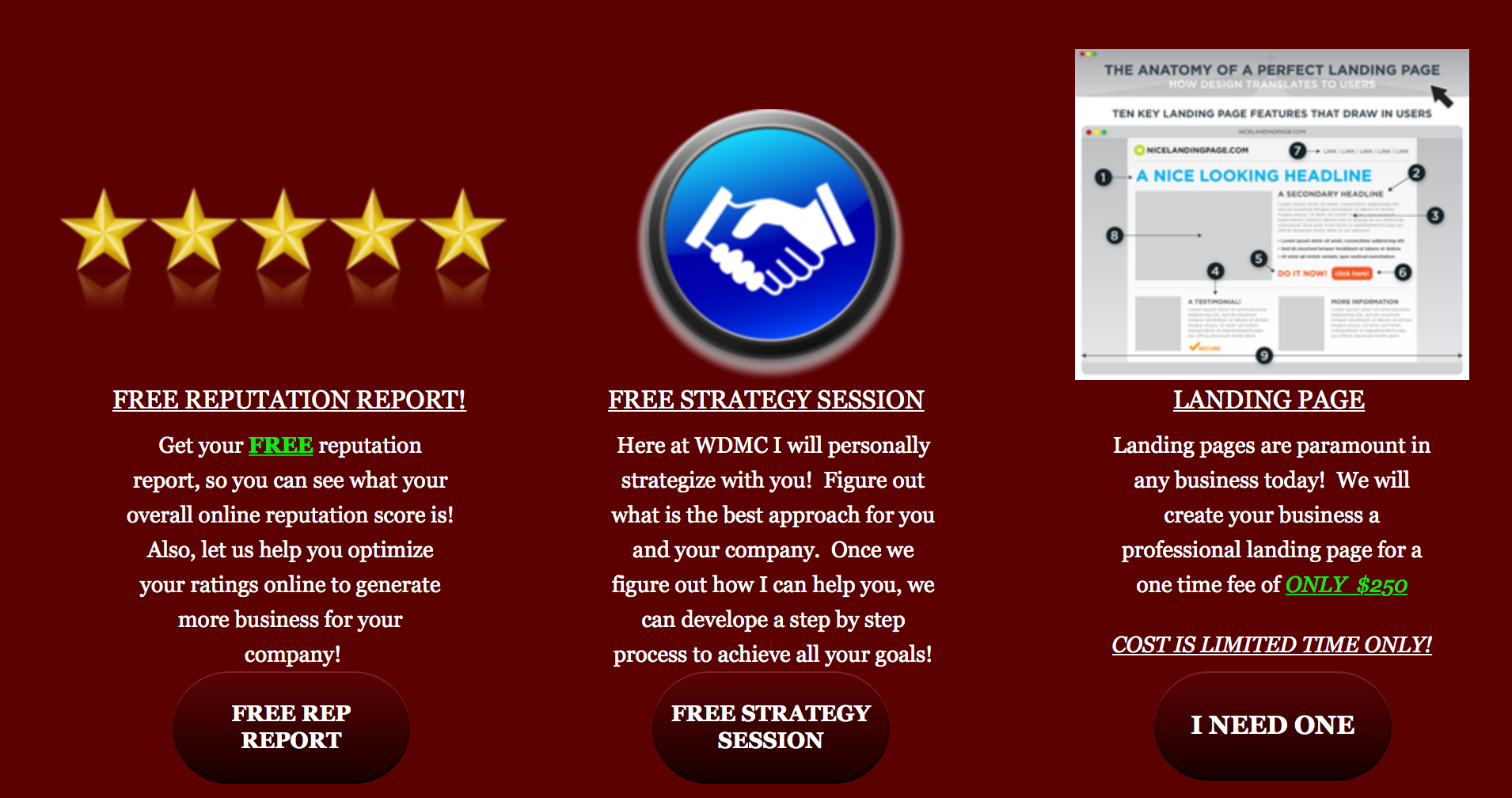
These buttons under the pieces of text aren’t standing out (because of the background color). If you aren’t changing the background, at least change the color of these buttons. Use Caps on the buttons.
- This big section at the bottom.
Reduce the logo size to as small as it can get. Plus, add a large, final button that links to the form on the top of the page with a call to action like , “GET ME THE GAME PLAN”
Thank you for taking the time to check out my page. I will definitely make some changes accouding to your feedback. I had the same thoughts on a few of the recommendations that you suggested. I would love to see some of your work. Also would love to bounce some ideas off you. Shoot me a text 210-801-5396
Hi there!!
Are you planning on keeping the “Presented By” section on live pages for your clients?
This is a cardinal sin and major conversion killer 😸 I would refrain from using any outbound links, including social.
Have a look at some great design resources right here for inspiration & best-practices.
Happy designing!


