Hey @anura16! You’ve come to the right place for a bit of feedback 😊
I took a look at your landing pages, and now I have a major case of the travel bug! You’ve got some great materials to work with here, but I have a tip that might help drive some more conversions.
I think your CTA needs to be a bit more prominent on these pages. Right now, your “Get The Brochure” button is below the fold, and if the users scroll quickly down the page, they may miss it altogether.
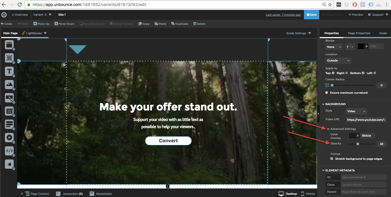
In order to create a strong CTA, it needs to be clear what you want the user to do. In this case, I would suggest throwing a slight overlay over your video. Not to cover it completely, but to help make the CTA jump out a bit more. Since you’ve got more images and video on your pages, it won’t hurt to edit the video background a bit. Then add your CTA in the center of the page to draw even more attention to it.
Here’s a screenshot explaining what I mean:
Do you have insight into how many of your viewers are mobile vs. desktop? Video backgrounds only really help to convert on desktop (as they aren’t functional on mobile).
That’s what I’ve got so far, but I’d be curious to know what our @Unbounce-Experts have to add to this.
Let me know if that helps a bit 😊
Hi @Jess:
Thank very much for your feedback on this!
Please take a look at this page - is this what you mean?
http://trips.heritage-expeditions.com/subantarctic-islands/
Thanks, again!
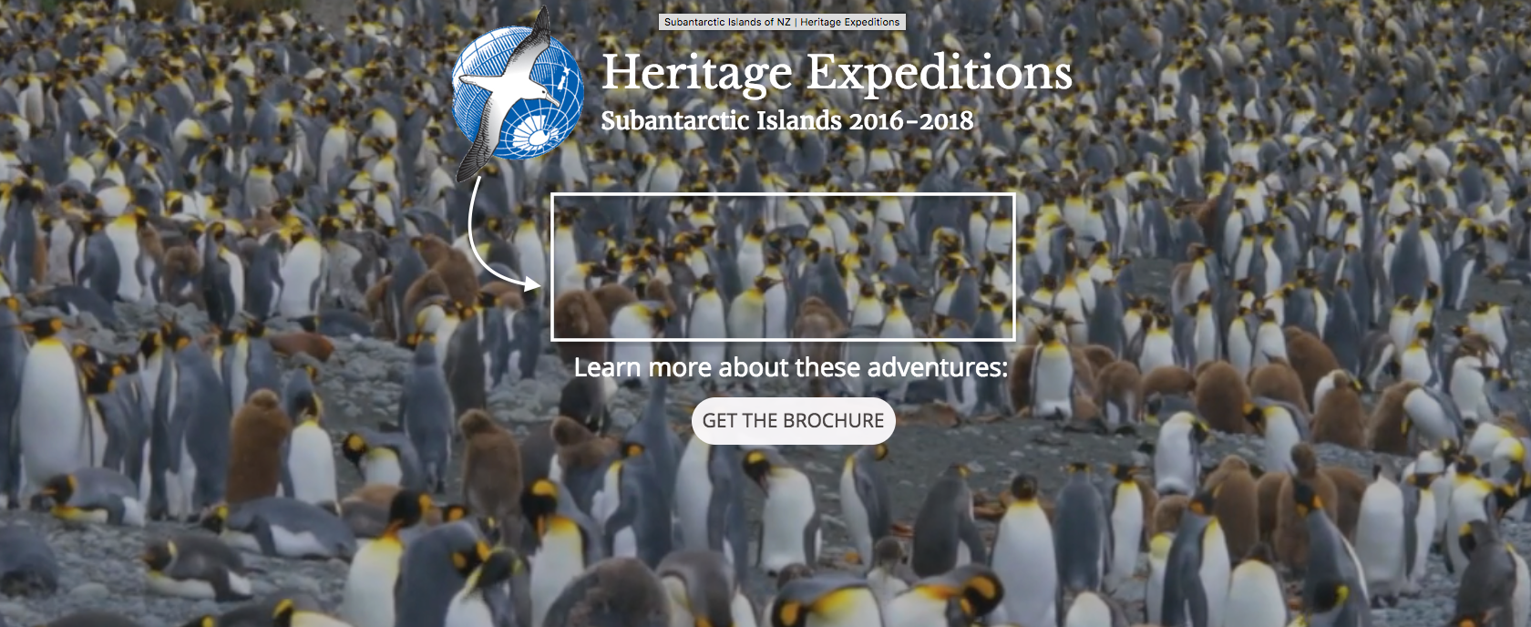
Hey @anura16! Yes, you’re definitely on the right track! You could even try bringing the Heritage Expeditions down so that it’s floating right above “Learn more about these adventures”. It will help draw all of the focus onto one clear CTA.
Here’s what I mean:
Now apart from the design, I’m curious, what’s your marketing strategy with this landing page? Once we know that, we can dig deeper into how to kick it into conversion overdrive. 🏎️
Cheers ☺
Thanks @Jess! I’ll try moving the logo/company name down to the center, as you’ve suggested.
This and other landing pages for Heritage Expeditions are connected to Adwords campaigns for the destination. For example, someone searching for a bird watching cruise or someone inquiring how to reach Campbell Island or Macquarie Island would trigger a Google Adwords ad for this Subantarctic Islands landing page. The goal of the page is to 1) educate the visitor about the tour company, Heritage Expeditions, 2) give them a window into the travel experience, 3) explain the different trip options and differences between them, and 4) drive them towards the CTA, which is to request an e-brochure. Then the res team at Heritage has their email address, name and voyage(s) of interest…and they can follow up with them, email them the brochure and start to nurture the relationship.
If the visitor really wants to access the actual website, they can do so via the footer. But the website is outdated and is not mobile friendly. Hence, the reason we’re using landing pages.
Hope that helps? Do you have any feedback regarding the conversion rate I should be aiming for with these?
Many thanks!
Amelia
That’s very helpful, Amelia, thank you!
You’re definitely right to use a landing page for this campaign.
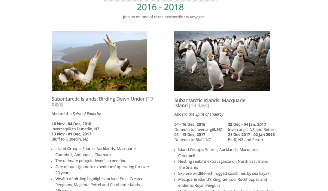
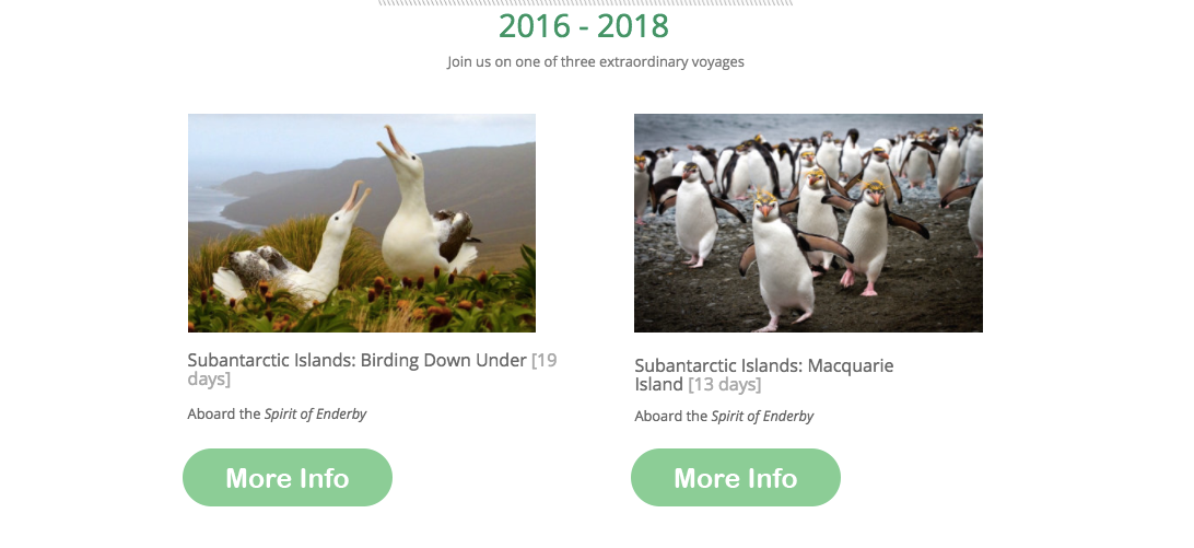
Here’s another piece of feedback that just occurred to me. The section towards the bottom of the page where each trip is detailed. I’d remove some of that detail and leave a bit more for the user to be curious about, it might increase the chances of them committing to receive an informative brochure. Here’s what I mean:
Change it from this:
## To this:
You could customize the More Info button to take them to the form where they can request a brochure with more information. Perhaps the barrier between maybe converting, and definitely converting, is that there’s too much information given away upfront.
Alright, I’m going to loop in some of our @Unbounce-Experts here so that they can provide some feedback on how to take this to the next level. They’re marketing geniuses. What say you, Experts?
Hey there,
Nice page overall! Here is some quick feedback for you to test:
I think the main issue in the header is that there’s a weak headline. I would change the main headline from the descriptive one you have now (Heritage Expeditions, The Russian Far East 2017), to something more enticing. You have “One of the least visited wilderness areas on the planet!” down below, and I like this. Maybe use that phrase as in the header. Try something like “Explore One of the Least Visited Wilderness Areas on the Planet” and couple that with a CTA button that says “Learn About Our Russian Far East Expeditions”
The “Learn More” buttons aren’t working for me on http://trips.heritage-expeditions.com/russian-far-east/
Try simplifying the page, by cutting down on the copy. As @Jess pointed out, this will leave the visitor with some curiosity, giving them more of a reason to opt-in for the free brochure.
Best of luck with the page!


