1: What challenge are you currently trying to solve?
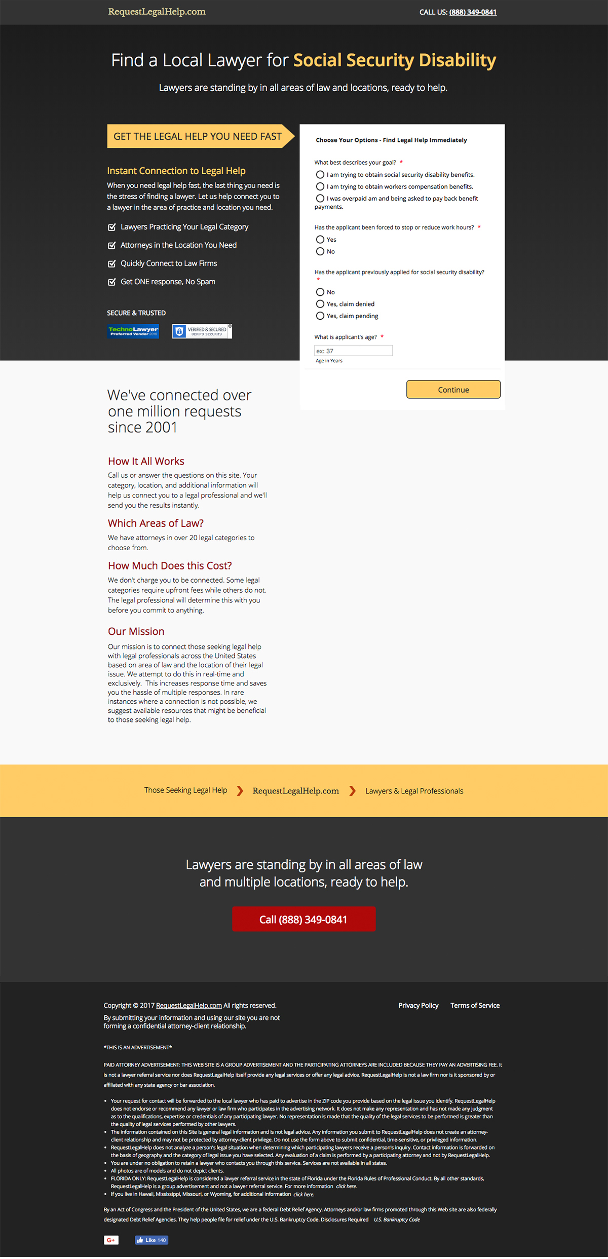
I’m working on refreshing and optimising a series of existing landing pages for a client for legal services. There are various different categories e.g family law, civil law, social security etc… that are the same page, but just a different heading and form.
The forms are embedded via JotForm as they require more extensive branching and a number of steps. Using the native forms was not an option.
I tried an a/b test with a refreshed page design and form design that was more cohesive to the overall style. Clean, easy to read – in theory should have improved the conversions (or at least matched). Instead, it’s lowered the conversions on almost all the pages. 🙄 😫
So I’ve scratched that for now – and going right back to basics. I’m doing a very simple a/b test of the original page with just a simpler form with a green button. Will see how this runs.
But in the meantime, I’d love some outside perspective on why the original page is still showing the best conversions – to me, the original page doesn’t feel as trustworthy, easy to understand or credible as the new design I did.
2: How are you driving traffic to your page?
95% of the traffic is from Adwords and is routing thru call extensions (even before it hits the website). 90% is on mobile. All US based.
3: What is your conversion goal?
Form submission and phone calls. Equal priorities.
4: Provide a link to your published landing page / convertable:
See live page for the original design – https://socialsecuritydisability.requestlegalhelp.com/
Screenshots of failed design attached as well (since it’s not live now).


