There are a lot of ways to make sure your landing page converts, and one them is to create a beautiful design that makes your message/offer clear.
Recently, the creative team at Unbounce unveiled three templates that Unbounce put together in response to COVID-19 earlier this year—FreshGoods, Multor, and Horizons.
In this post, we share the ways that you can take these templates and tweak them to highlight your specific offer but I wanted to share it here to provide some inspiration for anyone who needs it. Here are some of the highlights:
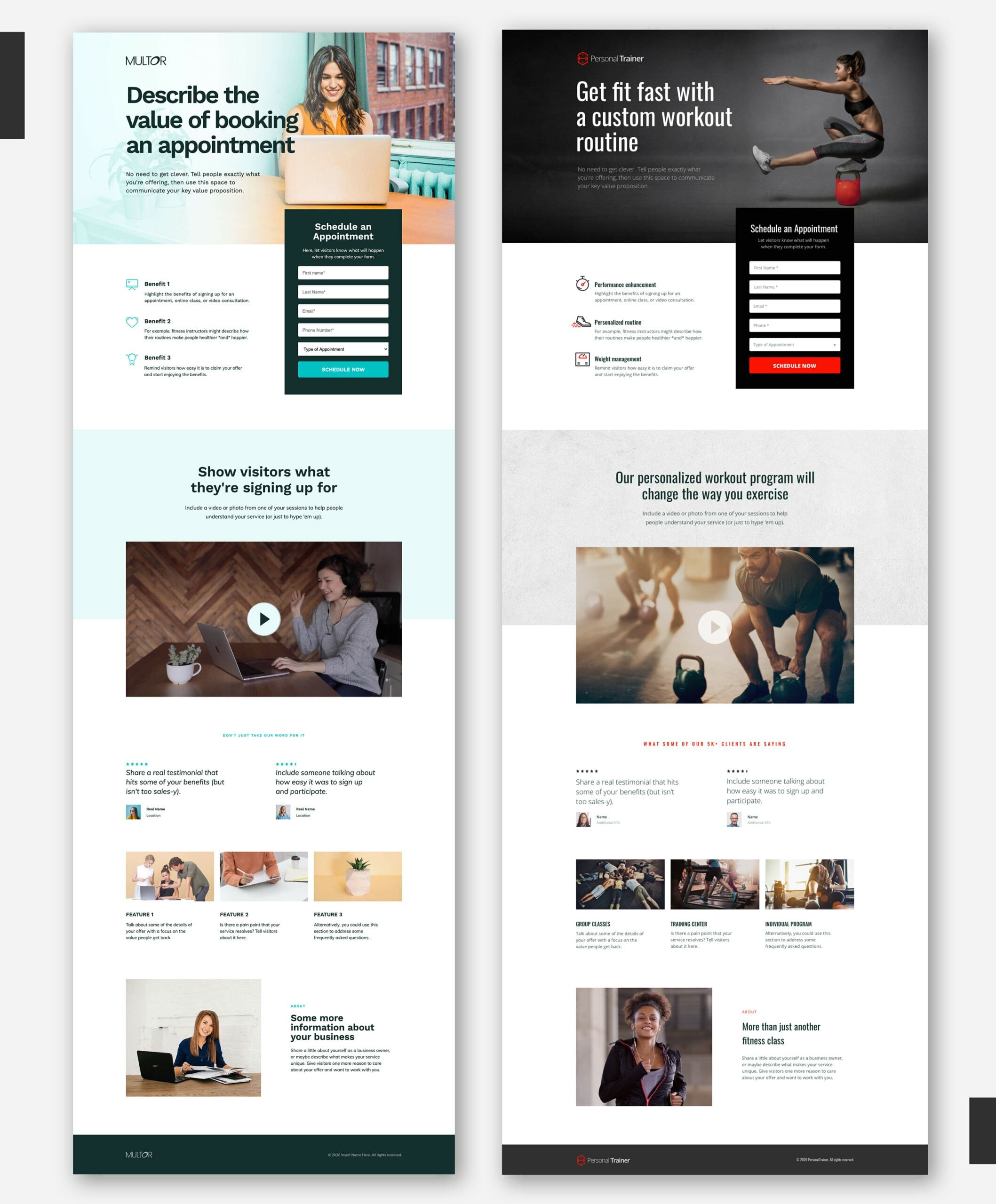
Multor → PersonalTrainer
The idea for the Multor lead gen template was to help businesses offer digital alternatives to their in-person services. This also applies to healthcare clinics and dentists to use it to offer online consultations, realtors can schedule people for virtual home walkthroughs, etc.
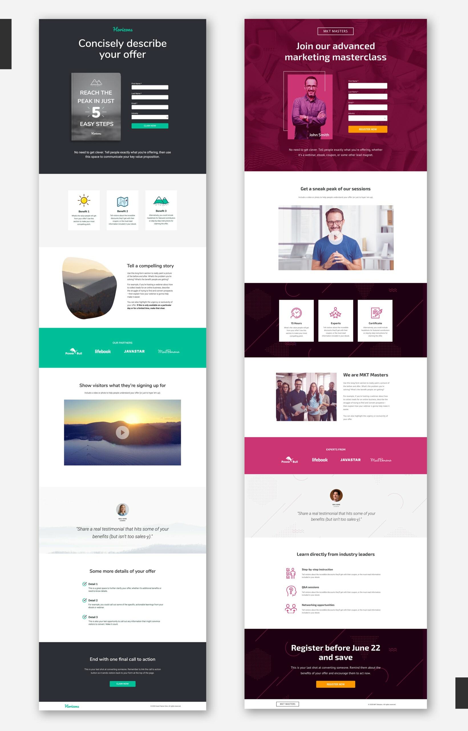
Horizons → MKT Masters
With the Horizons template, we wanted to help brands capture leads and for promotions during a down period. Think travel and hospitality companies that wanna get people booked for events next year, or marketing agencies hoping to attract business with an ebook or webinar.
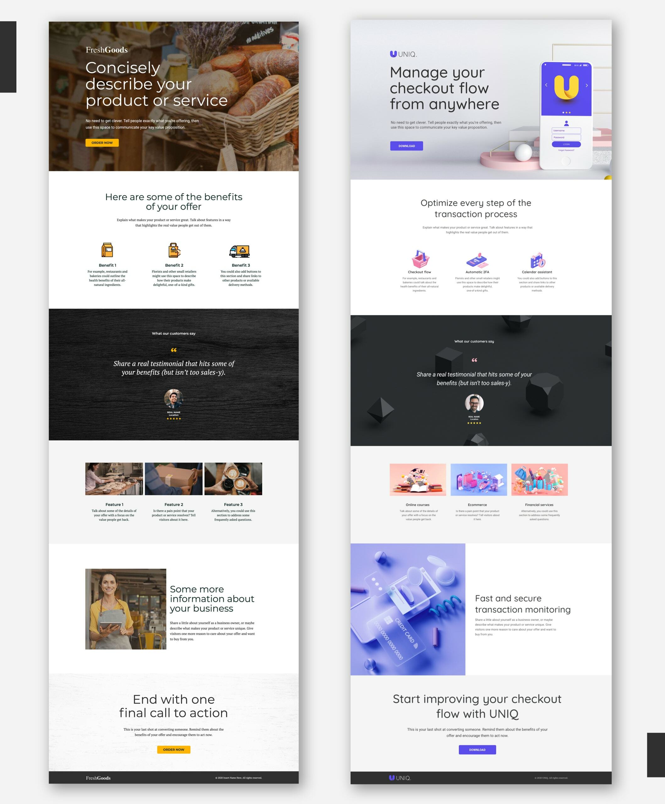
FreshGoods → UNIQ
FreshGoods is a click-through landing page template that was designed to help brick-and-mortars get online super quick. Small retailers that don’t have a website can use it to launch a basic ecomm page. Restaurants and breweries can use it to link out to delivery platforms or run special promotions. But it can also fit a more general product launch page—say, for a new mobile app.
As an added bonus, one of our very excellent copywriters (hi Garrett 👋 ) released a guide for putting together the content on your landing page, I’ll summarize it below:
Landing page layout guide
1. Your Header Section
Add a hero image of your product, service, or lead magnet . If you want to help prospects visualize the benefits, consider showing your offer in the context of use: someone using your product to solve a problem or improving themselves through your service.
Be sure to include your company logo . You want people to know this is your landing page, after all.
Write a descriptive headline that tells people exactly what you’re offering . You can also communicate your main value proposition using a couple of sentences just under your headline.
Update your call to action . If you’re using a click-through template, you could have a button that sends people to a product page on your website, a third-party delivery platform, or even add a Shopify integration. If you’re capturing leads, try to keep your form simple—only ask for the information you absolutely need.
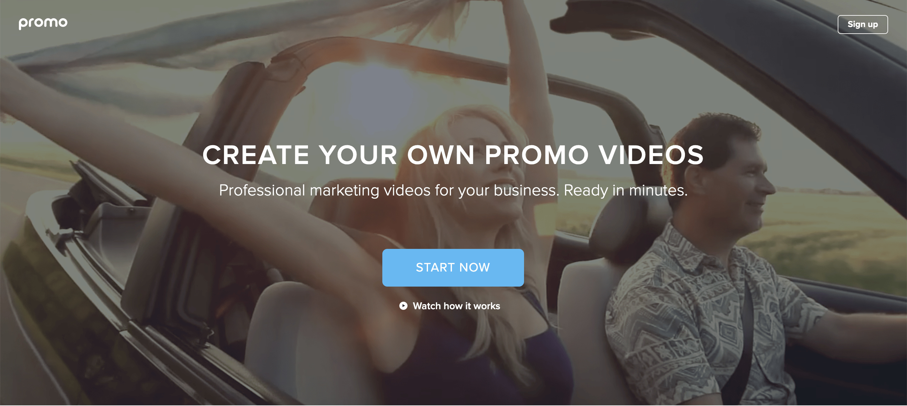
This header from Promo (featured in our post on high-converting landing page examples) communicates their offer super clearly.
2. Your Benefits Section
- People skim, so provide a bulleted list of the benefits of your offer . If you’re creating a sales page, use this space to highlight how your product or service improves your customers’ lives. If you’re offering a lead magnet (like an ebook), tell people what they’ll learn and how they can apply it.
- Does your template have icons for each benefit? Make sure they’re relevant to your offer or brand . If not, lots of websites offer free icons you can use to replace ‘em: streamlineicons.com, flaticon.com, thenounproject.com, material.io, icons8.com, ionicons.com, among others.
3. Your Social Proof Section
Include a testimonial from a satisfied customer , or maybe an endorsement from an industry leader. The trick here is authenticity: use a real quote that sounds believable. Even real testimonials that are too positive can sound like you’re making ‘em up.
- Alternatively, you could showcase other kinds of proof : awards you’ve won, trust seals you’ve earned—that sorta thing.
- Whatever you include here, remember to ask permission . For example, depending on where you source a testimonial from (Amazon, G2), there may be restrictions on how you can use it.
4. Your About Section
Let people know more about your business . What makes your product or service unique? What’s your mission statement—your raison d’être? This is your opportunity to connect with visitors beyond this particular offer.
- That said, you don’t want visitors to lose focus. Keep it short and sweet .


