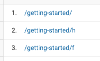
I was reviewing some stats on our landing pages in Google Analytics, and I noticed that on Monday, April 17, GA started showing the visits to our landing pages separated by variant. As in the screenshot below, it now shows the URL and the letter for the variant:

You can see it in the chart as well, where the regular URL (in this case, “/getting-started/”) is the orange line, then it splits into the green and purple (for variants “h” and “f”).

Does anyone know why this is happening?
