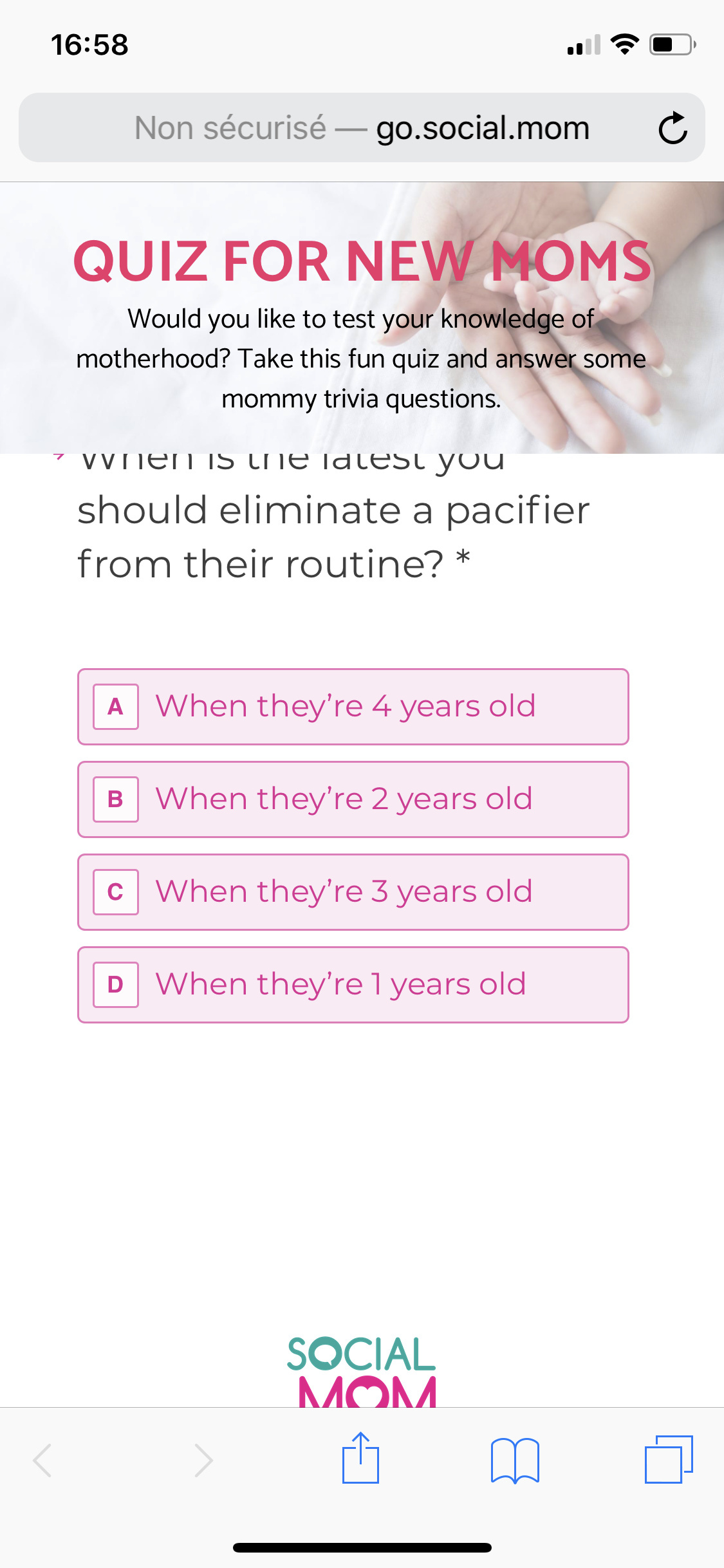
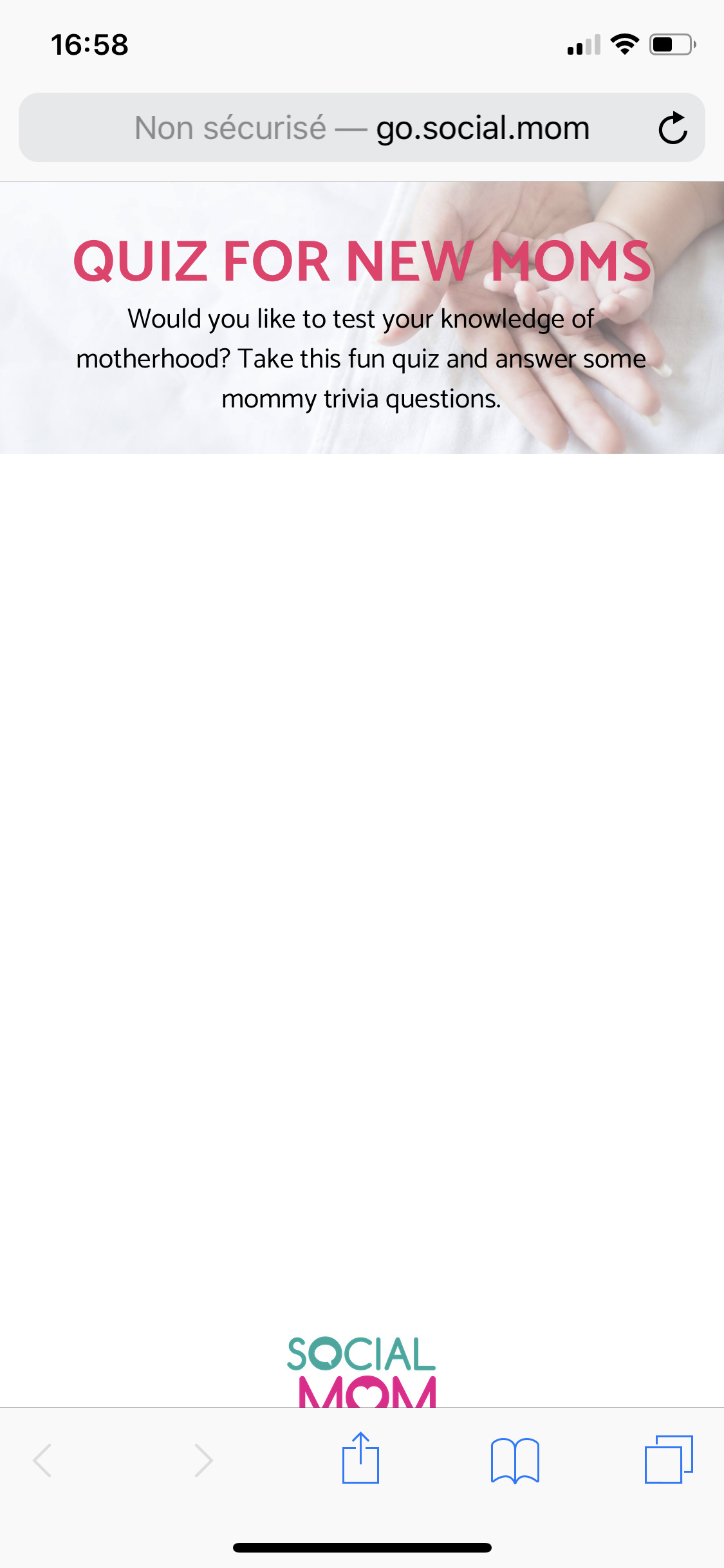
Hi @joelle, does it still happen if you remove all the elements except typeform?
it still doesn’t go fullscreen. But it works better! It’s like it magnets to the top of the page and goes under the first section when there’s one.
You do have to scroll within the quiz frame to see all the answers to some questions which is less than ideal.
In my iphone (6s) it looks good except for the banner that gets in the way. I would get rid of that.
Thanks for your comment. The point of the banner was to brand the page a little bit and make the link between our ads, the quiz and the next pages. So ideally we would fix the problem, not just remove the header
I understand that you want to brand the page. Why don’t you try something smaller at the bottom left corner of the page?
I used type form on my Unbounce page as well and have struggled with similar technical issues relating to mobile. This is the response I got back from Typeform support
“I can confirm that it’s been categorized as Non-Critical. This means that, while we’re aware of it, there is no set timeframe for it to be worked on and as such, it’s unlikely to be resolved in the short term.”
Typeform customer support team should take some notes from Unbounce. Even on the Pro+ Typeform support team doesn’t take technical issues very seriously.
This is what I’ve been feeling as well. Unbounce puts the customer support standard up and it seems hard to follow for others.
Did you find a solution or an alternative?
Hey Josh! That seems like a great solution. We ended up moving saas entirely. We chose Paperform which seems to be working just fine so far. Thanks a lot for your input 🙂
Glad you found an alternative. How do you like paperform in comparison to typeform?


