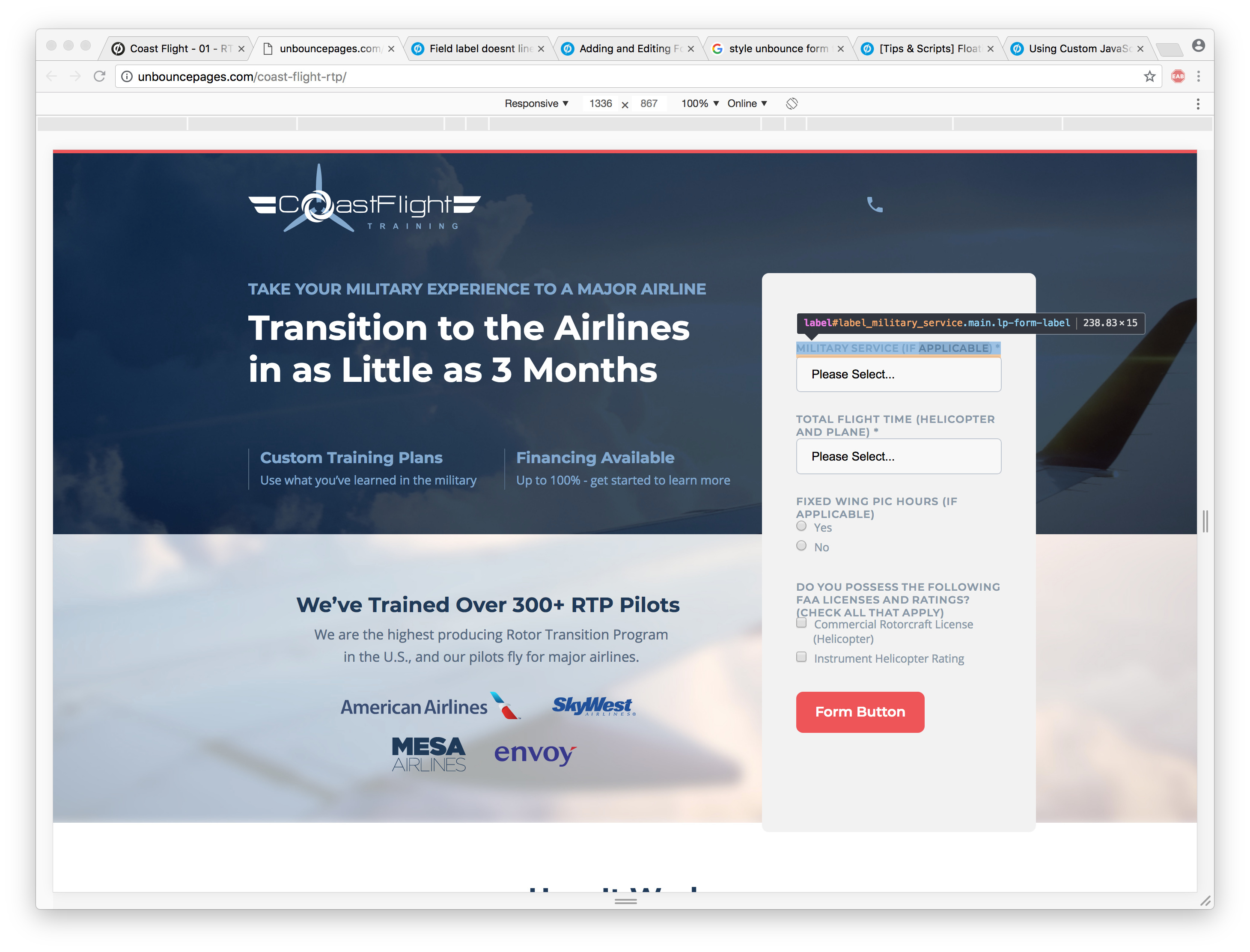
Hi @shoodwin!
You could try grabbing the ID of the field instead of the label and add some top margin. This worked when I tried it. It should look something like the following:
select#ELEMENTID.ub-input-item.single.form_elem.ELEMENTID
If you go back into Chrome dev like you did on the screenshot, you’ll be able to find and test it there.
I hope that solves it. Let me know if you need further assistance!
Hey @Caroline
That was a great tip, thank you.
Here’s what worked for me:
#lp-pom-form-117 .lp-pom-form-field .single {
margin-top:6px;
}
#lp-pom-form-117 .option {
margin-top: 6px;
I had to use the form element ID instead of the field ID, but 1,000 thank you’s 👏🏽
Shane


