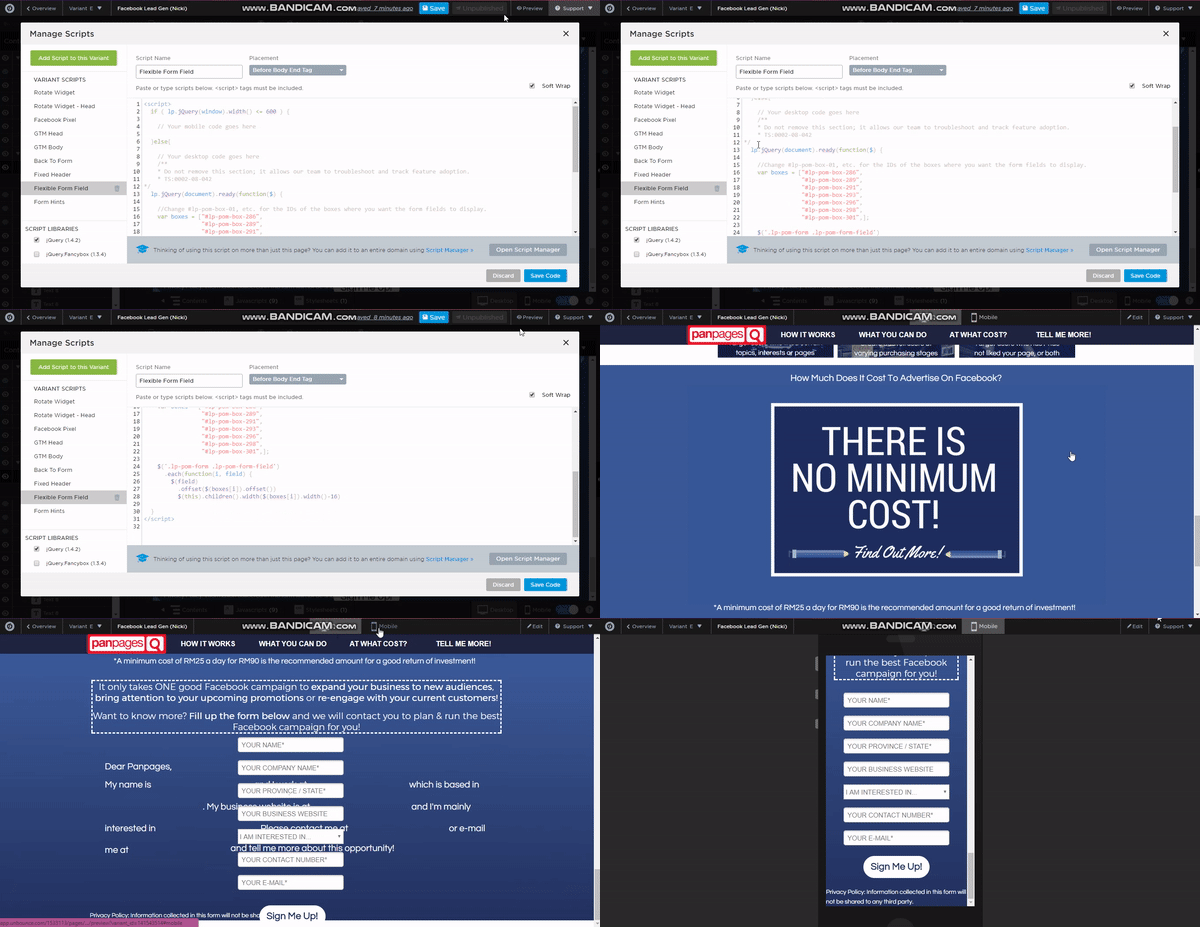
I tried using this tag from @Vic in that same forum above:
<script>

  if ( lp.jQuery(window).width() <= 600 ) {

// Your mobile code goes here

  }else{

// Your desktop code goes here

  }

</script>
So now my script looks like this in attempt to make the flexible form field work on the desktop version at least:
     <script>

       if ( lp.jQuery(window).width() <= 600 ) {


    // Your mobile code goes here


  }else{


    // Your desktop code goes here

    /**

    * Do not remove this section; it allows our team to troubleshoot and track feature adoption.

    * TS:0002-08-042

*/

  lp.jQuery(document).ready(function($) {


    //Change #lp-pom-box-01, etc. for the IDs of the boxes where you want the form fields to display.

    var boxes = ["#lp-pom-box-286",

                 "#lp-pom-box-289",

                 "#lp-pom-box-291",

                 "#lp-pom-box-293",

                 "#lp-pom-box-296",

                 "#lp-pom-box-298",

                 "#lp-pom-box-301",];


    $('.lp-pom-form .lp-pom-form-field')

      .each(function(i, field) {

        $(field)

          .offset($(boxes[i]).offset())

          $(this).children().width($(boxes[i]).width()-16)


  }

</script>
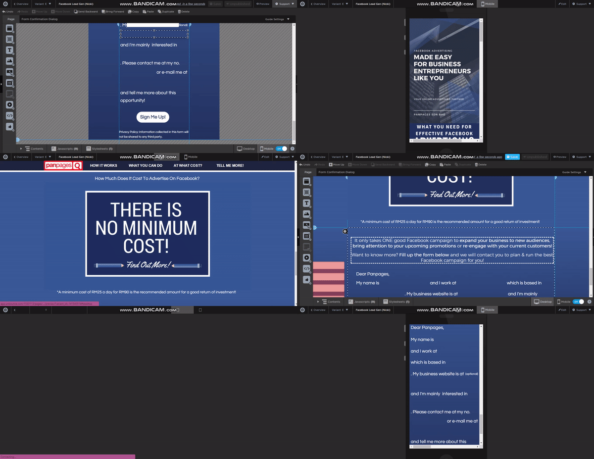
Not sure if I’m doing anything wrong, but I do hope that the flexible form fields can work on both desktop & mobile version. Currently after implementing the above code the flexible form field doesn’t work at all:

Ultimately, my question is still this: how do i get flexible form fields to work on both devices?
The short answer is you don’t. The long answer is you don’t need to. For what you are doing (based on the screen shot) you only really need the flex form fields at desktop. At mobile it is a 1 column form. Simple.
If I am missing something let me know but as I see it the best (fastest) solution is to have the flex form fields only on the desktop version of your page.
Joe
Hi @Joe_Savitch,
I don’t know about the flexible form running only on desktop, but when I tried running the flexible form field script on both devices after publishing the page, the code worked somehow. Turns out I just needed to publish the unbounce page for the code to work, so there’s that 🙂


