Hi everyone,
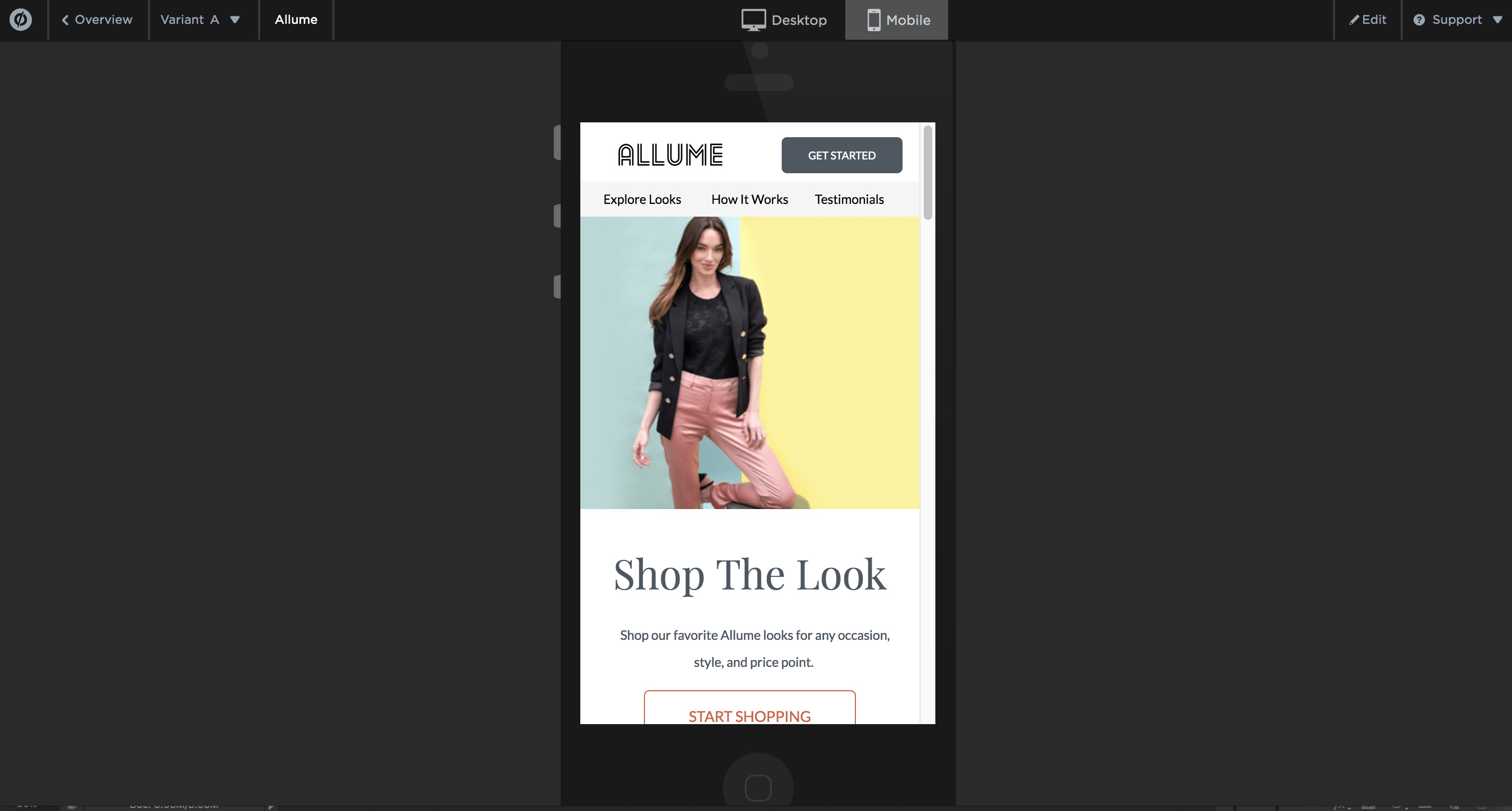
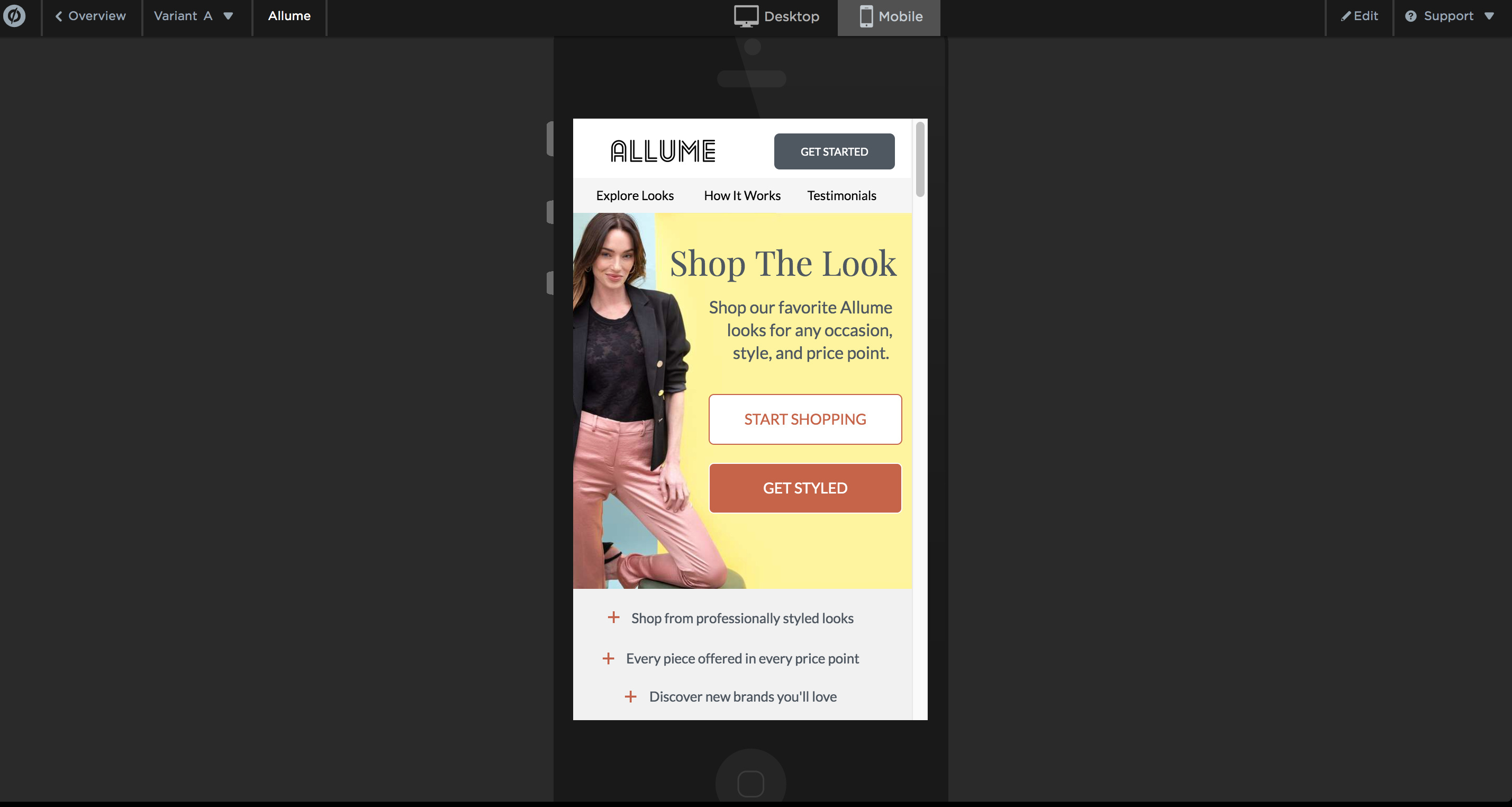
Having major issues with mobile responsiveness. Until recently whatever the Mobile Preview mode was showing, it would identically convert to what you see on mobile.
I’m not entirely sure when this switch happened, but now all of the pages I’ve ever made have around 20px padding to the left and right. I’m still using the same phone for previewing - iPhone 7s. My clients are experiencing the same issue - this is a major kick in the nuts to an established workflow.
Anyone else experiencing this and what might be the solution? I’m positive this was NOT there before, built more than 300 pages and never had this happened once, the same goes for my clients, never had a single complaint about how it looks on mobile.
Was there an update I missed?
what you see -
vs
what you get -
Any thoughts and ideas are greatly appreciated!
OP


