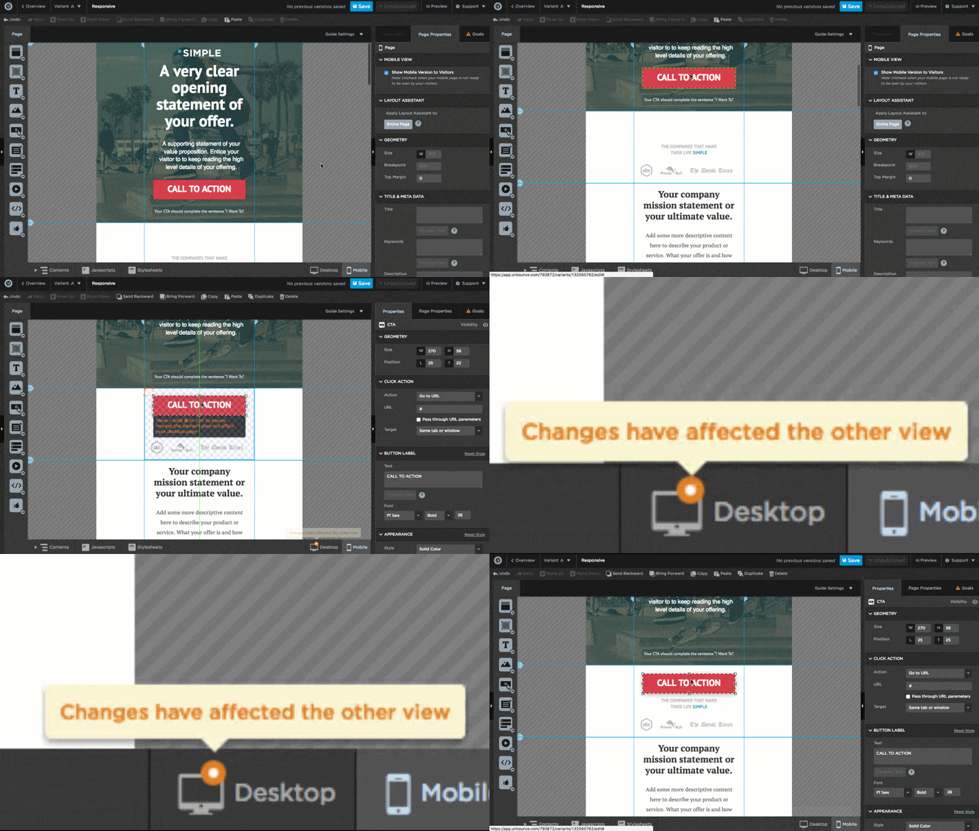
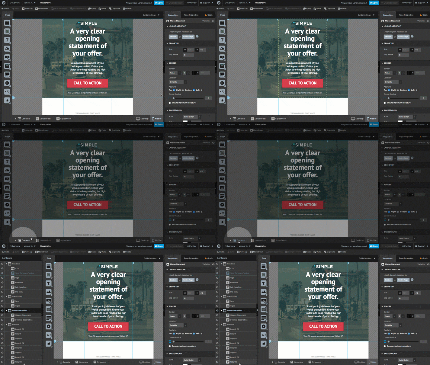
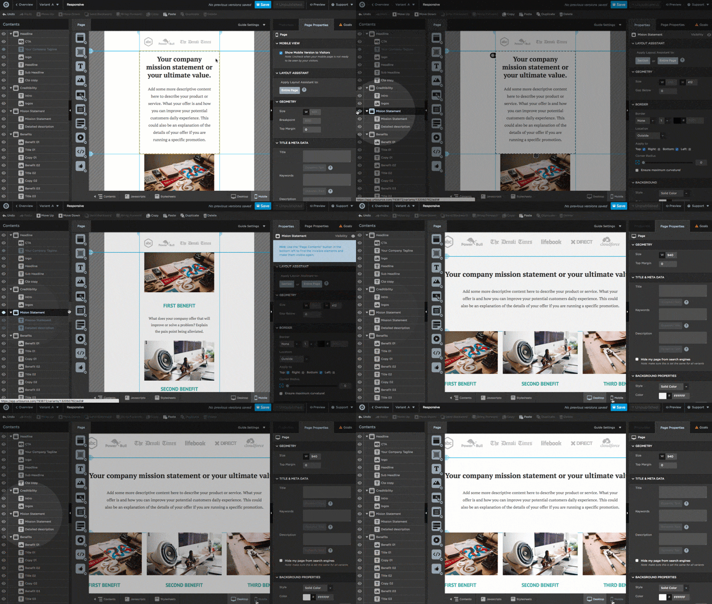
The new feature released allows you to click on the mobile version and make changes to it but doing this also affects the design on the desktop version.
Hi Tanveer,
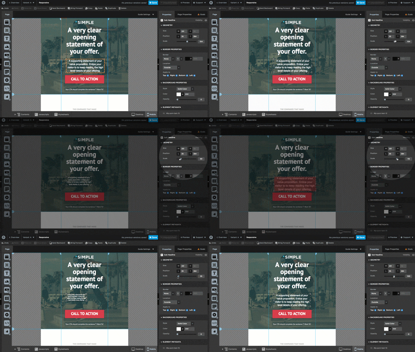
Elements can be sized independently (for example, images can be different sizes on Desktop and Mobile and text can be scaled in size via the properties panel).
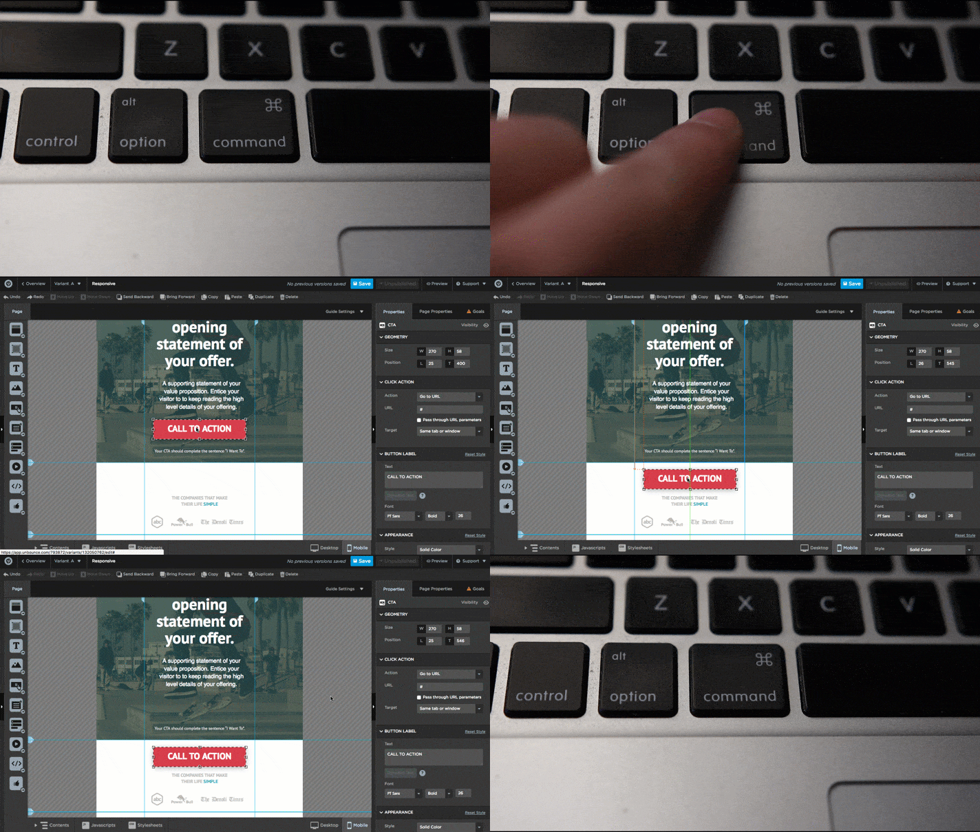
You can also move elements on Mobile without affecting the Desktop version. Anything moved within the same page section won’t affect the opposite view. If you are moving something to a different page section (or also grouping elements within a box), you’ll need to hold down command/ctrl to not affect the opposite view, but you’ll see a warning if it’s necessary to use command/ctrl + click for a particular item like the ones seen here: http://screencast.com/t/awFFwNz1FwgX
Your actual copy will be mirrored across both the Desktop and the Mobile view and while the images can be different sizes, it’s the still the same image displaying at a different size across Desktop and Mobile(this is because Responsive Design isn’t supposed to be two separate pages, but one page with two different arrangements). That said, if you do want two completely different content blocks, you can hide an element on one side using either the properties panel or the the page contents list, like so.
We’ve got more detail on the ins and outs of the Mobile Responsive feature here.
Does this work for copy/text as well?
Hi Daniel,
Yes, the above methods work for copy/text as well since they are considered a type of element on the page.
Quinn gave a pretty good overview of how to arrange/size different elements on your mobile version.
One of the best tricks, I’ve learned and also mentioned above is the command/ctrl + click for keeping everything in place across the desktop and mobile versions.
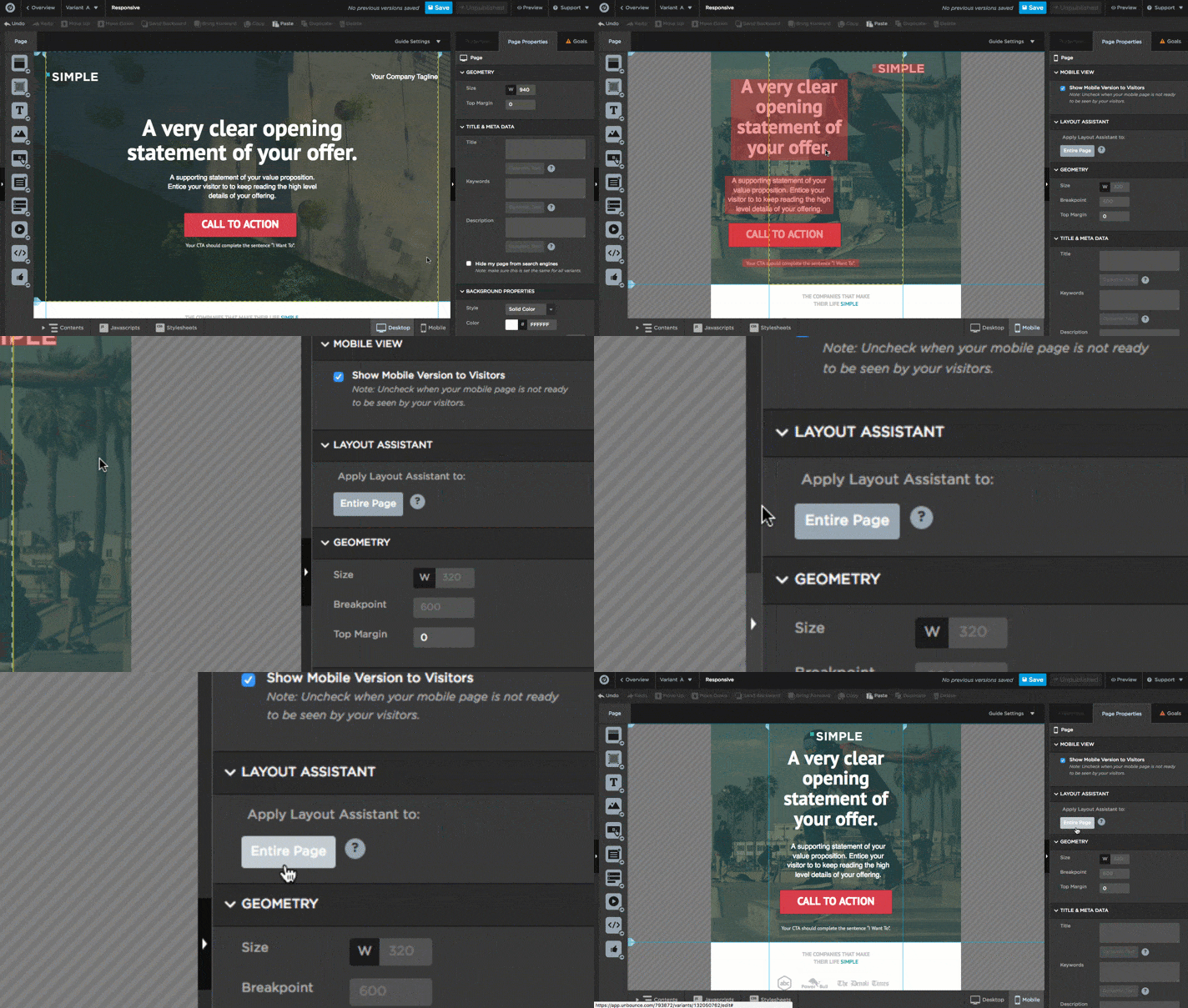
The only thing missing that I might add is the ability to automatically arrange a page and/or section (In fairness, this Layout Assistant was added a bit later than the original response to this question).
I used these swift keys, made about 20 changes without the red indicator that I had effected the other view, and saved. Went back to the desktop and it was an absolute mess. It’s such a mess I have to walk away from it.
Additionally, there is no way to revert, so you’re walking on a tight rope with this. At least give people an easy way to revert…
I would also like to add that you need a change only to “mobile version” or “desktop version” to avoid having to hold down command/ctrl for the entire time. It couldn’t be that hard to add as a feature surely?
Hi, I’ve tried using the Ctrl + Click for the text edits. it doesn’t work. I’ve tried all night to find a solution but nothing is working. When i change the font under mobile, desktop version gets messed up and vice versa. Is there a definite way for me to edit text on one platform and not affect the other??
Same difficulty for me !
Has this been solved? I am getting the same issue - changes on mobile impacts desktop
Hi guys,
The Ctrl + Click only relates to the position of the individual elements.
Changing the font is a whole other matter.
If you really need to have different fonts for Desktop & Mobile, what you can do is hide the desktop Text element on your Mobile page.
Insert a new Text element and style it however you want. Last but not least, hide the newly created Mobile Text element from your Desktop page.
I’m not sure, why you would need to change fonts but that’s the way to do it.
Best,
Hristian
Hi Arsalan,
Changes on the mobile version impact the desktop version only if your elements are changing page sections.
If you keep the elements within the same page section, you shouldn’t have problems.
Alternatively, if you really need to change the position of an element to a different page section you can use the Ctrl/Cmd + Click to accomplish it.
Best,
Hristian
Just stumbled across this thread. Thanks for all the tips! The Section Auto Layout Assistant helped and the Visibility tip too! But the CTRL tip really helped save the day! In summary, mobile optimization is now a breeze!
Hi Arsalan!
The important thing to keep in mind is that the elements that you have on your page (in both builders) are actually connected together, and when you switch between them, you are moving the same element. Sort-of like the reflection of a mirror. The changes you make in one builder are going to influence the other builder as well, but there are a few tips you can follow from our FAQ to make this work to your advantage.
1. Mirror Image
Be aware that any time you add or delete an element on one version, it will do the same on the other. Each time this happens we’ll give you a little warning at the bottom-right of your canvas.
2. Layout Assistant
Unbounce has this handy little tool called Layout Assistant that will do most of the heavy lifting when it comes to formatting the mobile version. When you first switch over to mobile, simply navigate to the Layout Assistant tab and click the Entire Page button.
3. Force Independent Changes
To move elements without affecting the desktop version (and vice versa), hold down the Command key (mac) or Control key (windows) when you drag an element. This will allow you to move elements outside of a page section on one view without affecting the placement of the element in the other view.
4. Resizing Text
To resize text, rather than changing the text size (which will affect both views), use the scale bar.
5. Page Contents
If you want to get a better sense of how your elements are laid out on the Z axis, open up your Page Contents panel by clicking the Contents button at the bottom left of your screen.
6. Hide Elements and Page Sections
Sometimes it’s difficult to have everything from your desktop version on your mobile as well. Don’t fret, you can simply hide elements in either desktop/mobile from appearing on your page.
💡 Tip: This works for images, text, boxes, buttons, forms - and entire page sections.
To hide elements, rather than deleting elements that won’t fit in your mobile responsive version, click on the Contents button at the bottom left, then click the eye icon beside the element you’d like to hide.
🔗 Related Resources
For a more detailed instruction on how to use Mobile Responsive, check out this Academy article. Alternatively, you can check out this workshop that walks through all of this (and much more) in a helpful video.
THIS IS HORRIBLE.
Why I am I paying for a service that doesnt even let you EASY and INDEPENDENTLY change your mobile and desktop layout?
Has anyone tried LEAD PAGES???
Reply
Log in to the Unbounce Community
No account yet? Create an account
Enter your E-mail address. We'll send you an e-mail with instructions to reset your password.

