Dear Unbounce community members,


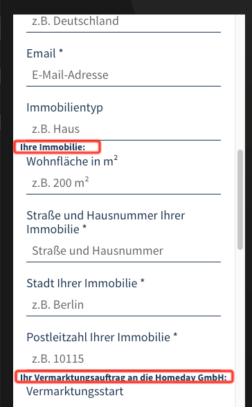
I’m currently struggling with styling the additional Category labels to form fields on mobile. Here is how it looks now:


CloudApp


For now the bold labels are just regular text fields.


Is there any way to increase the spacing after certain fields Immobilientyp and Vermarktungsstart of the form using css or anything else? I would very much appreciate your support and code snippets!


Thank you so much in advance!


Cheers,

Alis

@Joe_Savitch maybe you would be able to help?


You have a link to the page?


Guessing you’d have to change the position of each of the fields and each field afterwards…


((My main annoyance with unbounce is it’s reliance on absolute positioning 😉 ))


Thank you for looking into that!


Okay so each of the field inputs and labels are contained within a div with the ID of ‘#container-input-name


So in a style sheet you would need something along the lines of


<style>
#container_property_zip_code {
top: 1000px !important;
}

The top value you need to work out I am afraid… and then each successive field you’ll need to redo as well… The !important tag will mean that the style sheet will supersede the inline styling unbounce has applied to the form…


Thank you so much! It indeed requires some magic! But your solution works!


Good to hear 🙂 sorry I couldn’t have just said use “margin-bottom:10px;” 😉


Reply