Is there an easy way to control the placement of error messages?  Like placing it above inputs vs below inputs? I am looking for a way to do this for all inputs if a form exists on a page or a specific input element based on id.


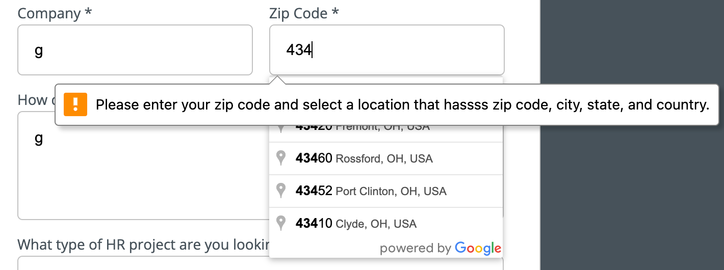
I am running into an issue where the messages cover my drop down.


I can’t find any information on what styling and what the html structure is like for how Unbounce applies validation messages. Any help is greatly appreciated!


Hey @nate-oo 👋🏻

I hope this older walkthrough post in the Community is helpful for you, it does require some customization. Let us know how it works for you!


  1. Above the Field: Place error messages above the input field to catch the user’s attention immediately.
  2. Inline with the Field: Display the error message directly beside the field for instant clarity.
  3. Below the Field: Positioning error messages below the field ensures consistency and avoids visual clutter.
  4. Color-Coded: Use noticeable colors like red for error messages to differentiate them from normal text.
  5. Clear and Concise Text: Use straightforward language in error messages, like “Email format is invalid.”
  6. Focus Highlight: Highlight the field like editing with an error to guide users to the issue.
  7. Real-Time Validation: Validate inputs as users type to prevent submission errors.
  8. Tooltips: Use tooltips for error messages when space is limited, providing detailed explanations when hovered.
  9. Grouping Errors: Display all form errors at the top of the form to give users an overview.
  10. Responsive Design: Ensure error messages adapt to different screen sizes for better accessibility.
  11. Accessibility Standards: Use ARIA roles to make error messages accessible to screen readers.
  12. Error Editing Option: Allow users to edit the field directly when an error is detected, streamlining the correction process.


4o


Reply