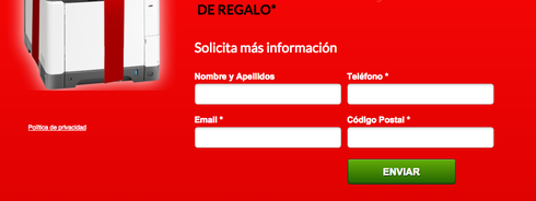
Can we have the form fields to be aligned in different ways instead of stacked up?
Hello Ben - thank you for the suggestion! At this time, our forms format vertically but as we introduce new features into Unbounce, this is the kind of functionality we would like to offer.
In the mean time, a third party form tool such as wufoo (http://wufoo.com/) may offer you the kind of customization you are looking for.
Hope this helps!
Can there be more than 1 column of form? I have a few more fields to add, but I would like all of them to be above the fold. Thanks!!!
Tim
How is this going? It has been some time since we requested this feature and nothing has happened !
Would like to see this feature as well, I would think it would be easy to implement with css and then just define how you want the the field aligned.
? solution?
This would be a great feature; layouts right now are very constrained by vertical-only fields
Yep, this is a much needed feature!
Is it possible for the time being to have a script that we can use to have them aligned horizontally?

Hi Joakim,
The honest truth is that we’re hard at work on features and improvements that are higher priority than this one. I wish we could tackle all of the requests in this forum, but we are staying focused on the features that will help the most customers increase their conversions and marketing ROI. You can see a list of idea requests ordered by popularity here:
https://getsatisfaction.com/unbounce/…
At the moment we are working on (server-side) Dynamic Keyword Insertion into published pages, managing javascript at a global level, and sharing snippets of content between multiple pages. We’re also prototyping a solution to allow responsive design for mobile & desktop.
We’ve also been through a growth spurt in the last couple of months and are finally getting some more helping hands on our dev and design teams.
I do appreciate your artwork though! Let me know if you’d like any more clarification on why we’re building what we are right now.
Cheers,
Carter
THIS!
I was looking for this as well, and came across this script that will help you create a horizontal form. Seems pretty straight forward. Hope this helps!
https://gist.github.com/markwainwrigh…
Hi everyone,
We’ve had a few customers wondering how to make a form that flows entirely horizontally (i.e. not just in two columns like the example above.) Like this:
I’ve written a script that’ll let you achieve just this. If the fields reach the edge of the page they’ll then break and keep going on a new line. It plays nicely with fields of varying heights, such as long checkbox/radio lists.
It also has options for placing the submit button inline with the fields, on a new line, or remaining wherever you manually placed it in the page builder.
Enjoy!
Hi Mark , I copied the script, but it does not work
Hi Carlos - Mark’s script will push things horizontally from the place you set the form to the right, until it hits the page edge.
Right now, you have your form set in the middle of your page section, so there’s not enough room for it to split out in a straight line without immediately spilling over the edge of the page, which it will stop itself from doing.
Thanks Quinn and of course Mark, for the best support. A additional comment, its only visible how it works in the Preview Mode.
Hi Carlos - that’s correct. Scripts only load up on preview or on the published page, so you will have to do one of those two things to see the forms laid out horizontally.
Form improvements are something that we want to tackle down the road, likely after some improvements to Mobile Responsive, along with a handful of smaller projects that have been on the back burner.
I added the script to my page, dropped a form into one of the sections, expanded the form to the full width of the page, but it’s still showing it in it’s vertical (default) form. I added it under the Javascripts and selected ‘before body end tag’.
Am I missing something?
Hi Hershal try this:
Placement: Head
be careful when warning messages appear on the form do not overlap fields
You must modify In Custom CSS (Stylessheet)
/* The title bar */
.lp-form-errors div.content{
background-color: #f0000d !important;;
color: white !important;;
position: relative !important;;
left: 0px;
}
/* The list of errors */
.lp-form-errors div.content ul{
background-color: white !important;
color: #f0000d !important;
position: relative !important;
left:0px;
}
/* The whole box */
.lp-form-errors div.content{
border: 3px solid white;
position: absolute;
top:70px;
left: -610px;
}
#lp-pom-form-40 {
width: 100% !important;
}
.div.error {
background-color: grey !important;
color: #f0000d !important;
}
@media only screen and (max-device-width: 480px) {
/* The title bar */
.lp-form-errors div.content{
background-color: #f0000d !important;;
color: white !important;;
position: relative !important;;
left: 0px;
}
/* The list of errors */
.lp-form-errors div.content ul{
background-color: white !important;
color: #f0000d !important;
position: relative !important;
left:0px;
}
/* The whole box */
.lp-form-errors div.content{
border: 3px solid white;
position: absolute;
top:270px;
left:8px;
}
>>> #lp-pom-form-40 is the ID of my Form<<<<
#lp-pom-form-40 {
width: 100% !important;
}
.div.error {
background-color: grey !important;
color: #f0000d !important;
}
}
Looks like this

Thanks! That somewhat worked. Are is there something I can do with the submit button? I only have two fields and would like the submit button to be inline as well. 
But Quinn, this has been an issue for over 3 years now.
Hi Bryan - it has. But, we try to prioritize our Product Roadmap based on customer feedback (not just here, but through Support tickets, and customer surveys as well) and it hasn’t been as high a volume request as a lot of other things that we have built. Again, it’s definitely still something we have our eye on building, but our focus has been to get the most requested features built when possible.
If you’re having any issues with the script Mark’s created as a workaround, we can definitely help troubleshoot that though–just shoot us an email at support@unbounce.com.
Is there any way I can make the form to have 3 columns? I would like 3 column form fields and the submit button below the fields.
Hi Maxus,
You might be able to achieve this by modifying the code a bit. If you’re still having troubles, go ahead and shoot us an email at: support@unbounce.com
Edit:
It turns out, Mark’s script will actually let you do 3 columns: (https://gist.github.com/markwainwright/9338233)
It stretches until it hits the end of the page section or box it’s in, so you just need to adjust either the box the form is in and/or the form field widths so three fit. There’s an option in the code to put the submit button on the next line or do manual positioning.
If you’re still having troubles getting this to work, contact our support coaches:
support@unbounce.com
This is probably an incredibly silly question, but one I need to ask - Where do I add this code? I’ve copied it from GitHub but have no idea where I’m supposed to place it 😦
Can someone here help me out?
Cheers,
Jaymes
Reply
Log in to the Unbounce Community
No account yet? Create an account
Enter your E-mail address. We'll send you an e-mail with instructions to reset your password.

