Sometimes I want a skinny full width box to appear on a Hero so I can place text on top of the box. This is useful when the text needs standout against a complex hero image.
The js for the full-width box was easy to implement, I found it in the community; placed Before End of Body Tag (don’t forget to bracket <> the script tags ).
script
var e = jQuery(’#lp-pom-box-309’); //Replace with your element ID
var a = jQuery(’.lp-pom-root’);
e.css({‘left’:0, ‘width’:‘100%’, ‘box-sizing’:‘border-box’}).prependTo(a);
/script
But, when I tried placing text on top of the box, it seems the box was always stacked on top of the text and obscured it, even though the view in my contents menu indicated the text should be on top.
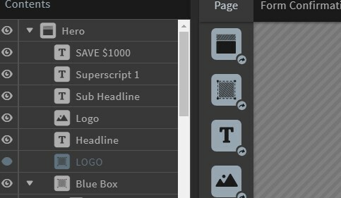
The copy SAVE $1,000 should be visible on top of the blue box. It’s clearly visible in the builder view, but when published, it disappears behind the blue box.


If I placed the text inside the box, it would not stay centered with all device types and sizes.
With a little help from a friend that has the technical skills I lack, we I found a solution.
First, create a text element but make sure it is not nested inside the box.
Use the keyboard arrow keys to position the text on top of the box (not the mouse).
Change the Z-Index of the full width box. This is a css property that determines the stack order of all elements. It needs to be a lower number than the text element.
If you’re a photoshop user, think of the stack order like layers in photoshop. Items with higher number are laying on top of items with lower numbers.
The Z-Index is visible in the lower right-hand corner of the Properties menu. Here’s is how to set the value to 1 which will make sure the box is behind the text.
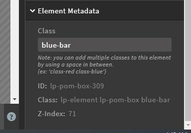
In this example I have a blue box that is full width. I entered a class name for the blue box. I called this one blue-bar. You can see the Z-Index is currently 71.

Now, change the Z-Index with a little CSS added to the Stylesheets tab. (don’t forget to put the brackets < > on the word style.)
style
#lp-pom-box-309.blue-bar{
z-index:1;
}
/style
This forces a Z-Index of 1 so the blue box will appear behind the text.

