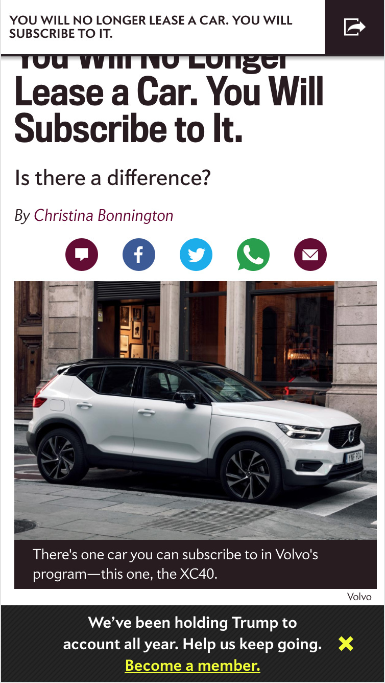
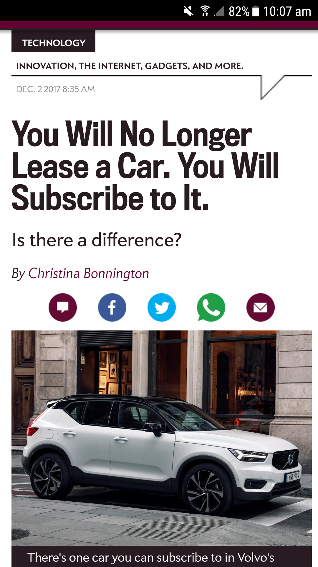
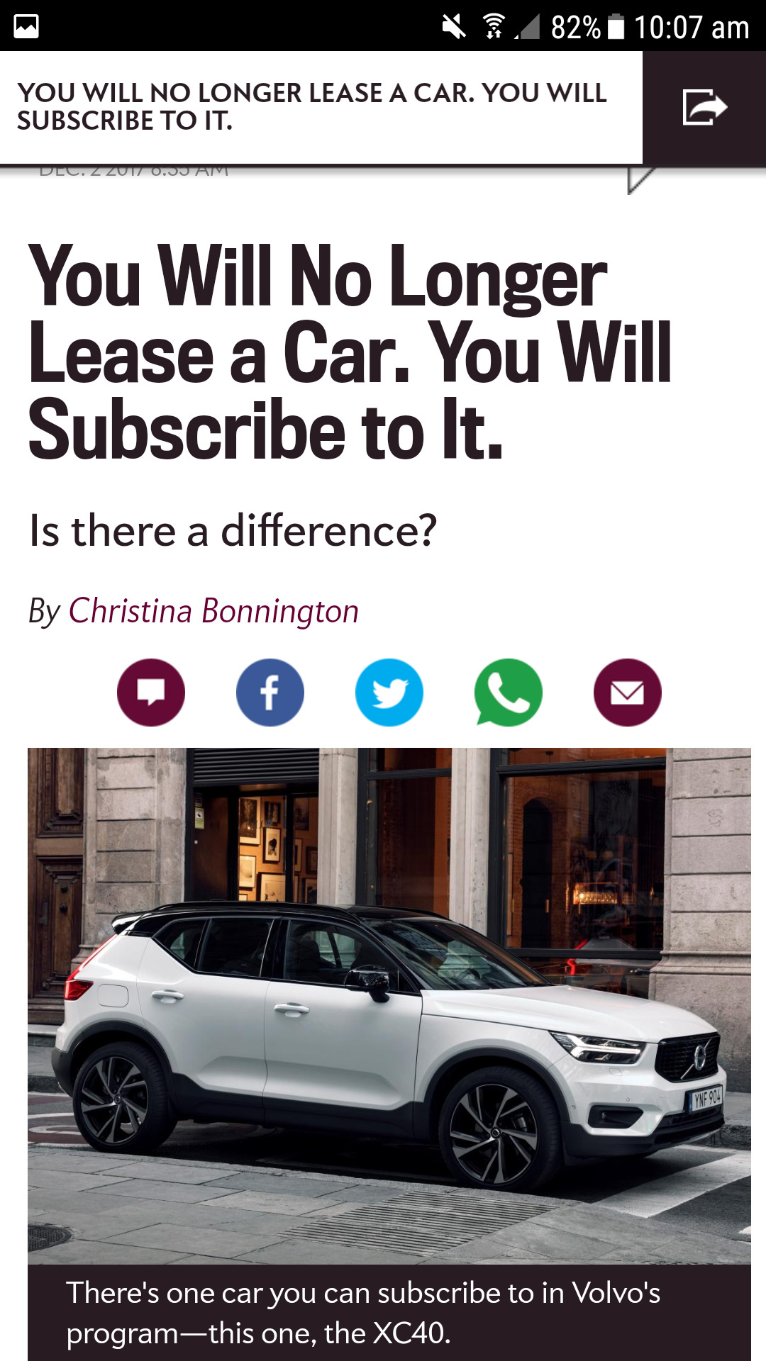
Looks like the header is still scrolling over the page? Can you explain what you mean in more detail or show a screenshot maybe 🙂
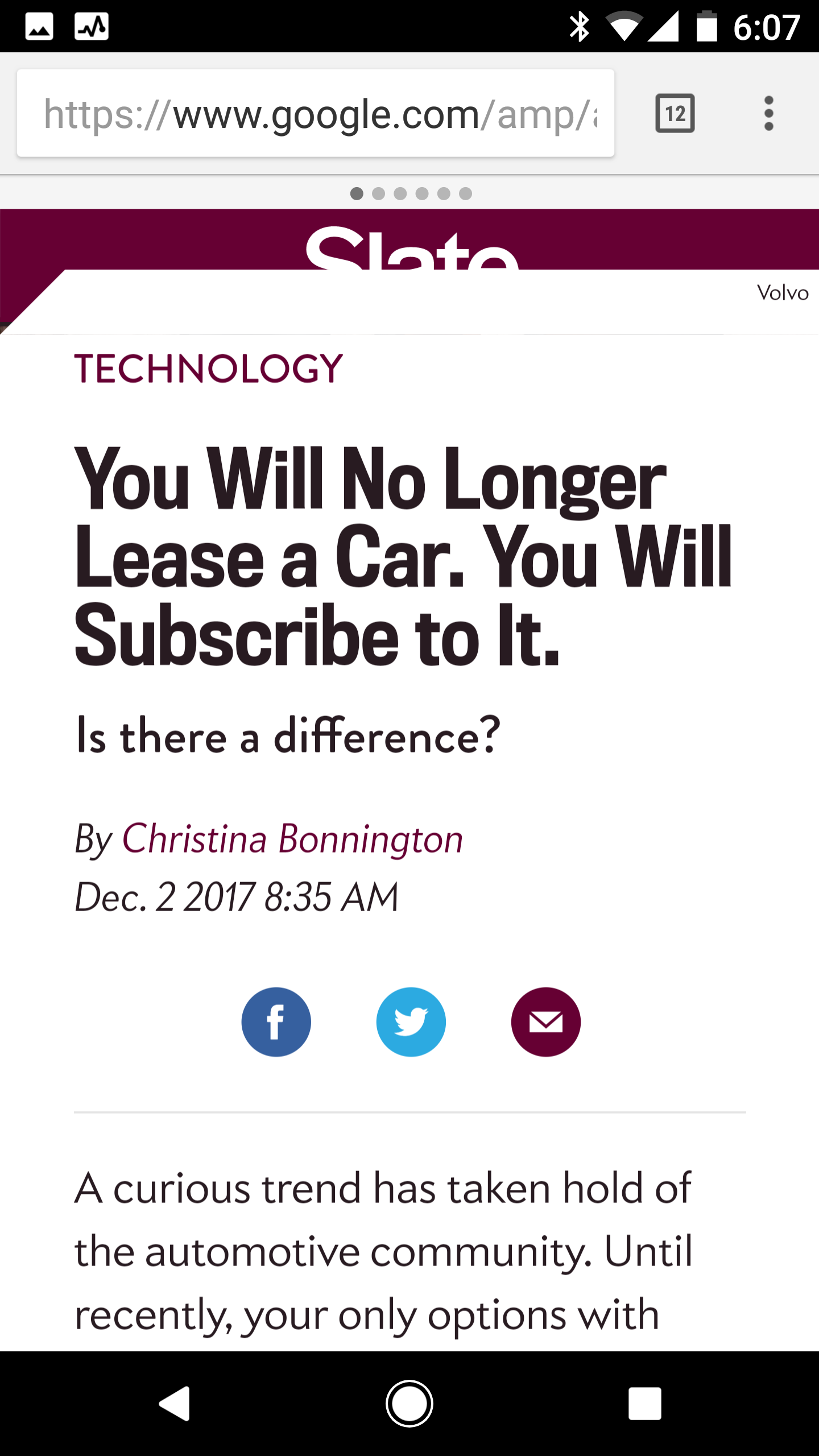
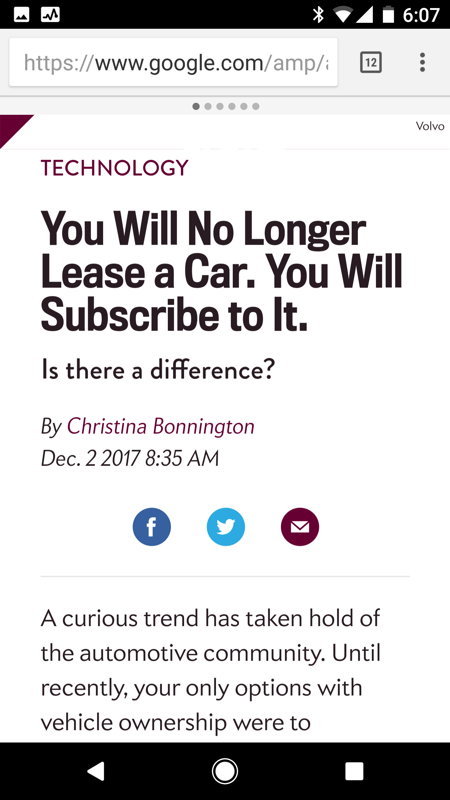
Hmmm, on my mobile (an android) it’s different.
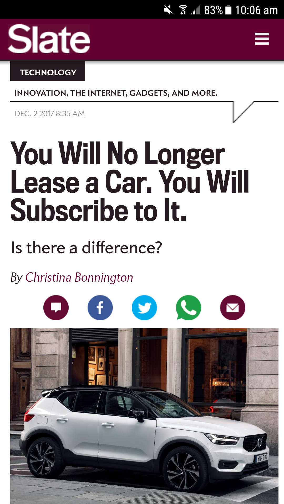
That’s odd, I just tried on my Android on Chrome browser, and it looks the same as before – what browser are you using? It looks broken on your screenshot to be honest.
Hi Zoe, I use chrome as well. I noticed when I go directly to slate.com and view the article/page it is exactly like you see it. But when I search it and use the link for the AMP page, it is different, and the page works the way I described. So, I’m guessing it’s a feature only available if you’re using AMP?
Thanks,
Charles
Ahh yes it’s probably AMP breaking the pop-up share feature and header.

