We want to change the width of our mobile page to better fit the current standard of larger screens (iphone 6 allows 375 pixels). Our current width is set to 320.
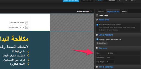

We want to change the width of our mobile page to better fit the current standard of larger screens (iphone 6 allows 375 pixels). Our current width is set to 320.
Great question! At this time the breakpoint for our mobile pages can't be changed. This is something we are hoping to be able to adjust in the near future though. That being said, our Smart Builder pages are fully responsive and they have 3 breakpoints associated with them
The breakpoints for Smart Builder pages are as follows: 425px or smaller (e.g., mobile devices) 426-768px (e.g., tablet devices) 769px or higher (e.g., desktop devices)
We've got some more information about this here as well: https://documentation.unbounce.com/hc/en-us/articles/4403349203732-Editing-the-Mobile-Desktop-or-Tablet-Version-of-your-Page-in-Smart-Builder
Hope this helps!
This is a feature that has been requested over 7 years ago. Respectfully, I’ll believe it when i see it.
No account yet? Create an account
Enter your E-mail address. We'll send you an e-mail with instructions to reset your password.