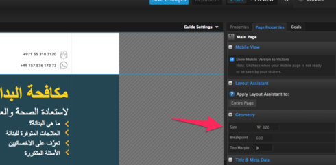
We want to change the width of our mobile page to better fit the current standard of larger screens (iphone 6 allows 375 pixels). Our current width is set to 320.

We want to change the width of our mobile page to better fit the current standard of larger screens (iphone 6 allows 375 pixels). Our current width is set to 320.

Hi Christoph,
Currently, the Unbounce mobile breakpoint is hard-coded and you can’t change it.
There are a few similar threads in the community asking for more freedom when setting the breakpoint but I’m not sure what’s the current status on that request.
Best,
Hristian
Thanks Hristian. There aren’t any work arounds either? Wouldn’t it make more sense if it was percentage based so the screen size would also be ok irrespective of the device used?
Hey @Hristian ,
is there any update on this topic? I’m especially interested in changing the break point of a the mobile form confirmation dialog. It’s set at 240px, but to embed a survey monkey survey I need 300px at least.
Does anyone know a work around? Besides creating a confirmation page instead of a pop up.
Thanks
Hi @Florian,
There is no way to change the breakpoint at this time.
The easiest workaround would be a thank-you/confirmation page rather than a popup.
Best,
Hristian
Hi, I believe it’d be super valuable to add at least a breakpoint for tablets. For a lot of businesses and clients (including ours), this is the channel that converts at highest conversion rate and now we have to custom code the whole code responsive instead of using the breakpoints with Unbounce. I hope you guys prioritize this feature.
I made a CSS that fixed the full width for an embed code. Something like this might help if you need more control over the mobile view. BTW 320 seems too small to me.
That makes no sense. The specific ID will work for your specific site. As soon as you got positioned images, several containers etc. this small fix is not working. Unbounce needs to change it or at least give an option to say if screen smaller than xxx i want 100% or 100vw of the screen. 320 is like 2006 😕
@justpeet you are right. the CSS is specific to my site – I had to modify the script to work on a second site I was working on, but the logic behind it still checked out. It’s not perfect, but it worked for me. If you have a better solution I’d love to try it out. Unbounce should definitely fix this fast.
Hey gang! Three years after this original post - have we snuck any closer to a better resolution for mobile layout?
320 px width is so 2015.
E
Is this seriously still restricted to 320px???
It’s 2020, average smartphone screen width is 720px.
This alone would make Unbounce unfeasible for us, unfortunately.
I would like to bump this as well. Why is this locked?
Hey @bungar! We have a new system for these kinds of feature requests, if you have a moment could you share some feedback here?
Feel free to share a feature request any time, the link is here in the community 👇
-Jess
Is this seriously still an issue, Unbounce? It’s closer to 2021 than it is 2019, and last I checked, Apple has officially stopped manufacturing the iPhone 4 FFS, so it’s about time we make this either responsive or allow users to set their own page width. Had I not already spent hours working on pages I’d be moving on to instapage or leadpages…and I still might have to
This is a absolute joke. Luckily I have only built one page so far and we can still move to another tool
I’ve literally been convincing multiple clients of mine to get off of Unbounce largely due to this specific issue. It’s absurd that designs HAVE to be 320px. Most users these days are on mobile and most users have phones much larger than 320px. Therefore on a 414px or even 375px device you get these tiny column widths for you content with so much space on the sides. It honestly looks terrible and awkward no matter how good of a designer you are. As mobile is the key way people are viewing content and landing pages these days it should be a key focus to allow Unbounce users the ability to adjust mobile widths.
June 2021 and still the same… this has got to be a sick joke… We are paying quite a lot of money to have this tool and it has this things?..
No phone in 2021 has less than 1024px of resolution…our traffic is around 90% mobile and pages are a shit due to this…
incredible…
We are already looking at other software to change it.
Still no? cmon Unbounce! we are getting close to 2022… I’m here with our designer scratching our heads as to how to present a Shopify category page mockup that isn’t fitting in that old old 320px …
@Jess Any update here? Is Unbounce even making updates to it’s product?
it’s been 5 years lol
Still waiting. We are an agency with about 20 clients using unbounce and if this isn’t resolved we will be forced to move….
Any news here? Rightfully so, clients are starting to get annoyed that we can make the mobile pages look better because of this limitation.
Hello, looks like nothing changed on this side? It’s not helping mobile performance tbh. Would be nice to have some update on it
Can we please remove the lock? The reasonings for this lock seem outdated at this point.
Does anyone have a fix?
-
Great question! At this time the breakpoint for our mobile pages can't be changed. This is something we are hoping to be added to our pipeline one day. That being said, our Smart Builder pages are fully responsive and they have 3 breakpoints associated with them
The breakpoints for Smart Builder pages are as follows: 425px or smaller (e.g., mobile devices) 426-768px (e.g., tablet devices) 769px or higher (e.g., desktop devices)
We've got some more information about this here as well: https://documentation.unbounce.com/hc/en-us/articles/4403349203732-Editing-the-Mobile-Desktop-or-Tablet-Version-of-your-Page-in-Smart-Builder
Hope this helps!
No account yet? Create an account
Enter your E-mail address. We'll send you an e-mail with instructions to reset your password.