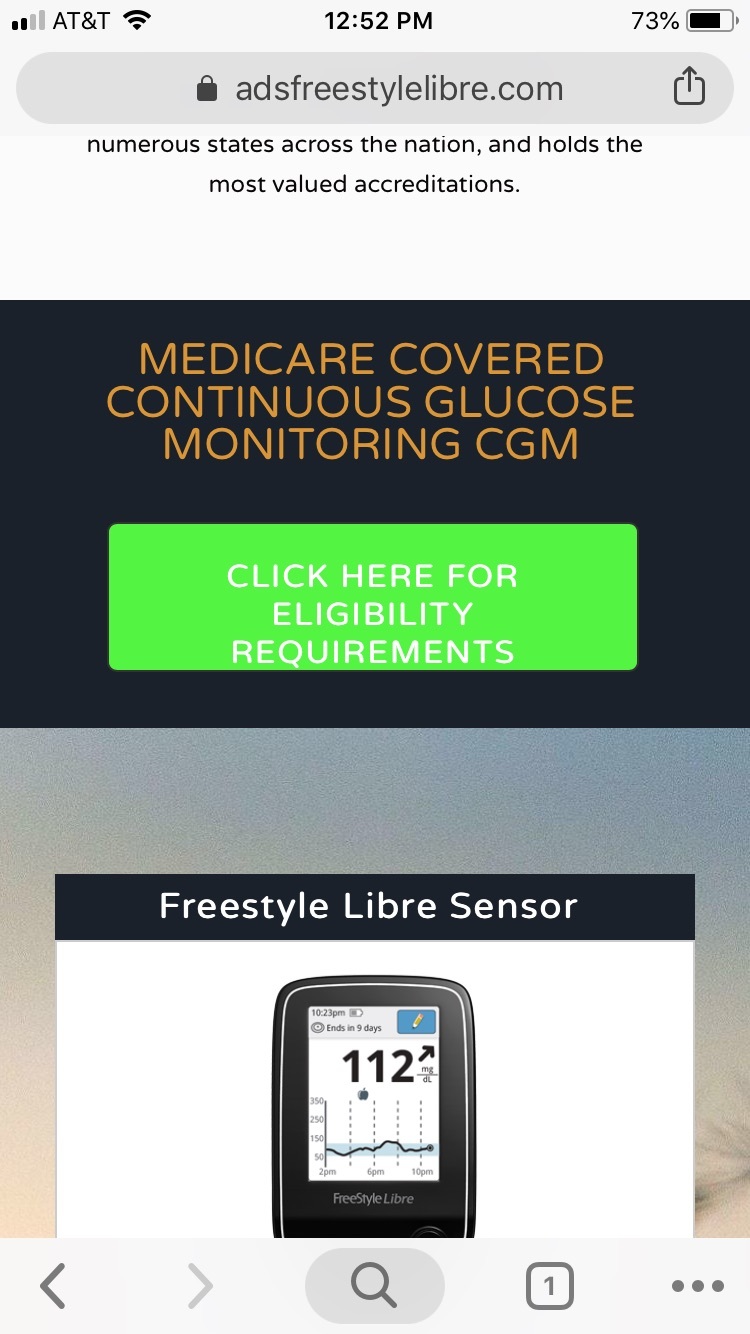
Has anyone ever had a problem with the button text previewing correctly, but incorrectly in the mobile landing page? The CTA text in the button is bottom justified. Added a no padding script, no luck. Please advise and many thanks. Attached is the preview and the landing page experience.
Can you please share a link to the page? 🙂
Hello Zoe,
Thank you for your response, but with some help with support and some wrangling. The landing page is to spec and the way we want it to look.
Apparently, there is a bug in the button function that if you bold the characters it may glitch the padding of the button. I also used the below script to be placed in the tag.
This didn’t affect the button justification and line height when just using the script. To actually get it to work, I had to unbold the CTA text and BAM! Centered and middle justified.
The real problem is that the bug displays properly in preview mode, we only experienced the issue on the mobile experience. The glitch has been escalated to the tech team to look into. I hope they get it to work since bolding has an impact on CTR.
Deanna in support did an excellent job identifying the issue and helping us with the outcome. So keep on shining you crazy little diamond. You’re going places in life.
Also, thank you for jumping in on this since we are new to the platform and may be posting more topics as we get deeper into the platform.
Thank you all!! 😀
Reply
Log in to the Unbounce Community
No account yet? Create an account
Enter your E-mail address. We'll send you an e-mail with instructions to reset your password.

