Hey there


So, I’ve developed a landing page for an award we’re giving off to our customers, which features some infos/photos about all of the awarded (60 boxes of content). When planning it, I’ve developed a layout with dimensions to fit both mobile and desktop displays in a nice way, so I got to unbounce and made my desktop page. Now I want to adapt it to mobile, and I surely don’t want to go through all the trouble of making the exact same layout again (there’s just a small change on the header).


So, the point is: Is there a way to copy the layout I did on the desktop section and paste it on the mobile section, without the “Layout Assistant” messing up my boxes of content and my layout?


Already tried copying the source HTML code from the published page and adding it as a custom HTML on the mobile view. Didn’t work.


All the help is welcome 🙂

Hey @Oz_Miguel if I’m understanding you correctly, you want to essentially keep the exact same look and feel for the mobile view?


As far as I know this is not possible. Unbounce will not automatically adapt the mobile view for you and the assistant uses some strange algorithm, so it is not always the way you want it. You cannot copy and paste the panel or code the way you’re trying.


We always build out the mobile view by hand. So, scale it and replace it. It is what it is. Of course, it would help greatly to see what you have. This way I could give more specific aid.


Hey Oz!


Wow! 60 boxes of content! I agree that rearranging that whole page for mobile is not an ideal scenario. Unfortunately, there isn’t a way to copy the desktop layout to mobile without the Layout Assistant.


What I suggest is disabling the mobile view so that if a user lands on your page, they get the desktop version. I wish I had a more mobile-friendly tip for you! But this option will likely save you the most time.


Let me know if you have any questions! 🙂


Yup, I want exactly that, @digibomb. I guess I’m gonna hava to do it by hand then…


Here’s the page: http://travel.worldpackers.com/top60/


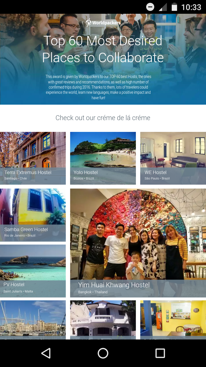
@Jess right now mobile view is disabled. The thing is, because of the different ratio, the scale went mad on some of the most horizontal sections, like the header, making it too small for a proper reading experience. On mobile, it looks like this. The text in the header is small, so I’d like to give it some vertical space to grow.


Ah yes. I’ve seen this problem before, I had to do it by hand myself once a long time ago.


The ideal way would be to integrate Masonry http://masonry.desandro.com/ ti would take some clever JS tinkering and testing. @Unbounce-Experts anyone ever integrated masonry or something similar?


THIS IS HORRIBLE.


Why I am I paying for a service that doesnt even let you EASY and INDEPENDENTLY change your mobile and desktop layout?


Has anyone tried out LEAD PAGES???


Reply