Solved

[Tips & Scripts] Flexible Form Fields


Userlevel 3
  • Former Unbouncer
  • 23 replies

A feature we get asked for a lot is the ability to create forms in more flexible and creative ways, like multi-column forms, horizontal forms, different sizes for input fields etc.

This solution tackles all of the above by allowing you to place the form fields anywhere you want on the page and choosing the width of each field individually. The only limit is your imagination!

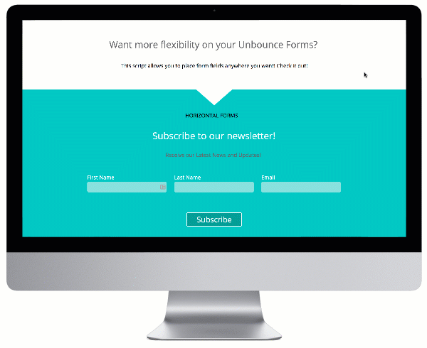
Check out the final product built in Unbounce here:
http://unbouncepages.com/split-form-fields/

flexible form fields unbounce


How to Install in Unbounce

Click Here for Instructions

🚨
This is not an official Unbounce feature. This functionality is based entirely on third party code, and has only been tested in limited applications. Since this isn’t a supported Unbounce feature, our support team will be unable to assist if things go awry. So if you are not comfortable with HTML, Javascript and CSS, please consider consulting an experienced developer.


Scripts Needed

Grab the javascript needed here:
https://gist.github.com/victorzen/9a0294e0e65c03e4b23183e0b58d2118

Instructions

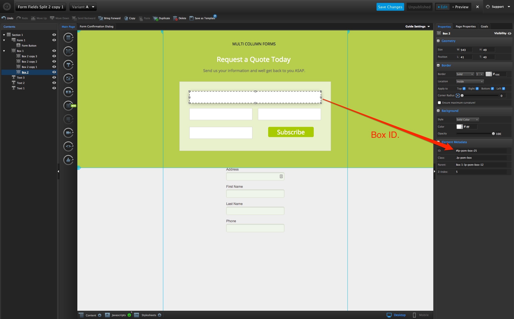
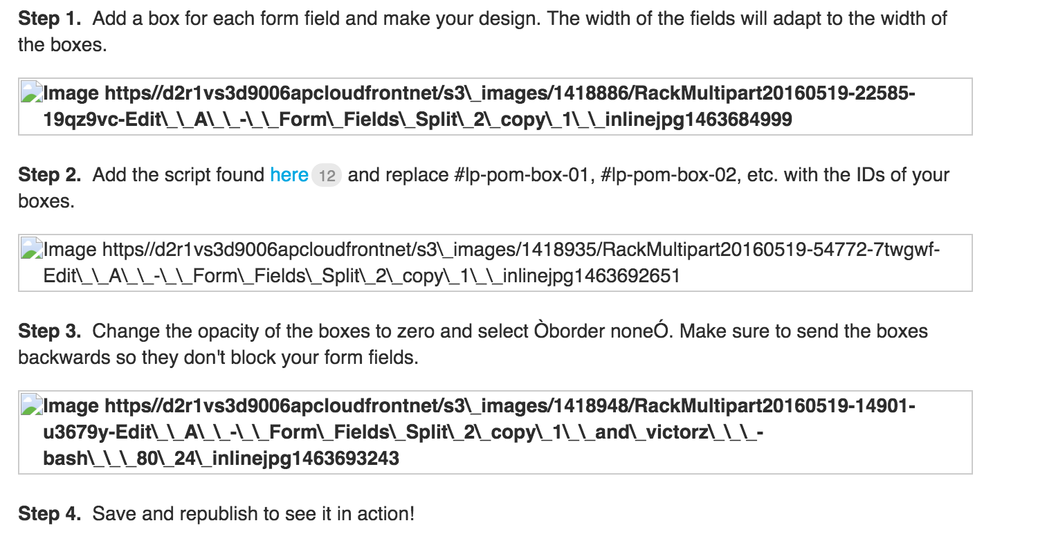
Step 1. Add a box for each form field and make your design. The width of the fields will adapt to the width of the boxes.  

Step 2. Copy and paste the following snippet in the Javascript section with placement ‘Before Body End Tag’.

<script src="//ajax.googleapis.com/ajax/libs/jquery/1.4.2/jquery.min.js" type="text/javascript"></script>

Add the script found here below the snippet and replace #lp-pom-box-01, #lp-pom-box-02, etc. with the IDs of your boxes.  


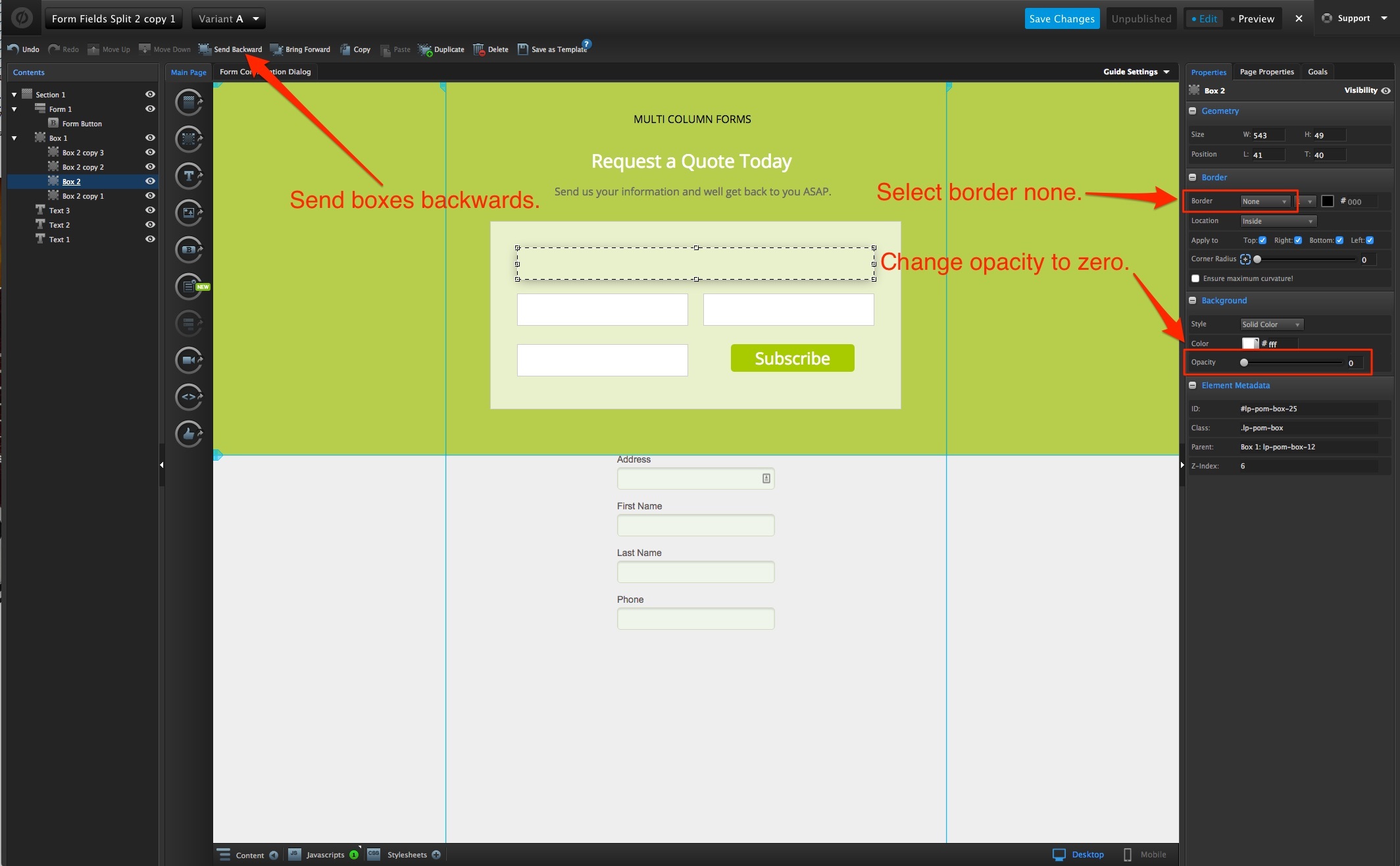
Step 3. Change the opacity of the boxes to zero and select “border: none”. Make sure to send the boxes backwards so they don’t block your form fields.  


Step 4. Save and republish to see it in action!


Testing

Like anything else you implement on your page, you’re going to want to test this out thoroughly to see what effect (if any) it has on your conversion rates.

We recommend running an A/B test and segmenting a small portion of traffic towards the page - just to be safe.

Conclusion

This is an incredibly simple way to get your forms look the way you want them and opens a door for exciting design possibilities!

Give it a try and please let us know what you think. Happy converting! 🍾


Can’t see the instructions? Log in or Join the Community to get access immediately. 🚀


Want to take your Unbounce landing pages + Convertables™ to the next level?
:spinbounce: Check out the Ultimate List of Unbounce Tips, Scripts & Hacks

icon

Best answer by winnieko 9 March 2020, 18:39

View original

57 replies

Userlevel 1

Hi there! Yes, this still works 🙂 You can see it on this page here:

http://unbouncepages.com/custom-flexible-form-fields/

However, I found that it works when I removed the “lp.” from the script. I hope that helps!

<script>
/**
    * Do not remove this section; it allows our team to troubleshoot and track feature adoption. 
    * TS:0002-08-042
*/
  jQuery(document).ready(function($) {
    
    //Change #lp-pom-box-01, etc. for the IDs of the boxes where you want the form fields to display.
    var boxes = ["#lp-pom-box-01",
                 "#lp-pom-box-02",           
                 "#lp-pom-box-03",
                 "#lp-pom-box-04"];
    
    $('.lp-pom-form .lp-pom-form-field')
      .each(function(i, field) {
        $(field)
          .offset($(boxes[i]).offset())
          $(this).children().width($(boxes[i]).width()-16)
      });    
  });
</script>

Hi Max,

You have to do both. Your form has to contain the fields you are collecting data for. The boxes are for placement purposes only. Think of it as a front end and a back end. The form is the backend - it holds the data you want to collect. The boxes are the frontend - they are strategically placed where you want the form fields to appear. You will also need to make sure you send the form “to front” and the boxes “to back” otherwise visitors will not be able to enter data. Also - make sure you view how the form looks on your mobile version because you will need to move the boxes to fit a smaller screen if you have them positioned horizontally on the desktop version.

Userlevel 7
Badge +4

Thank you, Vic!

Userlevel 3

Hi @Jenna_Bensoussan!

Here’s a script you can use to fire any code on mobile or desktop only:

<script>
  if ( lp.jQuery(window).width() <= 600 ) {

    // Your mobile code goes here

  }else{

    // Your desktop code goes here

  }      
</script>

All you need to do is remove the opening <script> and closing </script> tags in the Flexible Form Fields script and add it to the ‘Your desktop code goes here’ area on the script above. That will prevent it from firing on the mobile version of the page.

Hope you find this workaround useful. Have a great day!

Userlevel 3

Thanks so much, Jenna!

Couldn’t have explained it better myself!

Vic you da man, that’s a really  useful bit of script, we’ve been doing something similar but without the placeholder boxes to use as targets idea, which I think is a really neat way of positioning them as opposed to using JQuery to move them around in fieldsets.

This is a really good step towards the kind of flexible forms that would hold most people back…

Thanks for your efforts 🙂

Cheers

Stuart.

Userlevel 3

Hey Stuart - thanks so much for the feedback!

Glad you liked the idea of the boxes as placeholders. The idea came because I was trying to reposition the fields through javascript and wanted to see the end result in the editor before having to save and previewing. Having something to see in real time really helps with the design!

Cheers!  


This is a monster script… thank you. My design team has been asking for more form design flexibility, this is feckin’ amazin!

Hi,
I am getting these broken links for the images attached in each step of the instructions

Just stumbled upon this and can’t wait to start implementing this to our pages. Hopefully the image links will be updated soon.

Thanks Vic

Hi,

I have been trying this script on a new page I’m making. It works great (Thanks!) except for one thing.
One of the form fields can’t be selected.

So I made a page that has a monster form with 34 fields. When I tried it out in preview, and live, two of the fields would not work properly. All of the boxes are sent as far back as possible, and the form itself is sent as far forward as possible.
After deleting the two boxes, copying a box that worked, and pasting it two times, one of the fields in the newly pasted boxes started working. I naturally tried the same thing a few more times for the one that still wasn’t working. But after 5-6 times I gave up. I instead deleted the malfunctioning box and made a completely new one. I of course altered the script to reflect the new boxes names at all times. I sent the new box back as far as I can, but it still won’t work.

I even tried having the box display another form field, but that didn’t change anything. It was always the same box that didn’t work.

However, the field is properly displaying. And it is actually possible to select it by tabbing. And when selected, you can type in it. So it seems to work in every way, except that you can’t click the field to select it.

Any ideas?
Is there any thing else that could be blocking the form field? Is there anything else that I might have to do to make it accessible?

I have tried with both radio buttons (which is what I would prefer) and just a plain text field. Exact same result with both.

Very grateful for any help!

EDIT: I finally realized what the issue was! It was the positioning of the boxes. I had placed the two boxes too close together, although they didn’t overlap visually, the actual (but invisible) size of the form fields would cover each other. And even if one field was “in front” of the other, it made it impossible to select either one of them. Moving the fields further apart solved the problem for me.
Perhaps stupid of me to not realize it sooner, but using the visual editor sometimes makes you forget what is not seen 😉 Hope this might help anyone else out there with a similar issue!

Thanks again for the script, works really well!
Praying that this kind of flexibility becomes a built in feature soon

Hello,

I was trying to create the flexible form fields using the steps, but I was not able to see the expected result.Can you add the images of each steps. It would be great If we have the images of how to create each step.

Hi,

I’m trying to create a mobile view with a flexible form. If I preview the mobile view, the preview shows me the boxes of the desktop view. I have used the script, which “fires any code on mobile or desktop”, too. I even have created seperate boxes for mobile view and disabled the view of the boxes for the desktop view, but still only the desktop boxes are shown. I have change something on the mobile view and press save and refresh the preview, it takes the boxes of the mobile view and also shows them on the desktop view.

I have already spent some hours to figure out why this happens, would be great if someone could help me out here.

Best and also thanks for the great script.
Kurbm

OMG Vic!

I freaked out cause I thought the github link was created specially for me since it has my name on the url hahahahahaha

😂

Hello!

Thank you for this script. I’m using it on several pages and it’s working great.
I generated a new page based on an old one, and can’t seem to get the form fields to display.
Could you please check it out?
http://unbouncepages.com/november-enewsletter-1/

The second set of three boxes should also have checkboxes at the top.

I can’t seem to get this to work on any of my forms. Is this script out of date? I’ve copied it word for word, step-by-step, and it doesn’t do anything.

Userlevel 3

Cool! Can’t wait to see what your designers come up with!

Hope they like it and find it easy to use. Their feedback will be greatly appreciated 🙂   

Userlevel 3

My pleasure!

Genius!

Vic, If possible can you include a copy of the .unboucne page with this? For those of us who are very visual learners it makes figuring this stuff out so much faster.

Userlevel 7
Badge +4

Wow, this is awesome! Are there plans to eventually incorporate this into the default builder?

Userlevel 3

Hi Nicholas,

We are constantly working on making a better and more flexible product overall. There are a few things in the roster before this one, but through community input and voting it might gain traction!

Userlevel 3

Hi Nicholas, 

We are constantly working on making a better and more flexible product overall. There are a few things in the roster before this one, but through community input and voting it might gain traction!

This works fine for desktop, but it’s not mobile responsive. Even in the example, it wasn’t mobile responsive. Any advice working with this to make it responsive? Thanks.

This is AMAZING - I am having a hard time figuring out how to use this with some drop down menus, works great for text fields but the drop downs are in the same spot as the original form.  What code would I have to add to change that?

If I have to I know I can switch back to the Horizontal Script because my menu is just a simple two column deal but this is so easy…

Reply