How could I make 100% width Google Map inside custom HTML?
Main problem is that p-positioned-content class is limiting page width.
Thanks in advance!
Elvis
Best answer by Johnny_Opao
View original
How could I make 100% width Google Map inside custom HTML?
Main problem is that p-positioned-content class is limiting page width.
Thanks in advance!
Elvis
Best answer by Johnny_Opao
View original
Hey Stefano,
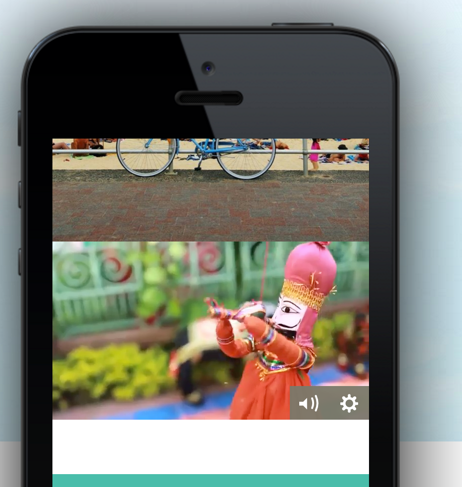
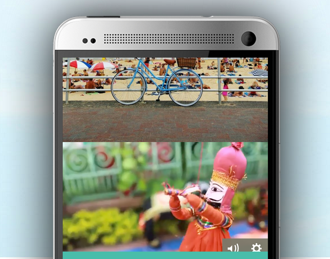
Sorry, I forgot to mention in my first post that I want to do it in ‘mobile view’. This video background thingy does not work in mobile view and moreover even in the ‘desktop view’ it doesn’t have any sound.
However, with the code provided by @Johnny_Opao, I was able to achieve full width but was unable to fix its height and also for some reason it was getting shifted to the bottom of the page.
Just another small issue.
Is it somehow possible to adjust the height of section ‘#lp-pom-block-XX’ according to the width of the video?
The problem I am facing is that if I adjust its height lets say according to my mobile, then visitors having mobile with small screen size will see a weird blank space under the video and visitors having mobiles with the wider screen may not see the video controllers (play or volume button) properly.
I used the code provided here :
/** * Do not remove this section; it allows our team to troubleshoot and track feature adoption. * TS:0002-13-015 */ #lp-code-310 { width:100% !important; height:100% !important; top:0px !important; left:0px !important; position: fixed !important; }Works fine for the full width but it puts the map sticked in header.
Thanks for your help!
I’m trying to get the 100% width to work on my page. When using the code snippets above, it does affect the width, but it also removed all scrolling (up and down) on the page effectively cutting off content. Is there a way to avoid that?
thanks!
Did you solve the problem? I’m having the same trouble here and don’t know how to fix it.
No account yet? Create an account
Enter your E-mail address. We'll send you an e-mail with instructions to reset your password.