If you have some time take a look at this page. We’re getting traffic but not converting. I the message clear? Any help is greatly appreciated. http://ww2.voiplink.com/new-voip-smb/

Hi Anthony,
I see that your landing pages says a lot about the benefits of the product/service you provide but it doesn’t say much the advantage users have from using it very strongly. The content needs to have a clearer value proposition and it needs stronger writing. Also you might want to consider adding a button that keeps directing people back towards filling the form.
Hope this helps!
Good Luck.
Snehaa
Hi,
The first thing anyone reads is your opening header text. Yours is:
Business phone service
Redefined.
As there is no full stop at the end of ‘service’ I can’t work out if the whole thing is one sentence, with an improperly capitalised “redefined” or what?
So that, the first thing people see, is confusing.
Also it sucks! You want to entice people, sell them the service!
“Business phone service” does none of this.
Why not change it to:
“Save Money and Boost Productivity with our Business VOIP Phone Service
We will revolutionise your internal phone systems”
Or something like that. Make it exciting! Sell the product! Sell your company!
Also what about some testimonials? Some Colour?!
Why is the page so narrow, widen it a bit!
Use a proper footer. The page looks like it was made by a year 8 in IT class using Microsoft Publisher.
Why don’t you have a phone number I can ring you on? You are a telecoms company after all.
Best of luck!
Dan
Userlevel 7
 +4
+4
Hey Anthony!
I have a customer in this exact vertical offering nearly the exact same product. We took over their campaigns and noticed their quality of traffic was a major reason why their campaigns were performing so poorly. A proper PPC campaign should always start with high-quality traffic.
Adding a dedicated phone number (that you can track) is extremely important. We found that the majority of visitors for their campaign preferred calling to sign up/get a quote. We also installed a live chat feature that worked quite well.
If you have any other questions feel free to hit me up. I’d be glad to share my data!
Stefano Apostolakos
https://ca.linkedin.com/in/sapostolakos
Hi, Anthony!
I like that your page is simple and white, maybe even too much 🙂
I would definitely add:
- testimonials section of a light gray or so colour and the footer.
- stronger titles & headlines
- a phone number in the top
- more related hero shot of phones or people talking/dialing, not generic office tables
But my main comments are about:
Form. Call to action isn’t clear, quote for what? After reading a supportive text, I see that I have an option of a free demo. So say the same in the header of the form, then list what this demo will include with one-two short sentences or a couple of bullet points and the button “Request free demo for my company”.
Between form and a button set up expectation “We will contact you in the nest 1 hour” (say the true time you usually contact your leads).
Below the button reinforce a safety of the contact details, adding lock icon and message “your information is 100% secure. We will never share your data to any third party” or something similar. Do not use word spam.
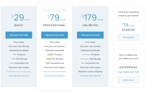
Price grid. Not sure displaying your price just saying “starting from…”, the question comes to my mind: “is it the same number for small business and big enterprises?”
Try to display price grid in the bottom of the page. Something similar to this one. But start with the expensive option first.
Abbreviation. Don’t know if the following abbreviation is common and crystal clear for your targeted audience: VoIPLINK’s Cloud PBX. Considering the possibility of female assistant looking for the telecom service for her boss, I bet she won’t be able even to read it 🙂
Use it on the page but remove from the above part.
wow, looks like a lot of work.
Hope it’ll help! Let us know your results
Rita
Thanks for the feedback. Does something like this work better?
http://ww2.voiplink.com/smb-voip-2016-lp-fb/
Hi Anthony,
This looks much better. But there a few things that can be added. For one as already mentioned, the call option and the testimonials. But I would also recommend some other changes the content.
-
After the main header statement. Add a line or two to support that statement. Give them a glimpse at how it actually happens in these two lines.
-
Scalability benefit, you say one or thousands but that is it. It is still ambiguous as to how.
But most importantly as already mentioned for Stephano, check the quality of your traffic. Even if you have less traffic but from your TG it is okay because it is more effective in converting. It could be that you are getting a lot of irrelevant traffic that is hindering your conversions.
Good luck!
Snehaa
Reply
Log in to the Unbounce Community
No account yet? Create an account
Enter your username or e-mail address. We'll send you an e-mail with instructions to reset your password.