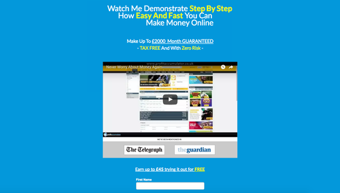
Hi Guys, I am new to internet marketing but I have created my first custom landing page. I am not sure if it is lead-worthy, but It generates me quite a bit of cash every week. Can someone give me their opinion of the layout (attractiveness…etc) http://www.onlineincomeconnections.com/matched-betting/. Regards Kyle

I’m terribly split in between what Im supposed to be looking for and what you want me to see. Tell me a story, ill read along. Have 5 people talking at me at once and I don’t know who to listen to first.
I thought the title was pretty clear…
Its just that my eye went to the video then to the left of the video then to the right then to the top. My attention got dispersed rather than guided.
ok so maybe the testimonials should be further down the page, past the form?.
Personally I’d have your headline centered in the screen and have the entire text clickable to scroll down to the video. But your best bet would be to check this article out: http://unbounce.com/landing-page-examples/5-landing-page-videos-that-will-make-you-jealous/
Userlevel 7
 +4
+4
I’d recommend moving the testimonials to below the video for sure. Too much going on above the fold.
Also, the white text on yellow background makes the button hard to read.
And maybe try a simplified heading, and use the current (wordy) heading as the sub-heading.
Hope this helps and good luck!
Hello Kyle. I do not have experience in the ‘get rich quick’ world so take my feedback with a grain of salt. Only thing I wondered was if you could communicate the credibility of being in the Telegraph and The Guardian by using their respective logos in an As Seen In: format. For me the screen shots were overwhelming, but I am not in your target audience…
Hi Guys,
Thanks for commenting on my page!. Btw this isn’t a ‘get rich quick’ system, I wouldn’t waste my time ruining my reputation when i’m trying to build one!. This is simply something I use that gives me a fairly good income and it’s been around for many many years.
Nicholas I have made a few changes to the page if you would like to look again and see what you think?.
I removed the testimonials because i think i need to keep it simple, as to not draw too much attention away, and when you visit the re-direct URL there are testimonials on the page anyway.
Have another look and I welcome your input!.
Regards
Kyle
Userlevel 7
+4
I like the updated version! Just wanted to note that the main headline doesn’t appear centered for me. The third line that says “Make Money Online” appears further to the right.
Hi Nicholas, thanks for your comments!.
I have just noticed that the title seems ok in chrome for me (centered), but it’s way out in firefox for some reason, i need to find a way to sort it.
Userlevel 7
+4
Hmm, interesting, because for me, it still looks off center in Chrome. Here’s a screen shot from Chrome on my MacBook:
I got this message when talking to support: unfortunately the unbounce responsiveness is not a liquid layout and only has 1 breakpoint so people viewing on screens on sizes in between desktop sizes and mobile may see some alignment differences.
I guess it’s going to take some trial and error to rectify!.
turned out my fix was to make the title into an image file so the text didn’t shift on different browsers!
i have added a live chat feature, so if any of you are from the UK and wanting a second income, i’ll prove it works if necessary 🙂
Reply
Log in to the Unbounce Community
No account yet? Create an account
Enter your username or e-mail address. We'll send you an e-mail with instructions to reset your password.