TwentyTwenty Visual Diff Script


Hi all!

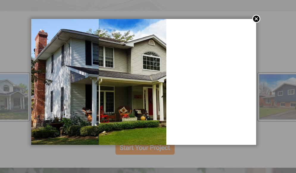
I would like to display a before/after slider in a lightbox. I’ve been using the TwentyTwenty script (https://zurb.com/playground/twentytwenty) on a regular website but I have to admit I’m struggling to implement in using Unbounce.

Do I need to change some of the wording, like replacing #container1 with #lp-pom-box1?
Is it even possible considering that this plugin depends on both jquery & jquery.event.move?

Thanks gals & guys!

Max


15 replies

Userlevel 7
Badge +3

Hi @mxlbld,

Generally speaking scripts you find on the internet need to be heavily modified to work on an Unbounce page.

However, I know another expert has a similar script working on some of his pages. I’m just not sure if it’s the exact same one.

@Stefano can you help out here with your script?

Best,
Hristian

Userlevel 7
Badge +4

Hi there!

Is this what you’re looking to accomplish?

  1. Create an HTML box and paste this inside:
<div id="comparison">
  <figure>
    <div id="divisor"></div>
  </figure>
  <input type="range" min="0" max="100" value="50" id="slider" oninput="moveDivisor()">
</div>
  1. Copy paste this JS code and place it before body end tag
<script>

var divisor = document.getElementById("divisor"),
slider = document.getElementById("slider");
function moveDivisor() { 
	divisor.style.width = slider.value+"%";
}
  
</script>
  1. Copy paste this CSS & replace background-image: url with your two images.
<style>

div#comparison { 
  width: 60vw;
  height: 60vw;
  max-width: 600px;
  max-height: 600px;
  overflow: hidden; }
div#comparison figure { 
  background-image: url(https://s3-us-west-2.amazonaws.com/s.cdpn.io/4273/photoshop-face-before.jpg); 
  background-size: cover;
  position: relative;
  font-size: 0;
  width: 100%; 
  height: 100%;
  margin: 0; 
}
div#comparison figure > img { 
  position: relative;
  width: 100%;
}
div#comparison figure div { 
  background-image: url(https://s3-us-west-2.amazonaws.com/s.cdpn.io/4273/photoshop-face-after.jpg);
  background-size: cover;
  position: absolute;
  width: 50%; 
  box-shadow: 0 5px 10px -2px rgba(0,0,0,0.3);
  overflow: hidden;
  bottom: 0;
  height: 100%;
}

input[type=range]{
  -webkit-appearance:none;
  -moz-appearance:none;
  position: relative;
  top: -2rem; left: -2%;
  background-color: rgba(255,255,255,0.1);
  width: 102%; 
}
input[type=range]:focus { 
  outline: none; 
}
input[type=range]:active { 
  outline: none;  
}

input[type=range]::-moz-range-track { 
  -moz-appearance:none;
    height:15px;
    width: 98%;
    background-color: rgba(255,255,255,0.1); 
    position: relative;
    outline: none;    
 }
input[type=range]::active { 
  border: none; 
  outline: none;
}
input[type=range]::-webkit-slider-thumb {
    -webkit-appearance:none;
    width: 20px; height: 15px;   
    background: #fff;
    border-radius: 0;
   }
input[type=range]::-moz-range-thumb {
  -moz-appearance: none;
  width: 20px;
  height: 15px;
  background: #fff;
  border-radius: 0;
     }   
input[type=range]:focus::-webkit-slider-thumb {
    background: rgba(255,255,255,0.5);
   }
input[type=range]:focus::-moz-range-thumb {
    background: rgba(255,255,255,0.5);
   }
}
</style>

Let me know if this helps! 😀

Hey guys!

Thank you so much for getting back to me so quickly.
That is indeed what I’m trying to accomplish.

@Stefano, I followed your instructions but unfortunately, something went wrong (see attached screenshot).
I end up with two cropped photos, and no slider.

Any idea what went wrong?

Best,

Max

Userlevel 7
Badge +4

Hey again!

Not totally sure without having a URL (you can PM this to me if you’d like).

You can download the page right here if you’d like to copy exactly what I did!

If ever this link expires, let me know 🙂

Userlevel 5
Badge +4

Hey @Stefano !

Thanks for the great script.
i’m trying to modify it to include a small picture with two arrow to replace the basic handle currently in.

Do you have any idea ?

Here is my LP (still a work in progress):https://recevoir.mes-devis-pratiques.fr/securdouche/a.html

And here what i would like to achieve : https://www.independanceroyale.com/DO-28/index.php (you can see the Before/after at the end of the page).

Thanks for any help !

Userlevel 7
Badge +4

Hi Julien!

You should be able to tweak some of the CSS to get your desired result. If I have some time before I leave for 🌴 on Saturday, I’ll try to shoot something your way!

Userlevel 5
Badge +4

Hello @Stefano !

I found a solution myself by adding a picture of the handle instead of using CSS 🙂

But i’m trying to use this into another landing page and i’m facing a small challenge.
The two pictures i use for the script and transparent PNG and are almost identical.
here is the landing page: https://recevoir.mes-devis-pratiques.fr/sfte-dynamic/d.html

The problem i have is when i’m moving the handle to the right, the new picture appearing keeps the old one in the background, killing the effect.
Have you an idea of what code or parameters (i tried to mess with them but to no success) i have to add to hide the before picture ?

Thanks in advance

Userlevel 7
Badge +4

Hi Julien!

Looks like this is a caveat of using two PNGs.

Would you be willing to kill the gradient background? if so, you won’t need to rely on transparent before/after.

Great stuff 🙂

Userlevel 5
Badge +4

Yes you are right and that’s what we just did.
It’s working now, thanks !

Hello Stefano!

I want to add 2 sliders BUT i can not make ir work. Is it even possible according to your code?

This is my Test Page: http://unbouncepages.com/slidertestrob/

Greetings from Mexico!

Userlevel 5
Badge +4

Hey @Roberto_Lujan

It should be possible as we are doing it on an old LP of ours.
One version for desktop and one for mobile.

You must have two JS script.

Here is the code for the second one:

<script>
var divisor2 = document.getElementById("divisor2"),
slider2 = document.getElementById("slider2");
function moveDivisor2() { 
divisor2.style.width = slider2.value+"%";
}
  </script> 

–> As you can see we added a “2” at the end of each instance of “divisor” and “slider”.

For the HTML code it’s a bit the same:

<div id="comparison2">
  <figure>
   <div id="divisor2"></div>
</figure>
<input type="range" min="0" max="100" value="30" id="slider2" oninput="moveDivisor2()">
</div>

As for the CSS, instead of having “div#comparison” we added a “2” on each instance: “div#comparison2”

Here is the URL where we tested it https://information.maintiendomicile.com/remplacer-votre-baignoire-par-une-douche-securisee/c.html

Beautiful!! It worked just fine!! I knew i was missing something like just adding a “2” just didn’t know exactly where to.

Thaks a lot!!

Userlevel 7
Badge +4

Thanks for that @julien_level 🙂

Hi @Stefano ! I tried to implement this slider and unfortunately the actual white circle with the arrows does not appear properly. I have attached a photo of the end result that I get. It functions as it should, but visually is suboptimal. Any idea what might be causing this? Your help is greatly appreciated!

Userlevel 5
Badge +4

Hello @Chase_Helton

If you want to personnalise the lookg of the slide, you have to modifiy the CSS part.

Here is my twentytwenty on a LP : https://douche.bien-vivre-chez-moi.fr
it’s not perfect but it does the job.

below is my CSS for it:

  <style>
div#comparison { 
  width: 60vw;
  height: 60vw;
  max-width: 580px;
  max-height: 414px;
  overflow: hidden; }
div#comparison figure { 
  background-image: url(https://crea.cloud-media.fr/landing/bien-vivre-chez-moi/douche/avant-apres/baignoire-sombre3-avant-carre.jpg); 
  background-size: cover;
  position: relative;
  font-size: 0;
  width: 100%; 
  height: 100%;
  margin: 0; 
}
div#comparison figure > img { 
  position: relative;
  width: 100%;
}
div#comparison figure div { 
  background-image: url(https://crea.cloud-media.fr/landing/bien-vivre-chez-moi/douche/avant-apres/douche-apres-carre2.jpg);
  background-size: cover;
  position: absolute;
  width: 30%; 
  box-shadow: 0 3px 1px 2px rgba(255,255,255,1);
  overflow: hidden;
  bottom: 0;
  height: 100%;
}

input[type=range]{
 -webkit-appearance:none;
  -moz-appearance:none;
  position: relative;
  top: -18rem; left: -1.2%;
  background-color: rgba(0,0,0,0);
  width: 102%; 
}
input[type=range]:focus { 
  outline: none; 
}
input[type=range]:active { 
  outline: none;  
}

input[type=range]::-moz-range-track { 
  -moz-appearance:none;
    height:15px;
    width: 98%;
    background-color: rgba(255,255,255,0); 
    position: relative;
    outline: none;   
 }
  
input[type=range]::active { 
  border: none; 
  outline: none;
}
  
input[type=range]::-webkit-slider-thumb {
    -webkit-appearance:none;
    width: 44px; height: 44px;   
   	background-image: url(https://crea.cloud-media.fr/landing/institut-maintien-domicile/curseur-bleu-avant.png);
 	
   }
  
input[type=range]::-moz-range-thumb {
  	-moz-appearance: none;
  	width: 44px; height: 44px;   
  	background-image: url(https://crea.cloud-media.fr/landing/institut-maintien-domicile/curseur-bleu-avant.png);
 	
   }
  
input[type=range]:focus::-webkit-slider-thumb {
    -webkit-appearance:none;
    width: 44px; height: 44px;   
   	background-image: url(https://crea.cloud-media.fr/landing/institut-maintien-domicile/curseur-bleu-apres.png);
 	
   }
  
input[type=range]:focus::-moz-range-thumb {
    -moz-appearance: none;
  	width: 44px; height: 44px;   
  	background-image: url(https://crea.cloud-media.fr/landing/institut-maintien-domicile/curseur-bleu-apres.png);
 	
   }
}
</style>

Reply