Hi i
m new to unbounce and Not feeling comfortable with the mobile version of my page http://unbouncepages.com/badcredit/ any suggestions ?

Suggestions please
Userlevel 7
 +4
+4
Hi Sam, welcome to the community!
Here’s a quick video I put together with some feedback on your mobile page:
Userlevel 7
+4
Hi Sam,
Was the page put offline? I can’t seem to access it. I would be glad to chime in.
Cheers!
Stefano Apostolakos
https://ca.linkedin.com/in/sapostolakos
Well done, Nicholas! Thoughtful and raises the bar for providing feedback 🙂
Sam - Agree with pretty much everything Nicholas suggested. Just wanted to reitterate that you might have difficulty getting visitors to fill out 6 form fields on their mobile device.
If you decide to go with a call as your CTA consider providing more guidance by either displaying a clickable phone number (tel: function in the unbounce page if I remember correctly) or to provide more content as to how they would “Call For Free Quote” because in reality you are trying to direct them to click the button to call for their free quote.
You have plenty of thoughts to iterate on so I won’t overload you with anything else until your next version.
Best of luck,Joe
Thanks Nicholas I appreciate your feedback and will start implementing your suggestions
I am new to creating landing pages. And am trying to focus on mobile advertising for PPC on google and adwords … and have horrible conversion rates .i would really love if unbounce had a way to make separate customized mobile ads and separate Desktop landing pages
i burnt through $,2,000 in 2 days without any conversions… ARGH going to take me while to figure out mobile landing pages
how about this mobile version ?
Userlevel 7
+4
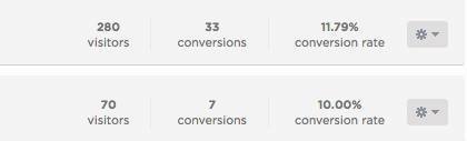
Hey Sam - I find that particularly odd. I run similar campaigns for customers in your industry and our conversion rates are usually close to 10% (not including phone calls). I attached a screenshot of a campaign we just launched for private lenders.
Perhaps the PPC traffic is also the culprit here? I would love to get in touch and give you a hand.
Happy 4th!
https://ca.linkedin.com/in/sapostolakos
Userlevel 7
+4
Hey Sam,
Just checked out your mobile page. It is a nice start, but I think there is still some room for improvement.
The main thing is, the page doesn’t tell a story. Why should I fill out the form? What can your company do for me? Why should I trust your brand over others? Why do I need to take action? Think in terms of benefits.
Telling a compelling story is an important part of landing page design. You can do this by putting yourself in the shoes of your ideal customer. When they come to the page, what questions are they going to have?
Right now, when I look at the page on a mobile device, the first thing I see is a big form staring back at me. I would consider moving this down the page a little bit, so the page doesn’t look like it’s asking for my info up front. And above the form, add some images and text to build the credibility of the page and tell the story of why your brand is unique and valuable.
The items you have below the form might look better if you work them into the above-the-fold area of the page.
Furthermore, a few testimonials would add credibility to the page. And maybe some logos of companies you’ve worked with or partnered with. With financial services, trust is a huge issue.
Lastly, there are two calls to action on the page (call vs. fill our the form). I would recommend focusing on just one, so your visitors don’t have to think as much.
Hope this info helps and keep up the improvements. Landing page design is an ongoing process! 🙂
Spot on, Nicholas!
Also, I’d suggest connecting with either Stefano or Nicholas to schedule a Google Hangout to chat more about this. It looks like you all might be able to work together and collaborate on bringing this page up a few notches. :)
Reply
Log in to the Unbounce Community
No account yet? Create an account
Enter your username or e-mail address. We'll send you an e-mail with instructions to reset your password.