Shoot me down! ;)

  • 12 October 2017
  • 4 replies
  • 2 views

1: What challenge are you currently trying to solve?

Increas conversion rates.


2: How are you driving traffic to your page?

Various PPC channels.


3: What is your conversion goal?

Above 4% on all LPs


4: Provide a link to your published landing page / convertable:
https://eloomi.com/schedule-demo-lp/
(If you open in Incognito, you can also access the other versions if you’re up for critiquing multiple)

Thanks guys!


4 replies

@andreasobel

I’m not a fan of “shooting people down” as this is a place of constructive criticism and trying to build success… but I get what you are saying 😉 so here goes…

I looked at the lp you shared and 1 other variant. Both are pretty rock solid. But I can offer a few suggestions.

Without knowing which LP is converting better I personally like the shorter page. The one with more logos at the top and more content in the dark blue panel seems like a bit much for me… but I may not be your target audience. So take this one with a grain of salt. I do like longer LP’s in general but the mass of overprint text, especially at mobile, was a bit much for my eyes.

The biggest place I think you could improve the page is in the form. @Oli_Gardner talks about form first design. This course explains it in detail.

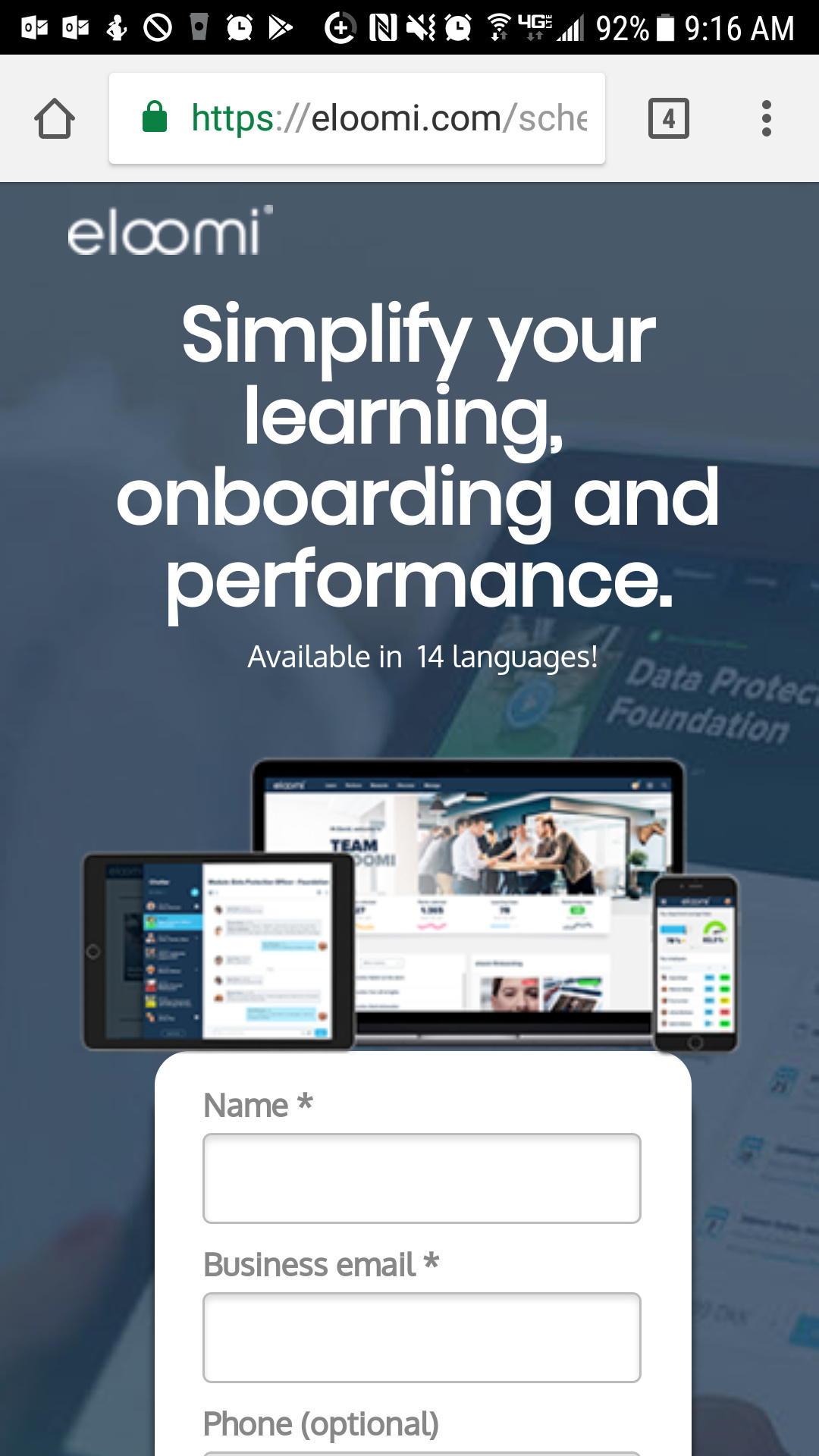
Especially at mobile, your form gets lost at the top of the page. The CTA is outside of the white box so it doesn’t even look like a clickable element anymore… I think adding a little copy around the form, maybe even a headline and making the CTA more prominent (square no rounded corners) will help conversion rates.

I would also suggest adding smooth scrolling to the page. That way it doesn’t seem like a page refresh is happening when I click the lower CTA.

It is a page… hope that was helpful!

Joe

Userlevel 6
Badge +1

Hey @andreasobel great looking LP!

Honestly there’s really noting to suggest other than testing to get your conversion rate. I would need to know:

  • How long has this campaign been running?
  • Are you already running tests? And if so what are the current rates and split weights?
  • What channels are you advertising on?
  • What types of ads are you running: display, ppc, etc?

Hey @andreasobel!

I definitely agree with what Joe is saying about your form on mobile. Here’s the variant that I’m looking at:

With the way that this variant is laid out, I’d say that the image is probably less important than your call to action, at least for what you want to be seen immediately on load, and you could probably improve your conversion rate by adding a bit of compelling text above the form.

You might try a variant putting your form at the bottom of the page and having your CTA button at the top (reverse from the way it is now). This not only puts your CTA in the visitor’s immediate field of view, but also gives you more of that precious vertical space to sell your visitor before they even have to touch their screen.

Have you tested a desktop variant with your promo video somewhere on the page (the one that can be played on the mobile version)? I’ve taken a look at a few different different variants and I’m not seeing your video on any of them. I’m curious if that was a conscious decision you made based on previous testing?

Personally, I prefer the variant without the animation in the header area of the page. IMO, the movement is distracting. My experience with both of the landing pages that had the animated background was that I watched the animation and and then scrolled down the page without really even looking (and definitely not absorbing) the header text.

All-in-all though, I think the content and layout of your page are really quite good. It’s very appealing and conveys trust and a level of professionalism that would be expected with an LMS platform. You might consider taking a closer look at your advertising channels at this point. You can have the best landing page on the Internet, but if you’re not driving the right kind of traffic to it, it won’t do you much good!

Thank you very much guys, appreciate all the feedback!

Joe_Savitch

  • Have added smooth scrolling and will test it over the next few weeks to see what happens.
  • The form first video I will watch today and implement some tests to see what happens, along with the square button
    Thank you for the link to the from first design video! (Insert virtual highfive!)

digibomb

  • The particular page linked has been running for a few months. We are currently testing 4 different versions with a 25% split, one of the ones here (the one with the different design) is performing significantly lower than the others so will give it a bit more time and then discard to test a new page with some of the information gathered from you guys.
  • We are running PPC & Display across the most common PPC channels plus some industry specific pages. Can’t really share too much since this is public 🙂.

leah.ann

  • Reversing everything is an excellent idea for a test, will put that into effect asap and see what happens. We do have people scrolling quite far on the mobile version but it might have a positive effect so definitely worth testing.
  • We actually have a live version with the video being a part of the design where you can press play. Do have some other tests in pipe with that video though, as it has provided some interesting thoughts for testing.

Overall guys, thank you very much for taking time out of your day to view and review this landinpage.
If you’re ever in Copenhagen, I will buy you a beer as a thank you!

Reply