Pre launch Landing page feedback

  • 23 January 2021
  • 5 replies
  • 4 views

1: What challenge are you currently trying to solve? Give as much detail as possible
I want to explain the idea as clearly as possible.
I want to collect emails from interested parents.
I do not want to sell to them.


2: How are you driving traffic to your page?
I plan to pay for Ads.
Ive never used Google Ads, Facebook Ads, Insta Ads so any advice is most welcome. Thanks 🙂


3: What is your conversion goal?
5%


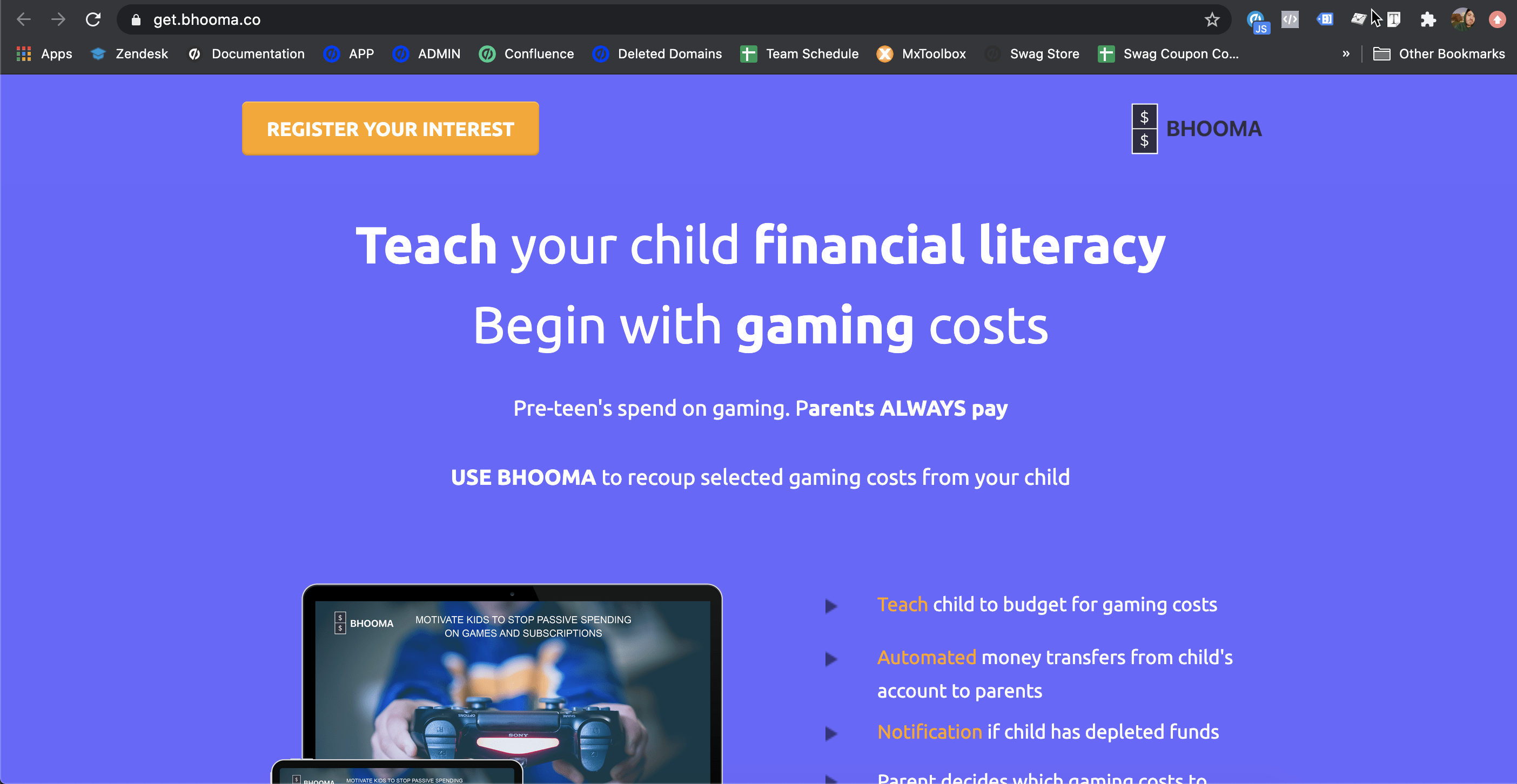
4: Provide a link to your published landing page / convertable:
https://get.bhooma.co/


5 replies

Hi @VivekAyer!

I think you’re off to a pretty good start here - though I do have a few suggestions when it comes to sprucing things up a little bit.

When the page loaded, I thought for a quick moment that my browser had bugged out or that perhaps an image at the top of the page was just taking a million minutes to load, ex. the blue background. Have you considered adding a background image? Maybe a screenshot of the product in action or an industry shot of somebody playing a video game?

“Begin with gaming costs,” - this made sense after I had read a bit more on the page, but I’d consider experimenting (maybe an A/B test?) with some different copy. Would it be appropriate to change this to “video games”? Gaming could mean a lot of different things to different people.

I like the section with NOTIFY, AUTOMATED, and TEACH. That’s nice and specific.

Two of your testimonial images are of the same person and the one on the right side is from “Parent c,” so that may need to be updated if you’ve already gone live.

The page has some nice bones in development - I’d just try experimenting with some different layouts and copy so you are maximizing your chances toward success.

If you are looking for some extra pointers on layout, there are some great suggestions in this post on the Unbounce website if you are interested:

Thank you so very much Alex 🙂

Id happily add an image. I do have the image of the child holding a game, did that not appear?

Will definitely give A/B testing a try once Ive got a decent number of responses!!

You are right parent C is yet to give me a photo to add 🙂

I see the image of the kid holding the controller (with the different screens) but above that I am only seeing the blue background.

You can see what I mean here. There’s just quite a bit of empty blue space - so I would maybe experiment with some different ways of managing this space, ex. adding a background image, a video background, a pattern, etc. Just some contrast to your text and your images so it isn’t this big blue abyss!

Hope this helps! 🙂

Userlevel 7
Badge +4

Hi Vivek, here’s some feedback in a video for you:

Hey Nicholas, thank you so much. I am happy with your feedback. The more I learn about landing pages, the more I see how little I know!
The very specific points were most appreciated.

Reply