http://unbouncepages.com/doctor-appointment/
This is my landing page . please review some issue if any suggestion

Please review my landing page
Hello Syful!
At one glance there are a few things that could be improved.
- the header font colour clashes with the background so it could be hard to read. You could add an overlay box, change the font colour, or make the background overlay white.
- Spacing between benefit 1 and 2 and 2 and 3 are not the same height.
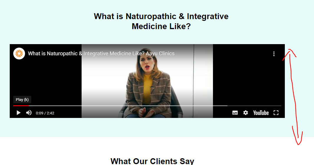
- If you make the video box taller, the video could be bigger, or if you’re trying to save space on height, you could make the box narrower and move the text next to the video box.
- A lot of space between header of testimonial and the testimonials. Would look better if minimised. Also, the testimonials are not updated yet.
- I’m not sure if you’ve worked on the mobile version already but the arrangement is off.
I’m not good with copywriting so that’s all I could help with. Hope it helps!
Thank you for your correct suggestion.
Reply
Log in to the Unbounce Community
No account yet? Create an account
Enter your username or e-mail address. We'll send you an e-mail with instructions to reset your password.