Need Help! New User 0 Conversions Even With Smart Traffic


Hello! I’m looking for advice. I have two digital campaigns going that click through unbounce landing pages. I can see that the impressions are delivering clickthroughs to the landing pages but I’m having 0 conversions. I even added the Smart Traffic since it claims that will increase conversions but NADA!

The landing pages match the ads and target audiences. I’m concern because this is work we are doing for a client and 0 results thus far. PLEASE HELP!

These are the landing pages:

https://inquire.ndnu.edu/
https://choose.sage.edu/bachelors/


12 replies

Userlevel 5
Badge

Hi Maria.

It’s hard to say exactly what the problem is without all the details around target audience, the ads driving people to these pages, etc. But theses might be some factors.

The biggest factor I see is the offer. In the first link, I’m not even sure what the call to action is. What is the user signing up for? If it’s signing up for classes or something of that nature, there isn’t enough information for people to make that decision.

Let the person know exactly what they are going to get and what to expect when they submit the form. If it is some sort of information packet, let them know what’s in it and when they can expect it.

The button on the second link is a bit clearer in that it is to get additional information. But even that is too vague. What are they going to learn specifically? How are they going to learn it? And most important, what is the benefit of learning more?

I would also test a variant that sells that offer rather than just the schools in general. Remember, with a lead gen offer, you don’t need to close a sale; you just need to get the person to take the next step.

Those are the things. Best of luck.

Exactly as Sean Says

-Change CTA and page goal/ H1/H2, key points to request a course brochure
-Missing Fav icon
-dark grey input boxes do not work
-check traffic mobile vs desktop, seems more optimised for desktop
-Add a sticky bar

Thank you so much Sean! I will work on the CTA. It is hard when it is for college enrollment and they are not giving you a true offer other than talking to an advisor or requesting more information. But I will be more specific. 🙂

Hi Cheetahconversions1 for the feedback. Sorry for my question but what is H1/H2? Are you talking about the headings? Also, the page goal is set to form submission. Should I change that too?

I never thought about checking the traffic of mobile vs desktop. Historically, mobile is greater. I will look into that. Is there a way of checking that inside Unbounce?

Lastly, adding a sticky bar… is that something I should add to the landing page or the actual client’s website?

Sorry for all the questions again, first time using this tool.

Userlevel 5
Badge

You’re welcome.

I know those generic type of offers can be difficult to work with. I’ve been there myself. You could try to make it at least sound like it is something exciting or valuable. For instance, if the information is something that gets mailed out to the prospect, you could position it as a Free Decision Guide or something similar. Or if it’s talking to an advisor you could position it as some sort of consultation.

Those are just off the top of my head. I’m sure if you give it some thought, you could come up with something even better.

Thank you! Working on that CTA right now.

Userlevel 5
Badge +2

👋 Hi @mdelamo!

Sean had some excellent advice and I have a couple of points to add on!

Russel Sage College:

  • On mobile, there is no CTA above the fold. Move your form up or have a button that anchors to your form and place that right where your thumb would naturally lay (I prefer the form above the fold).
  • I think you have great points/benefits about the college, but what are you trying to get your users to do? Get started on a degree? Learn more about their degrees? Something similar should fall into the headline. Perhaps even more specific if this page is just for bachelor’s degrees.
  • Let’s talk about that form - “Give Me a Call” - Who is ‘me’? Someone is probably not ready right at that moment to talk to someone. I think you could do a multivariant test here (if you have enough traffic) - “Get More Info”, “Schedule a Call”, “Free Degree Consultation”, etc. I do love the arrow pointing to the form!
  • Sprinkle some additional buttons that bring a user back to the form further down the page
  • Build some easy trust with a favicon and metadata (especially the page title which shows on the tab)

Notre Dame - De Namur

  • For me, I was unable to see what I typed in any of the form fields, I would always suggest white backgrounds for form fields - our eyes have been trained over the years to look for them! This could definitely cause a big hit on CVR!
  • I have most of the same sentiments for this page. Add additional CTAs throughout the page, add a favicon and metadata
  • The form headline and the submit CTA kind of match up… Signing up to talk to an admissions counselor sounds a bit strange. ‘Schedule a Call’ sounds better! You could also test what I mentioned above on the other page!
  • For the headline, I would also be more specific here - the same goes for what I mentioned on the page above!

I’ve been working with higher edu landing pages for years so I understand how tricky it can be! If you have any interest in working with our agency, feel free to message me!

Userlevel 7
Badge +4

Just here to say that @Caroline is the higher education landing page wiz. This is really good feedback 👆

Thank you so much for your feedback! I’m working on fine tuning the landing pages. Hoping for some conversions soon. 🤞

Does it works correct now?
Can you mark post as a solution?

Not yet, still 0 conversions

Userlevel 7
Badge +1

Hi Maria!

A few other tidbits to include here –

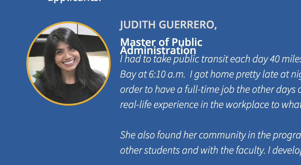
In this section of the page, the copy seems to be overlapping a little:

These sort of details seem small, but enrolling in courses is a big financial decision so you want to make sure everything is absolutely polished.

One other thing I wanted to add that I found on https://www.ndnu.edu/ website was a COVID sticky bar at the top. This shows that this page is up-to-date and complying with any health orders in the region which is a win-win. Here’s some documentation on getting started with sticky bars if that’s something you’re interested in.

Lastly, while you don’t want to crowd your page with too much information (you really want to get your visitors to the form to convert), something I liked that was also on your website was a success story.

Something like this allows your visitors to see the impact that enrolling may have on their futures.

I’m going to quote one of our Community Leaders here on this one:

You can adjust the page until the cows come home, but what’s most important is that the offer is something that really resonates with your audience. I can see you’re using Smart Traffic (which is awesome!!) so this opens up so much opportunity for you to try various headlines and see what sticks.

Hopefully this gives you some more runway to try new tactics. Best of luck!

-Jess

Reply