Solved

Looking for feedback on Real Estate focused landing page

  • 9 October 2019
  • 8 replies
  • 11 views

1: What challenge are you currently trying to solve?
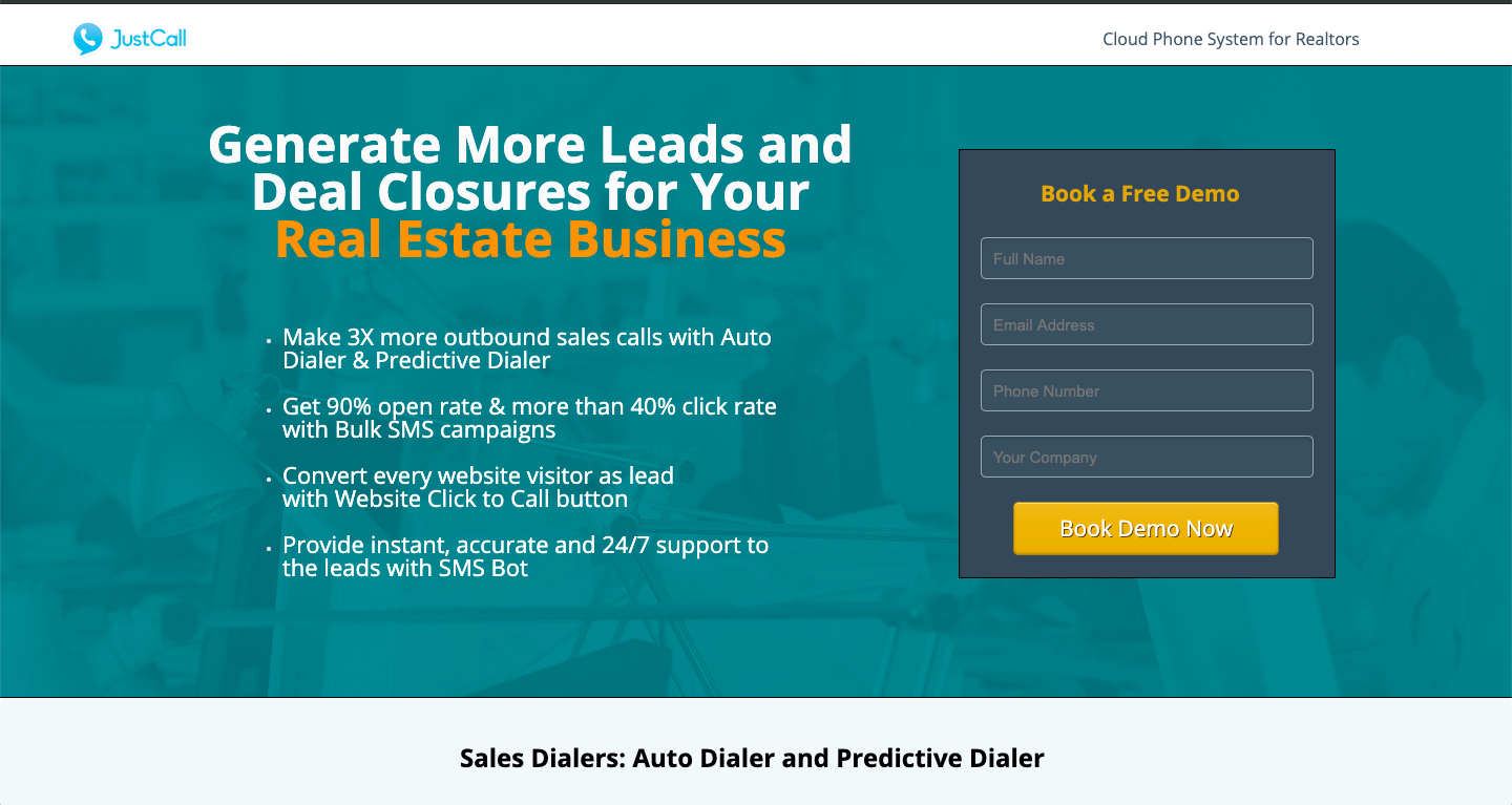
I have created this landing page for JustCall- Cloud telephony solution. Tried to keep the focus on the pain points real estate agents face(in the lead gen and conversion process) and how different features of JustCall assist them in solving these pain points.


2: How are you driving traffic to your page?
Mostly PPC and FB ads.


3: What is your conversion goal?
8-10%

4: Paste a link to your published landing page / popup: 👇
https://real-estate.justcall.io/cloud-phone-for-real-estate/

icon

Best answer by happyagencies 14 October 2019, 22:32

View original

8 replies

Userlevel 3
Badge +1

Hi @Abhishek !

Let me tell you that I think this is a great and useful tool for this industry, and you can get many leads as soon as you start working on your campaigns and your digital assets.

I’m looking at your landing page and I think you can still improve some sections.

  • You might want to separate the Main Header as a first important section, where you can also share your CTA (the “book a free demo” in this case, make sure that the whole CTA is shown and visitors don’t need to scroll down… I know it is missing just a little bit in this case, but just keep it in mind)

Check out this example: https://www.6cmarketing.com/previous-work/unbounce/contentoo/

*I’d work on the “features” and “benefits” of this tool within a different section maybe.
You can also try some bullet points for the benefits.
Check out this examples: https://www.6cmarketing.com/previous-work/unbounce/listing-alert/

*I believe you should also add a footer with some information about you.

*Finally, and this is just my personal opinion, I like to make the “reviews” section smaller and with less text. Always keep in mind that this is a Landing Page and the main goal is to sell a product or a service, not to show loads of information about yourself.

I hope you find this information useful!
Cheers!
Ariel.

Thanks Ariel for taking out your time, I will definitely work on your feedback. Will try to make the page more readable and clutter free. @happyagencies

Userlevel 5
Badge

The first things that jumps out at me is how busy the page is.It’s hard to know what to look at or what’s important. I would simplify it. Lead with a your main benefit, a single visual that supports it and a call-to-action and save the nitty gritty for later in the page.

It also looks like you’re not using a responsive design, so the problem is exacerbated on mobile. That’s a change you’ll want to make.

Your headline has a good benefit, and it would be even better if you presented it in a more specific or intriguing way. You could also include a subhead to give more context.

I like how you offer specifics with the sales call and open rate numbers, but why should people believe it? Where do those figures come from? You need to back up those claims for credibility.

In other places the copy is too generic, such as the heading about high ROI for very low cost. It sounds like an empty promise and it’s all subjective.

It seems like a useful product, you just need to refine how you present it.

Best of luck!

Thanks, Sean for your honest feedback. I have created another variation of the landing page with minimal description around the main header. What do you think about this variation?

Userlevel 3
Badge +1

I like it!

You can give more format to the 4 bullet points, but I think you are on the right track.

Userlevel 5
Badge

It’s better than the previous version, and I think with a little more refinement it could be really good.

The term deal closures sounds clunky to me. Close more deals sounds more conversational, but maybe you have market research that says otherwise.

The bullet points have good information. They might be better used later in the page, though. It’s best to focus on just one thing on the hero area. You want people to be able to tell what the page is about in 3 seconds or less.

Maybe you could use a subhead introducing that it’s a full featured phone system or however you position it.

And if you do go with bullets in that spot, it might be better to make them a bit mired of a teaser to get people to read more.

I would also revise the design a bit. Some of the text is hard to read. Make sure you have food cobtrast between your texts and backgrounds. That goes for the form and buttons as well.

And mane there is some sort of image you can use to help convey the messaging quicker as well as add visual interest.

Best of luck!

Yeah, I am trying some formating options and CSS for the bullet points. Thanks for the assist mate!

Thanks a lot, Sean for detail feedback! I am working on the responsive design for mobile and text on the front screen.

Reply